Web Design Inspiration
10 Sites with Brightly Colored Wed Design
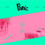
1. This site did a great job of using brighter colors without making the page look too messy. The colors grab your attention and make the page pop. http://www.huxtaburger.com.au/ 2. This website did a good job of using a bright yellow but still making it look clean and professional. http://hlvticons.ch/ 3. I feel like orange would be […]
Large Background Images in Web Design
I like how http://super16.dk/ has the boldstylized text that has a great animated transition over a shuffling landscapes. http://richlanddubai.com/ is attractive because it starts with a slideshow that showcases it property with the contact information easily viewable and a site thats easy to navigate. https://www.jardan.com.au/ starts with a colorful animated slideshow […]
10 Examples of Photo Based Websites

Moonlight.movie This site captures the essence of the movie Moonlight through utilizing large images of the movie’s central characters and incorporating vivid colors. Rafsimons.com The Raf Simons landing page is two split rotating images that showcase the grit of the New York City streets and a few sample pieces from his clothing line Blackpyramid.com Black […]
10 Nature Themed Websites

1. https://caavadesign.com/ I enjoyed the nature themed photography on this page mixed with design elements. Every pictures has something from nature in it. The page is set up in a grid layout and is easy to navigate. The typography is easy to read and I like how they alternated the stroke colors using their complementary color […]
10 Great Samples of Illustrative Web Design
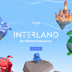
10 Websites Using Brightly Colored Web Design

https://www.thredup.com/ Thred Up uses a lot of bright colors. The colorful layout gives this website a bright, upbeat, happy vibe. The colors are bright, but not over the top. I liked how they used several colors that blended together nicely. 2. www.abcya.com ABCYa used a variety of bright colors. The website […]
10 Fabulous Examples of Retro Webdesign

www.woosterhound.com I found this site, and had no idea it was for consulting services. I maybe really liked this because of the dog. The site is originally in Russian, and I used the nifty google translate in Chrome to read more about the company. When you click through services, and about company you are treated […]
10 Great Websites That Use Sketch or Handwritten Elements in a Creative Way
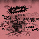
The first assignment of my Website Design class was to find a type or style of websites and then to look and find some good examples of that type. I have always been inspired by using hand-drawn elements in a digital format. I like seeing how different designers can integrate texture and depth to a […]
10 Exceptional Graphic Designer Portfolio Sites
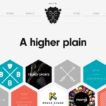
http://heathershaw.com Heather Shaw’s website features an overlay of photos on top of each project, with a block of color to provide visual consistency. The typography and block design make it very easy to navigate to view the designer’s work. This design is very appealing and makes you want to search through her web […]