10 Fabulous Examples of Retro Webdesign
Student Guest Post Author Info
Student Bio: Hali A.
Student Website: Website
Student Bio: I'm a Graphic Design Student at SLCC and I love it!
Published Date:
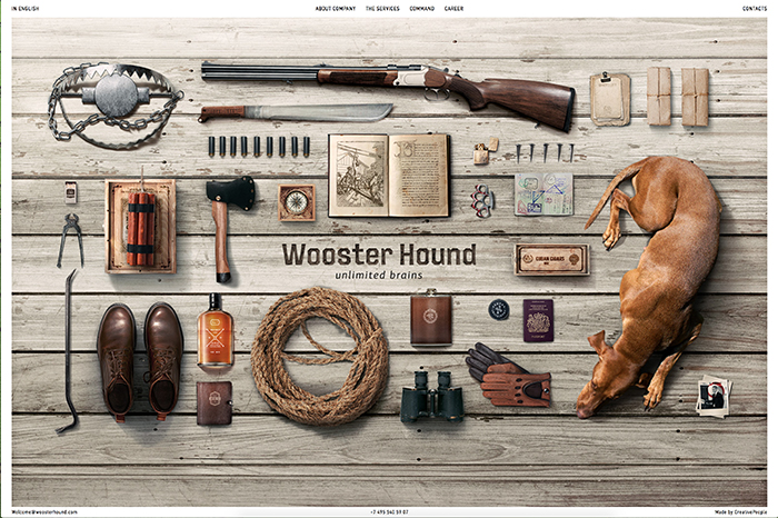
I found this site, and had no idea it was for consulting services. I maybe really liked this because of the dog. The site is originally in Russian, and I used the nifty google translate in Chrome to read more about the company. When you click through services, and about company you are treated to great vintage illustrations that remind me of an inventor’s notebook. The main page was my favorite though, because I love that it gives a vintage feel without text or illustrations. Old nails, rope, a machete, and the old book and all on a sleek looking wood floor, seems like an 1880’s man getting ready to go on a hunting expedition and he’s gotta show off his gear on Instagram.

Sometimes it’s hard to realize you are aging when something from the 80s is considered Retro. I really enjoyed this website, and when you are actually on the page, the circles (stars!) rotate around the logo. I confess I know about as much as Jon Snow when it comes to Vinylcuts, but I really applaud the look they created here. When you click on the page, it takes you to very 80s looking magazine covers which takes you to more 80s tv screen looking pages. It’s just great.
This site is simply fantastic. As you click down through the pages, you get to see wonderful illustrations and animations that make you feel as if those scientific books I’ve talked about so much have come to life. The page really only uses a couple of main colors, and it does a fabulous job of mixing simple and complex. The animations add so much to the page, and another script font really makes it feel retro throughout each page you flip through.

When I saw the option to find Retro web design, I was pretty excited. I knew I already had one off the top of my head because I worked for the company! RubySnap is all about being Retro – the days of yesteryear. In the shop, they use Pinup girl pictures paired with names for their cookies. You can see this on their menu that I linked, with the first cookie on the list: Audrey. Also, the background pattern sings retro to me, with the awesome fonts, and simple illustrations.
This is another site that did a fabulous job of sneaking in animations with their retro illustrations, that it really brings the page to life. The site as a whole does not have a lot to it, and I really like that about it. It says everything it needs to without having too much information or pages. The illustrations in this one are what really give it the retro feel for me. I really like the logo as well, it reminds me of a sigil that would be pressed into hot wax on a letter.
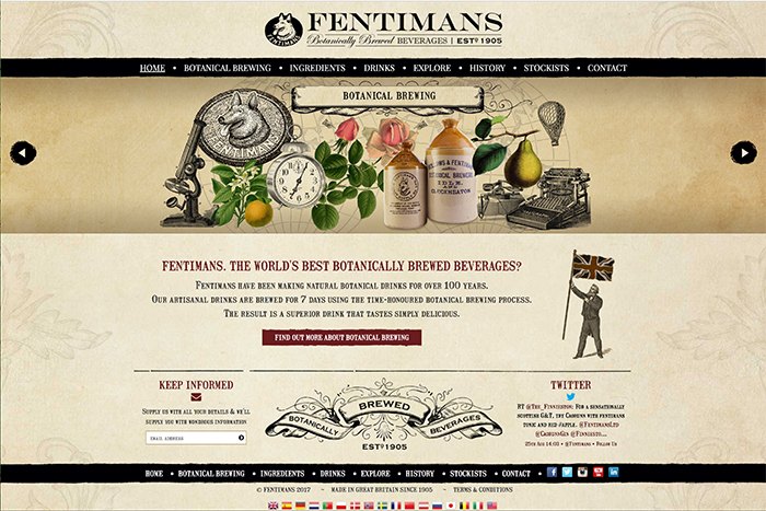
I found that a lot of food and drink companies have a very retro feel, so you’ll end up seeing a lot of those on my list. That’s okay though, because all of it looks so deliciously delightful. I love the branding for this drink company. From the font, to the fantastic decorative banner “Botanically Brewed Beverages” this site sings retro. I also really like that in one of the rotating images they chose to do a photograph of some vintage Fentiman’s bottles. Thumbs up.
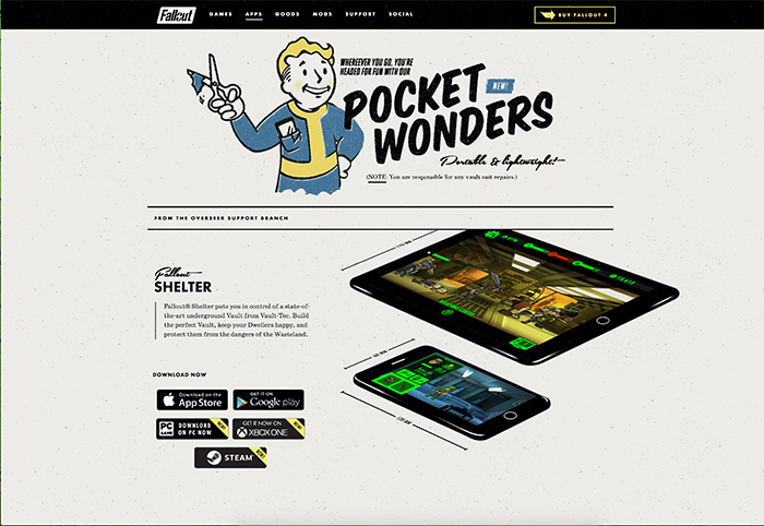
I couldn’t pass up the chance to throw in a video game website in, and what better website than the one for Fallout 4. The game itself is packed full of retro goodness since it takes place after a 1950’s fallout, and the website also offers its fair share of awesome examples of retro web design. The apps page was my favorite, because I love the mix of fonts, and how the script font reminds me of a retro Airline logo or camper trailer.

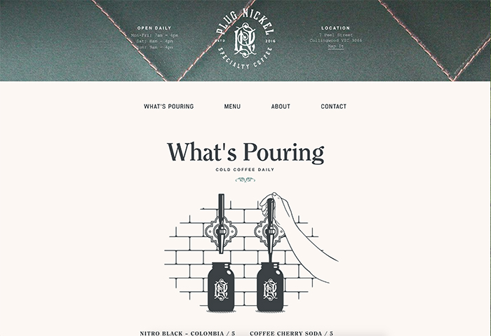
This site is a lot like the Plug Nickle coffee site, in that it’s really simple, but gives all the information you need in one page. A lot of these sites reminded me of what the owner of RubySnap always said to me about her cookies “They are supposed to remind you of simpler times!”. While I don’t necessarily think the 50s were simpler, the branding from the time popped without being too much like Victorian ads often were. The fonts and colors for all of these sites are what really stood out to me and gave me a retro feel.
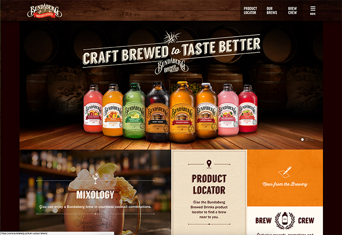
Let’s get back to drinks and treats, shall we? Skip the introduction and go straight to the main page. I love the mix of retro and modern on this page. The great fonts used that carry that vintage feel, but also the clickable boxes that remind me of what a lot of websites are doing these days. I think Bundaberg did an excellent job combining the two, and I love the mix of fonts they used. I especially like the wood grain banner at the top of the page, makes it feel like I’m in an old bar (even though I’m sitting in my bedroom at my desk).
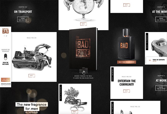
This site is awesome. The DeLorean takes the cake for me, but also the fact that is almost looks like an uber vintage scientific bird or animal book. The page is super interactive, with each of the boxes being clickable. I don’t think I’ll ever wear the man’s fragrance Bad, but I can still appreciate the work they put into this website.