https://www.magicleap.com I thought this was a great example of negative space. Magic Leap was not afraid to use negative space in their design and it worked for them. As you scroll down the bubbles pop up with little descriptions to the side, this is a repeated design throughout which is nice and simple. Negative space […]
www.Tesla.com It’s a simple site, but they utilized the expansion of the photo across the entire page and it’s clearly focused on the Tesla model with the blurred background. The red color car pops well and is the first thing you look at and I like the soft, muted blues and grays in the background. […]
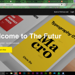
1. http://www.entreprenörsgatan.se/ I don’t actually know the name of this company or what their service is, but they use animated typography on top of video. The text on the screen is eye-catching and leads your eyes across the page. 2. https://www.thefutur.com/ The Futur is a tutorials, demos, and critiques of a variety of graphic design […]
http://www.marleighculver.com/ This designer used simplicity when designing her website. This makes her portfolio website easy to navigate and easily draws you in. Her work is easy to see and find and her simple about page is also easy to find. I felt as though the simplicity of this site kept me focused on the designer […]
– Wonder Sauce – Wonder Sauce (http://www.wondersauce.com) excels in the minimalism style with a sophisticated home page, contrast colors (grey/white) and a clean typeface choice. The background is attracts the viewer attention because of its content – short videos showing the office and moments of a work day. Lastly, simple geometric elements such as the two buttons below […]
Square Enix (North America version) https://na.square-enix.com/us/home Square Enix’s homepage uses a very great deal of white space to help accentuate their updates, advertisements, and any of their beautiful images they have on the page. They make it quite obvious which of their subjects they want their viewers to notice (bigger than life image slider) […]
This is my review of ten sites that I felt made good use of photography. I am also choosing to review sites that are related to other things I am in the process of researching before either purchasing or contacting for additional information. My first step in doing this research was to search the phrase […]
https://hornhunterpacks.com/ Horn Hunters use color to catch the eye. They use yellow and brown/black color to use some contrast. On the home page they have a slide thing that changes, and each one still catches the eye from being bright and having contrast. 2. https://sophuntinggear.com/ SOP hunting gear also uses color usage in web design. However, […]
www.http://fillet.com.br Fillet’s website does a great job of using many different colors. They are all vibrant and pleasant to the eye. www.http://goodrich.com Adi Goodrich uses a colorful backdrop as well as colorful photos. The photos are eye catching and interesting to look at. […]