10 Great Websites That Use Sketch or Handwritten Elements in a Creative Way
Student Guest Post Author Info
Student Bio: Meredith Entrikin
Student Website: Website
Student Bio:
Published Date:
The first assignment of my Website Design class was to find a type or style of websites and then to look and find some good examples of that type. I have always been inspired by using hand-drawn elements in a digital format. I like seeing how different designers can integrate texture and depth to a flat image to create something that feels like more traditional art forms. I decided to use that inspiration to find 10 websites that utilizes these hand-drawn elements to create a unique and interesting designs.

This company’s slogan is “Stand out” and I think that the use of hand drawn elements with traditional photography effective conveys how this company is willing to step outside of the box, or willing to design in an original way. The octopus tentacle theme continues throughout the page, popping up on numerous additional images, creating this random and unexpected element to otherwise standard images.

What I liked about this site is the use of a dark background. Many of these styled websites often has a light background that either mimics paper or some kind of canvas. I like that this one uses a chalk like background which shows that this design style can be used with a wide variety of color schemes. The use of the photography is also very well integrated into the design, so that they add to this kind of hand drawn style instead of subtracting from it.

Some of the other pages used handwritten fonts in a way that created a soft, and even frilly feeling to the pages. I liked that this page uses the handwritten font to create a sense of intensity and edginess. It shows that this creative concept does not have to regulated to just feminine based marketing. This design helps to give an immediate sense of the type of event this site is created for largely through the use of the font.

I tried to find websites that used this type of design that were NOT for designers or artists, but I really liked this website. I liked the use of this artists illustrations above each of the topics and links that she has on her website. I also like how her logo is very reminiscent of a signature an artist would use to sign their artwork. But despite the use of the sketch elements, I felt that the rest of the page was designed very simply and in a complementary way, so that the drawings and logo stick out in the viewers mind.
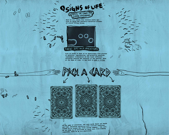

This website is one of my favorites. I like how the handwritten font is different for each link and the sketch style of the site feels very organic. I feel like the website was designed as whole piece and created from the ground up, instead of just adding some sketch elements to typical website layout. There are no obvious buttons or links, instead everything looks simply like an artist’s doodle page.
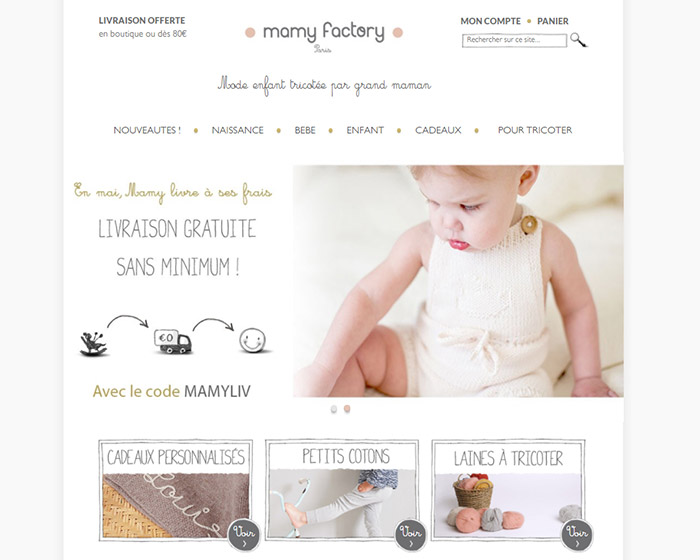
This website includes two hand written font styles. I found quite a few other pages with similar elements, but what I feel like really adds the hand drawn element to this website is the use of imperfect lines around the search box and the other links below the banner. It creates a unique feel to the website and really makes it feel like it was specifically a design that was created for this website and not a generic template.
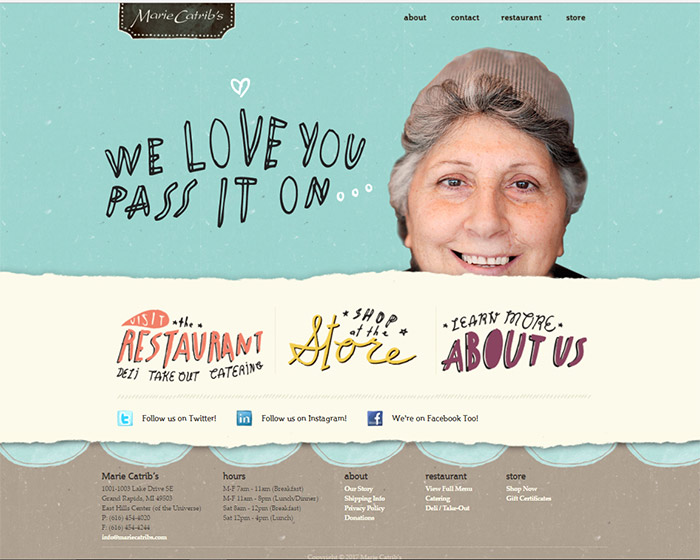
I really like the blend of both the font style and navigation bar that has rough edges. It creates a feeling of whimsy that is hopefully carried over into the restaurant as well. The color scheme adds to this feeling of lightheartedness with the pale turquoise as the primary color and the accents of the light beige and brown at the bottom.

This site utilizes a more sketch style in its images, but allows the font to stay more traditional so the focus can remain on the drawings. I like how the use of the images add a fun element to something that might be considered a little boring or uninteresting. This website is obviously created for individuals who have knowledge of technical jargon, so even though describing this business’ services might be boring, the design choice creates a more exciting layout for this topic.
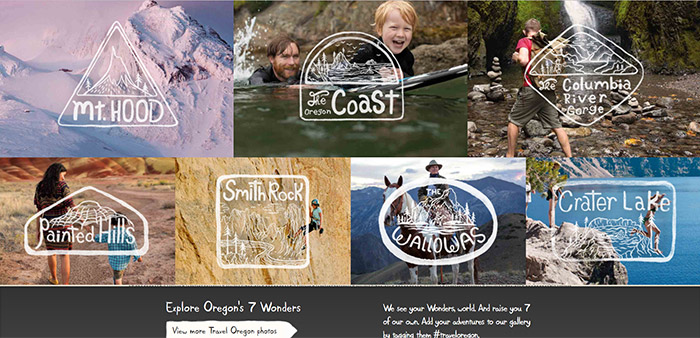

This site had some of my favorite uses of hand written fonts and sketch style. I like it so much, I had to take two screenshots. What I really like about this page is I get the feeling that each use icon and font was specifically created for this page. I really feel like this design effectively shows the unique characteristics of the culture of Oregon. A page with similar photos but with a more traditional font would add more focus on the photos, creating a more majestic feeling, but at the cost of the unique, quirky feeling that I think really expresses a more accurate experience of Oregon.
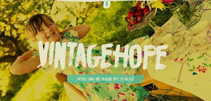
I like how this website used a filter and the font to add to the feeling of “Vintage” in the design. This website continues the use of this font throughout the website including in the large bodies of text, which is a nice change. Many of the websites would only have a unique font for the banner, but then use a more traditional font for a majority of the text. With this design choice, I feel it adds that vintage feeling through the whole page instead of at just the banner.