Author Websites with Good “Curb Appeal” and User-friendly Navigation
Student Guest Post Author Info
Student Bio: Cindy C Bennett
Student Website: Website
Student Bio: Cindy C Bennett is a YA author who writes contemporary YA, though she has a few books which dip a tiny toe into paranormal, fantasy, and sci-fi. She's mom of two boys, two girls, and two great daughters-in-law and a son-in-law who she adores. She has two adorable grandbabies, with another on the way, who make her grateful she didn't kill her sons when they were teens (haha). She lives in Utah, has her whole life, and can't imagine living anywhere else.
Published Date:
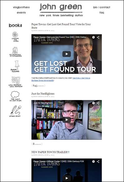
John Green http://johngreenbooks.com/
I like the clean look of this site. The simply drawn icons that are black and white feel simple and interesting to me, and take you to a new page about the book or subject. I like that each article is actually a video, and that there are few navigational tools at the top, which are easy to see.
Nicholas Sparks http://nicholassparks.com/
This is a bit difficult to see because I had to zoom out to capture the whole screen, but I wanted the whole thing to show what I do like. I really like that the most often used buttons are across the top, as well as all of his social media buttons which are readily available without searching. His background is a book, and even all of his buttons are page-like. At the bottom are more large buttons and quite a few small links which make everything easy to find without having to search much. A lot of info and yet still looks clean and not overcrowded. My favorite thing is that no matter how far down the page you scroll, those top buttons stay on the screen.
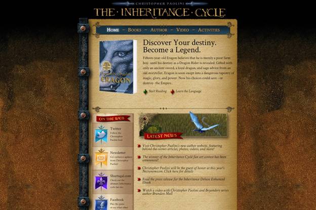
Christopher Paolini http://www.alagaesia.com/index.php
I searched his site out hoping it would be cool because he’s so young. It didn’t disappoint. The site feels like his books (which is the best way I can think to describe it). He has a cool “shiny” thing that runs across his header. His social media links all are custom made to look like flags. His background has the feel of an old book or old paper. Again, it’s fairly simple and not cluttered, and yet feels interesting and interactive.
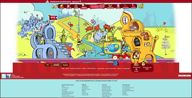
Seuss http://www.seussville.com/
This is probably one of my favorites in my search because it looks exactly as you would imagine it should. It’s fun, colorful, very interactive, easily navigable, when you hover over the buttons they shake (so cool!), almost everything on the home page is a link to somewhere else. I love that it fits on my screen and I don’t have to scroll down at all to find anything. In fact, that may be my favorite thing about it because nothing is lost or missed by the viewer since it’s all seen as soon as you open the site.
Jodi Picoult http://www.jodipicoult.com/
The reason I like this site is because it’s very smartly done. By that, I mean that she has put her name large and clear at the top, with her social media links directly below, and she has several pictures of both herself and her books on the page. Most people buy books by recognizing either the author name or the book cover. It’s easy to navigate, and has multiple places on the home page to find the same things, so if you can’t find one of them, you’ll likely see the other. It is just a little busy for my taste, and even zooming down to 25% I couldn’t get the whole site on my screen, but otherwise good.

Danielle Steele http://daniellesteel.com/
There’s actually only one reason I chose this site. Overall I think it’s rather boring and doesn’t have very interesting links, and I probably wouldn’t hang around this site long even if I did read her books, but the one thing that I loved is that there is a calendar on the home page to easily find the last post written by the author. The date is highlighted with a different color. It’s sort of hard to tell since apparently she only posts about once a month, but I just thought it was such an interesting feature.

R.L. Stine http://rlstine.com/bookshelf/#top
The image below is not his home page but the page I liked best which is his bookshelf. I love that it’s an actual bookshelf that you click on the cover to read about the book. He has a very interactive home page as well, and again, it looks exactly how you’d imagine his website to look. It did have a pop-up on the home page which is both good and bad. Bad because they can be annoying, but good because they’re very effective.

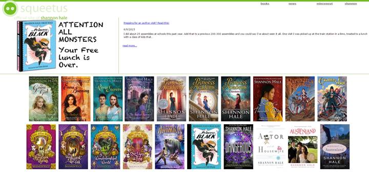
Shannon Hale http://www.squeetus.com/stage/main.html
This is another one that appeals to my sense of less-is-more. Pretty basic, but it has very easy navigational tools with dropdown menus. All her books are easy to find since their covers are right there on the main page, as well as being on the dropdown on the top right. Easy to follow the logic of the layout. One thing I didn’t like was not being able to find any social media buttons, and in today’s world, I think people, especially fans, want to stalk someone easily online, so that’s a bit of a negative.
Anita Shreve http://www.anitashreve.com/
The thing I liked about this site is that you always stayed on the home page. Whichever button you chose the content came up on the same screen and it felt smooth and seamless. I think her background is appealing (because who doesn’t want to be on a beach looking at this view?) and each of her “pages” kept that same feeling.

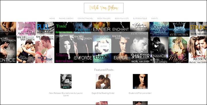
Rachel Van Dyken http://rachelvandykenauthor.com/
I thought this was a cool site because as you scrolled down on the welcome page, the background was shown in little splits in the solid screen. It was simple to navigate and find your way around, good dropdown menus, and had all the info I can imagine you’d need from an author.