10 White Space Websites
Student Guest Post Author Info
Student Bio: Nikol M
Student Website: Website
Student Bio: I'm a student at Salt Lake Community College studying web design.
Published Date:
www.gavingough.com
White spaced is used to present a balanced and harmonious website. The content is simple and clean. The white space frames the area of focus: photography.

www.mettaskincare.com
The title of this site is Metta Natural. Here white space is used in to highlight the natural ingredients of the product. It is also used in the spacing of menu choices and conveys a calm, clean mood.

fiordilattegelato.com
Double the white space? Sort of. White space is again used to highlight product and simplify menu choices. The white space between menu choices allows choices to be read more easily. In the product highlight photos it is also used to really emphasize the subject. White space in photography has another name, but serves the same purpose.

brownscourt.com
This is an example of another non-white white space site. This site is using white space as a background to visually simplify the menu choices and also as a frame around the content. The design is clean and visually comforting.

www.windowsofnewyork.com
Proof that white space doesn’t have to be “white”. This is a very simple site, with very simple information. The use of white space allows the focus to remain on the subject. The minimal design makes the navigation simple.

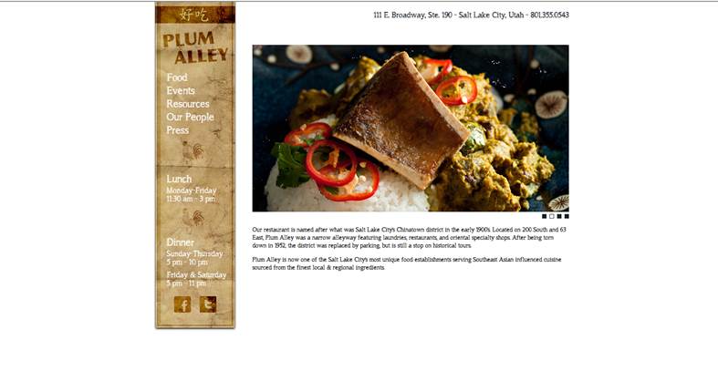
www.plumalley.com
They want your focus to be the amazing food they feature prominently. The use of framing with white space makes that the primary focus while the restaurant details are minimal but easily accessible while not taking away from the photos.
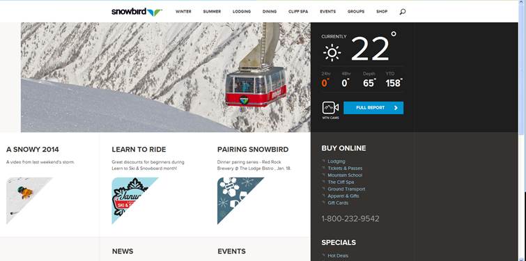
www.snowbird.com
On this website there is a lot of information present. The brand is minimized in scale to leave room for the information they want you to know. All of this information could look cluttered without the use of white space to open up the content. White space is used to break up information on the page but also to balance and harmonize the visual effect of so much information.
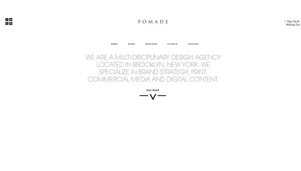
www.pomade.tv/pomade
Pomade takes advantage of white space in order to draw attention to the main purpose of the page. The size, scale and color of the logo immediately draw a viewer’s attention and keep it there.
smittenkitchen.com
The white space on this page assures that the focus will be on the beautiful food photos. It is also used to divide the information for easy reading in smaller chunks.

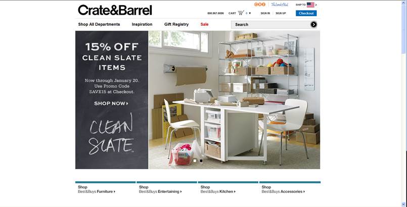
www.crateandbarrel.com
The use of white space on this page allows for product to be the main focus. General information is neat and presented in a contrasting black. This palette allows for the use of other brighter colors to draw attention to important marketing details.