10 User Interactive Website Designs
Student Guest Post Author Info
Student Bio: Jessica Lambert
Student Website: Website
Student Bio:
Published Date:
1) SCROLL FOR YOUR HEALTH – http://shibui.me/web/scroll/index.html#orange

While not quite as USER interactive as some on my list the design and flow of this particular parallax site stood out and was honestly my favorite. The pages are designated, as usual, with a simple, user-friendly, easy to use navigation menu. However, much to my delight, all of the design elements float twist and break creating a unique and fun to scroll transitional page effect. With each page change I had full scroll control allowing interactive navigation through the dance like page transitions between each particular fruit, also directly maneuverable by the colored links at the left. I found myself quite mesmerized by their stunning use of simple design shapes and bright compliment of colors. These elements combined created an incredibly bold WOW factor while efficiently retaining an overall simplicity.
2) ENERGY TRUST OF OREGON – http://energytrust.org/timeline/
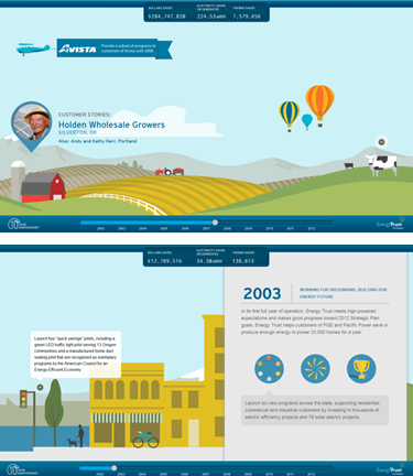 Beautifully cohesive, the user’s visual interaction is a treat! The layers move separately as you move along the linear timeline. They really kept the details in mind with this one! Each frame seems to have something in motion keeping the user present and engaged.
As you click and drag or move using of the bottom slider through the natural, time-based progression you are presented with picture boxes that offer pop-up style stories and comment boxes winking their little plus icons at you.
Breaking up the simplistic scenery are benchmarks with short descriptions of milestones and usually some mouse-over elements to playfully present the enormous amount of information this page was designed to convey.
The widget at the top is an extremely clever design device that creates a fun, fluid, progressive dollar amount that really makes a statement by the end of the presentation without coming across as a heavily pushed and overly repeated propaganda point.
Even the obligatory information was well-placed and not an overbearing element really stepping back and allowing the user to experience the information in an incredibly powerful format.
3) PORSCHE EVOLUTION – http://porschevolution.com/
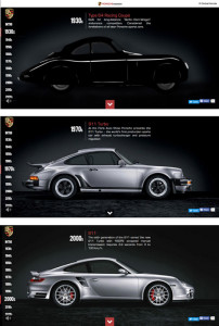
Porsche Evolution creates an almost a flipchart effect by keeping their car in the exact same spot but showing the different iterations through the timeline. The lefthand, vertical timeline can also be utilized to jump to a desired year, circumventing the years between. The information is clean and short but engaging.
One thing that sets this site somewhat apart by using a form of user engagement few others take advantage of; audio. The music, while using the same song, is creatively stylized to match the corresponding era. This design pairing accents the car on display and creates a happy, nostalgic effect.
Now, we all dislike pages that have a loud, auto-playing background song or obtrusive noises, this is NOT one of those sites. Plus the thoughtfully made and easy to find mute option is highly appreciated for those of us browsing from sound inappropriate locations.
4) NATHAN RILEY – http://www.nrly.co/
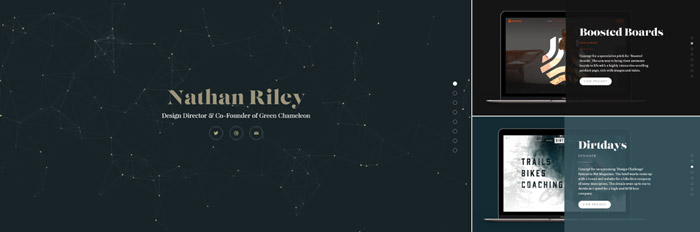 In much the same vein as Porsche Evolution, Nathan Riley uses a similar “still” frame quality to the vertical scroll design of his portfolio. Moving various layers over a seemingly static laptop graphic, changing the color, graphics and information in a “Blinds” meets “Swipe” style motion.
Nicely done but not groundbreaking. What I really, really loved about the site was actually the “Live”, animated, interactive vector-based background on the landing page. Reminiscent of astronomical star charts slowly floating and changing, you can click to create additional anchor points and connection lines between the existing points. Played with it for at least 5 minutes… each time I pulled it up. COOL!
5) BOND MEDIA – http://www.bondmedia.co.uk/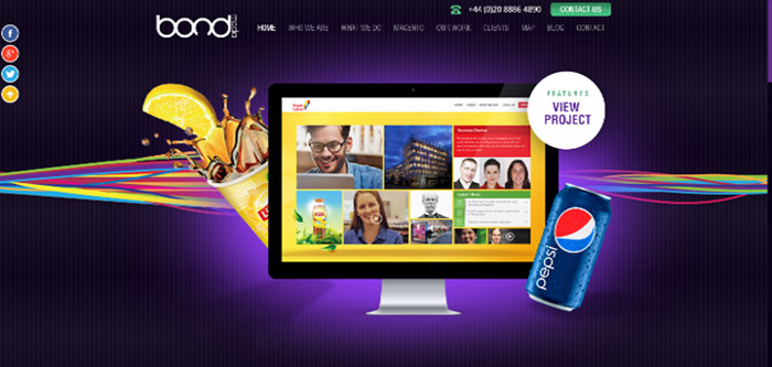
This fabulous site took uses a full-width design with horizontal scrolling elements on their vertical scrolling single, long page design. Utilizing a static page with moving elements they started with the top slider shown above – navigated by arrows or the circular purple icons below – each when hovered-over revealed the title for the flipside’s icon. Each display “splat” was also interactive with several examples to cycle through by mouse click. Each object floated above the background and enter/exit in all directions.

Continuing down the page the text was refreshed with alternate phrases where the text gets dark purple, catching your eye. For a recent work showcase they again went with a lateral movement using cube pictures in a slide, showing three at a time with navigation arrows and more details on mouse over. Between recent work and the next horizontal sliding section they break up the motion neatly with a paneled information section. I cannot help but note the exceptional attention to detail in the icon choices – the scrolling service detail. section included. The custom purple icons however are my favorite as most have a subtle animation to them making them enchanting to watch and keeping the viewer’s attention.
6) JACKSONVILLE ARTWALK – http://jacksonvilleartwalk.com/
 Jacksonville Artwalk uses another fun, vertical parallax design. Contrary to the previous designs focusing on a subject that doesn’t seem to move on this site utilizes more of an elastic, layered effect. The content and background layers scroll at syncopated speeds while the semi-transparent header and footer keep quick navigational elements close by. They implement a mix of artistic-funky elements with clean text and simple icon driven elements really engaging the user’s interaction.
7) LAKE NONA – http://learnlakenona.com/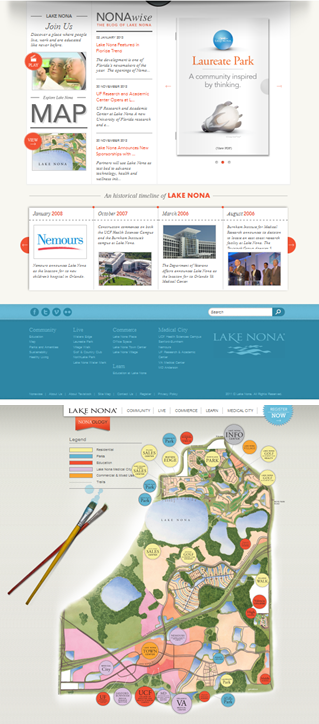
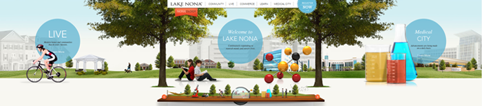
There for a bit sliders were all the rage – some manage well enough, leaving you feeling only slightly jerked around, while others are downright terrible and you aren’t sure which way is up! Then there are those rare sites that just GET IT – this is one of those sites. The topper is beautifully detailed with free floating elements, clickable text bubbles for additional info and bright icons contrasted by clean white space with an ingenious spyglass bird’s eye navigation piece at the bottom.
The lower content layout is simple and clean offering bite-sized bits of information and even a video clip that pop out with a nice surrounding dim for ease of focus (below). A three page widget keeps things in motion with a slow rotation. What a treat however when I happened to browse deeper into the site and came upon the well-crafted, colorful map! This site sets quite a high standard and I have to admit was my overwhelming favorite!
8) NASA PROSPECT – http://nasaprospect.com/
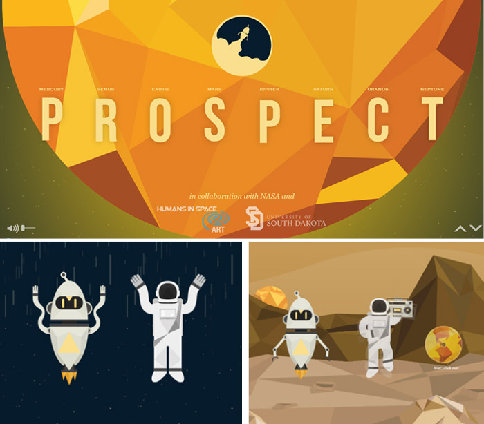 This science-based website is a very engaging and I can see how children would appreciate how interactive it is for them.
This scrolling design creates a visual story with the changing imagery accented by comic-book style blurbs with clickable elements that expand that not only progress the inherent story but keep the user engaged through constant control and motion.
While the page transitions are fairly blocky and not the normal fluid transitions we normally associate with “animation” but they paired it with clean, simplistic design elements balancing it out via congruency.
9) LOST WORLDS FAIR – ATLANTIS – http://lostworldsfairs.com/atlantis/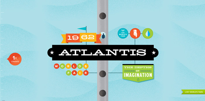
Setup as an educational website this fictitious “World Fair” is another educational type sight. They use a single page scrolling design that follows you down to lost city of Atlantis with road-trip style signs passing to incorporate the text and information.
The user controls the animation via the scroll. The design elements are rather static and do not try to create a 3D style animation, however with the retro feel of the theme this is actually a better design choice than the alternative.
The Depth meter helps you to keep track of “where” you are and the falling guy in the tube are the only non-static elements. I think they could have added a few more clickable elements to expand the content.
10) DOMINOS – https://www.dominos.com
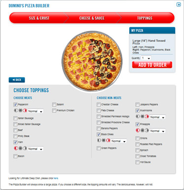 Silly as it sounds, one of the first websites that came to mind when I was thinking of user interaction was the newly redesigned Domino’s Pizza website. Not only have they added user reviews and a rating system for their products but they have taken things quite a bit further by adding some very unique elements. Food is definitely an area where people get finicky and quite upset when their requests (or demands) are not met to perfection. The pizza builder interface they have created is graphically driven and gives a preview of just how your pizza will look, what will be on it and where – especially great for “halfsies”. Everything is up to the user and supplied by a familiar, user friendly set of options; topping checkboxes, pizza portion icons and amount dropdown boxes.
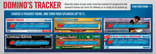
My other favorite feature is the One and Only Dominos Tracker! This feature offers real time communication about my order and its subsequent delivery. Having worked in fast food I understand the mechanics behind it and frown at some of the criticisms it has been given – I love it! It removes the guesswork and often reminds me just in time for delivery. Not only does it save ME time but the driver as well! They went a step beyond by adding employee name personalization for each process step (accountability!) and tracker themes for customization. We love the Metal Theme and are very ready to rock when our food arrives.