10 Interesting Animated Websites
Student Guest Post Author Info
Student Bio: NicoleT
Student Website: Website
Student Bio:
Published Date:
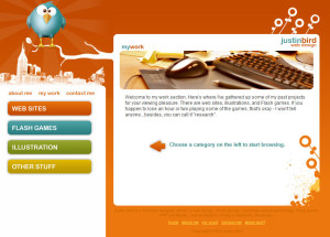
Justinbird.com is a great example of how a website can be enhanced by some well-placed simple animation. The website is very eye-catching because of the great color scheme, but the animations put it over the top. As you explore the site the bird watches over everything, occasionally blinking. For me this subtle animation adds life to the site. As you mouse over the about me, my work, and contact options a twitchy little pointer bounces out. Mousing over the bird causes him to fly up off the branch flapping madly, leaving the branch bouncing in a twitchy manner that complements the bouncy pointer. The animations all work well together and complement each other.
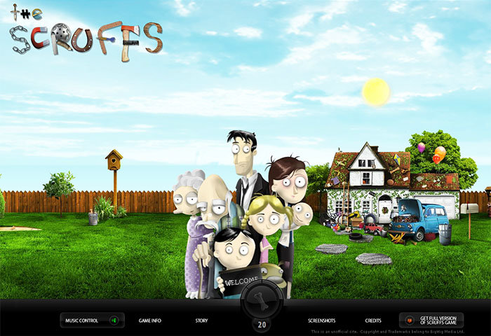
The highly animated website uses multiple types of animation to promote The Scruffs game. Moving the mouse around the screen triggers a nice parallax effect that gives the site a 3-dimensional feel. There are also many animations triggered by hovering over objects and still others triggered by clicking on various objects. The most intriguing aspect of this site for me is the animated favicon.

This website has it all, cool scrolling parallax effect, a portfolio gallery that seems to respond to your touch, and hover spacecraft. The graphics are super cute and beyond the landing page the site design is clean and crisp. A very cool feature here is the menu bar, when you have scrolled down past where the menu bar is visible it will reappear when you mouse towards the top of the screen as if it is anticipating that you are looking for it.

http://graphicnovel-hybrid4.peugeot.com/start.html
To promote their Hybrid4 technology on the web, Peugeot features a graphic novel depicting an adventure where various modes of transport must be used. The site uses parallax scrolling to create the animation. You can either select autoplay to watch the whole story, or scrub through to explore it at your own pace. I especially liked the parallax effects on the highway scene, which I found to be more dramatic when I manually scrolled through it.

This website for a French studio uses parallax scrolling and mouse over transitions to animate their website. At the top of the website various colored blocks spin to create a pinwheel effect that highlights their services. These blocks beg to be clicked by increasing size as you mouse over them. As you scroll further down the page their gallery of work flies in from the sides of the screen. These animations can be activated by scrolling or clicking the menu for the various sections at the top of the page.

http://lostworldsfairs.com/atlantis/
Take a journey 20,000 leagues beneath the sea with this website that utilizes parallax scrolling. Simple charming illustrations and clever jokes and factoids amuse as you scroll deeper and deeper down to ocean floor. The only thing that would make this site better would be some Easter eggs to click on.
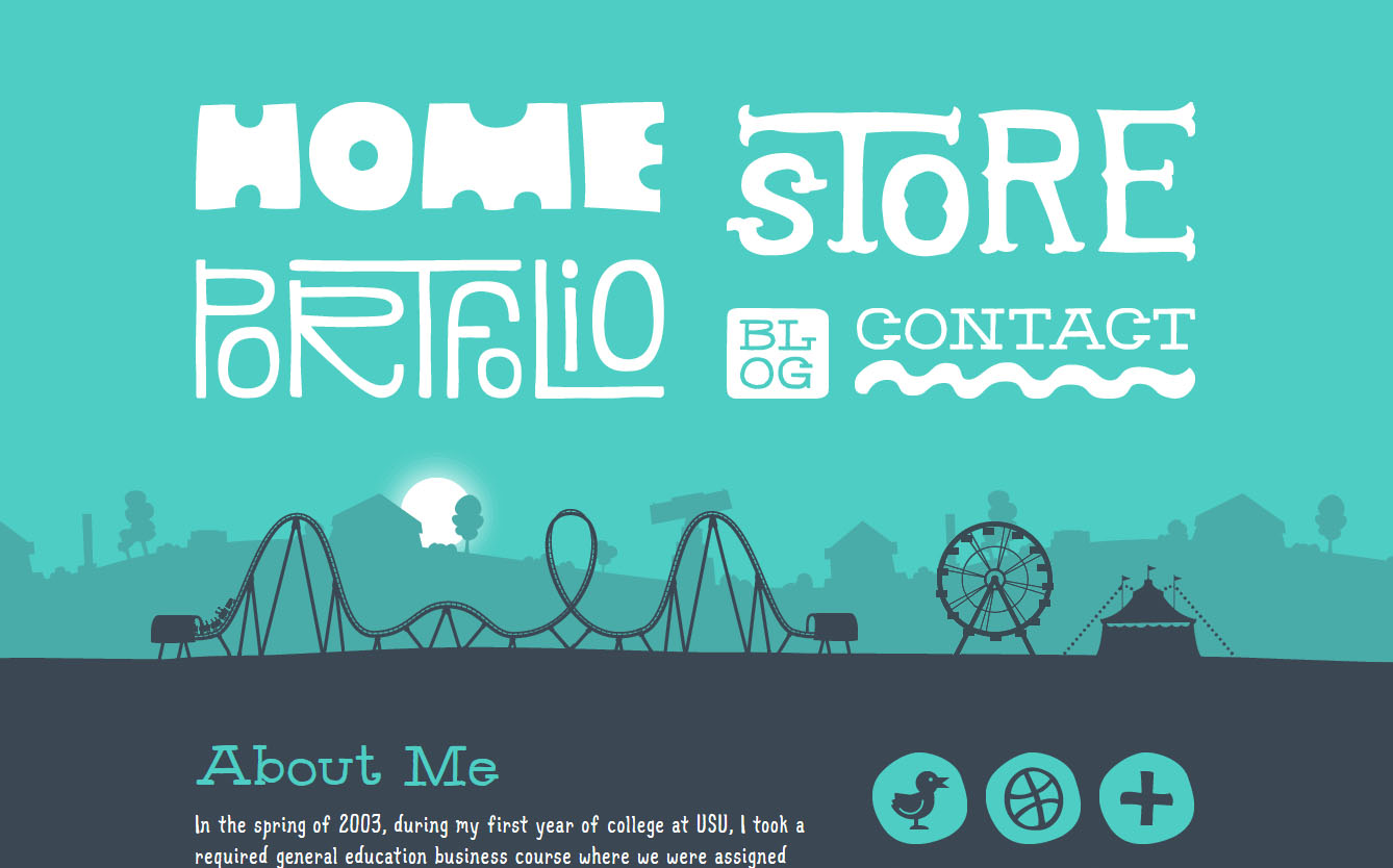
This website for Utah designer Denise Chandler utilizes a simple animation to add interest to the website. The looped animation keeps the Ferris wheel spinning while the roller coaster runs its course over and over again. In addition a subtle parallax scrolling effect adds further dimension as you scroll down the page. This is a good example of how a simple animation can ass life to a website.

http://www.pncchristmaspriceindex.com
PNC financial group goes to the effort every year of calculating the cost of the gifts from the Twelve Days of Christmas. 2013 was the 30th year they have published this price index. To celebrate the 30th anniversary they created an interactive workshop where you can customize the twelve gifts. They utilize whimsical animation to accompany this building process which adds fun and interest and brings this economic information to life.

http://makeyourmoneymatter.org/
This website demonstrates the difference between banks and credit unions when it comes to how they handle your money. Parallax scrolling takes you on the journey your money follows through the big banks, and then builds up a homespun town with the credit union money. The best idea I take away from this website is the scroll down arrow that reappears if you stop before you reach the end of the “show.” I also loved the animated pre-loader.
http://blacknegative.com/#!/loader/
Wow, this is such a dynamic site! Parallax scrolling moves you through the more than a dozen main screens that make up this site. Each main screen features a different project from this design group. Each main screen also uses different animations.