10 Great Sites using Contrast in Web Design
Student Guest Post Author Info
Student Bio: Delmy Fuentes
Student Website: Website
Student Bio: SLCC student studying for Graphic Arts-Illustration major.
Published Date:
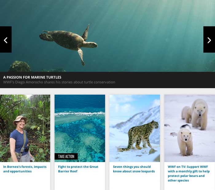
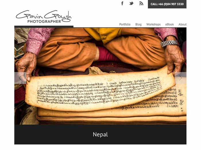
WorldWillife is a example of size contrast on a website, it draws the attention to the large turtle photograph to catch the eye of the viewer.

I like this website enzolivolti.com , the way contrast has been applied on type size, different fonts and colors too. Simple and clean. Looks very open and easy to scroll down the page.
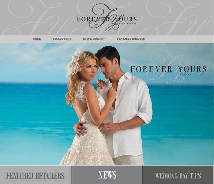
The turquoise color of the ocean and the contrast of the couple attire cached my eye, I like the way the page is layout, and headline in different font and in the background also makes a good contrast.

This site has an alignment of all elements. The type has been organize to the left and to the right. Also contrast on type size and color.
A totally different approach when it comes to contrast in this webpage. The relationship between the design elements and the layout communicate visually the purpose of the webpage to invite people to surf their page.

With elements of different sizes: rectangular, circles, small and medium sizes reflect a contrast that can pops up in this website.
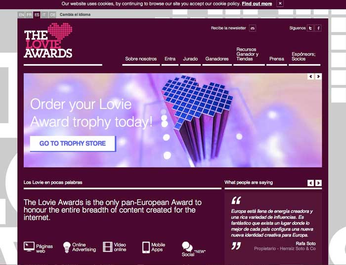
The color schemes they use create contrast between the blue heart, the white type and the white box and purple reverse type. Also the body content is a predominant element all over the website.
I like how this website is presented on the web, the vivid color on the photographs represent and excellent contrast that gives the viewer a desire to keep looking at the photos. I enjoyed browsing this website.
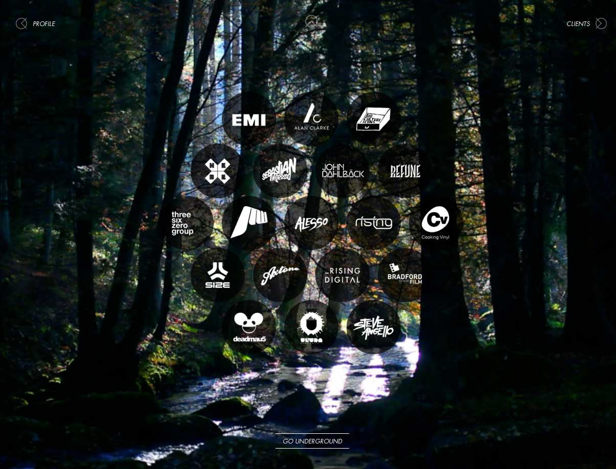
I like this website as I was surfing it the animation of water flowing was cool, the circle of those elements in the middle of the webpage creates a positional contrast. Also the darkness of the edges and the focal point in the middle makes an awesome contrast.
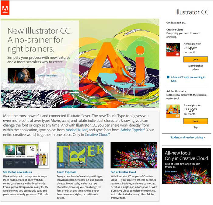
Adobe website shows color contrast, alignment of all elements, darkness and lightness shows
all over the design of the webpage.