10 Great Samples of Creative Minimalist Websites
Student Guest Post Author Info
Student Bio: Mikaela Smith
Student Website: Website
Student Bio: I am an artist, a designer, a techie and a geek and I thrive on creating designs that change everyday interactions into beautiful experiences. I love technology, loud rock music, riding a motorcycle and I have a black belt in Googling and Kenpo. Despite my black thumb, I love plants and I hope someday to build a computer from scratch. Secretly, I dream about becoming a ninja hacker with killer design and on-point houseplants.
Published Date:
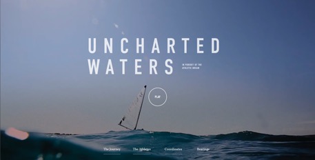
Uncharted Waters
http://uncharted.sunbrella.com
This website is an excellent example of minimalism in web design. I particularly liked the clever use of video throughout the site. It adds a lot of visual information and interest to the site while maintaining a very streamlined and uncluttered page. The site is easy to navigate and very effectively uses a white, grey and black color palette to create contrast and help guide the user through the site and highlight current location. The sites color palette choice makes content the star of this site and allows the viewer to be immersed in the experience without distraction.

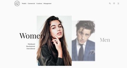
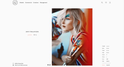
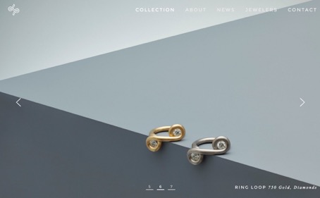
62 Models
This website uses a limited color palette and uses some very creative methods to allow there to be a minimal amount of information displayed at any given time. The main landing page uses animation to move the main options in and out of focus. Another nice example of minimalism is found in their gallery pages. Rather than adding clutter by listing the full name under every photo, they display the photos, first name, a simple favorite icon and oversees icon. If you’re interested, you can choose to hover over the image to get more information. The obvious focus of this site is the photos, and the small, black, sans serif font makes strong use of white space to really give the photos impact on the page.
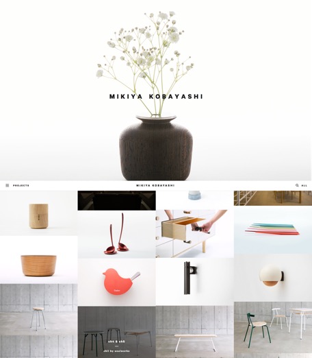
Mikiya Kobayashi
http://www.mikiyakobayashi.com
This website is a perfect example of minimalism to me. The whole interface is very reminiscent of a mobile site with just the three bar menu located at the top left. Outside of the menu, search icon, and website name, there is nothing else displayed outside of images/content. When you select the menu, it has very few links and shows your current location in the site using the strikethrough line. This website compliments the feeling of Mikiya Kobayashi’s work and helps convey his minimalist aesthetic through to users visiting his site.
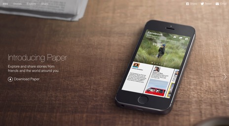
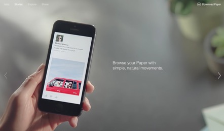
Paper
https://www.facebook.com/paper#
This website has a very minimal feel and almost no text. This site has very familiar layout for users and this makes it intuitive to use. Once again we see minimalism really succeeding due to the addition of video. This site uses video as explanations for using the app and then adds just a single sentence summary. Because there is almost nothing else to look at or interact with, the unobtrusive download button really gains importance and pushes users towards a download.
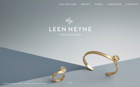
Leen Heyne
This website is another example of a site using a limited color palette. While minimal, the background designs added visual interest without complicating the design of the site. They were also used in a clever way to help display the actual merchandise. Making something both streamlined and multifunctional are very common practices in minimalism. Once again the navigation and overall feel of the site are streamlined, uncluttered and easy to navigate.
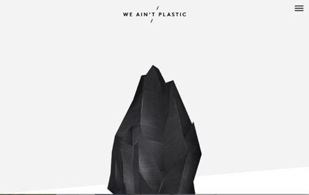
We Ain’t Plastic
This website is more “cluttered’ then my previous examples, however, the light background, and nicely spaced font still give this site the feeling of being very minimal. One nice touch on some of the pages was to make the text a light grey which made the page appear less crowded than it actually was. This site also makes strong use of white space, especially with the page headers. The also had some very nice simple graphics that also helped to draw attention to key information.
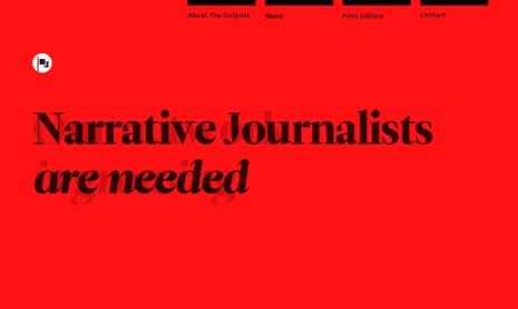
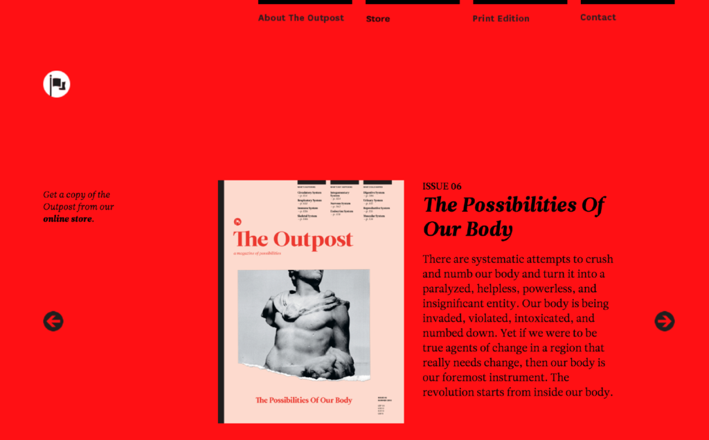
The Outpost
Unlike previous picks, this site doesn’t shy away from color use. Rather than go with the common white, black and grey color scheme, this site goes bold with a solid bright colored background set with black text. The site is clean, easy to navigate and very striking.
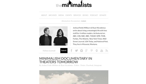
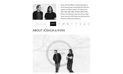
The Minimalists
http://www.theminimalists.com/
This is the website for a podcast I really like. I thought it was an interesting contrast to see this site compared to my previous choices. Content and navigation for this site are really not very minimal, however, the site appears deceptively minimal. Just by using a classic minimal color scheme, black, white and grey, along with the use of white space make a lot of content appear streamlined and easy to read.
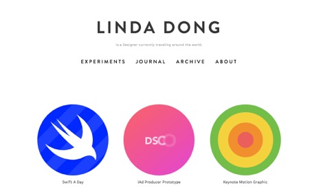
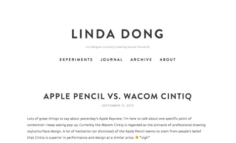
Linda Dong
This site was a fun and bright minimalist website. It made good use of a black and white color scheme, but it used bright attention-grabbing vector graphics that gave the site a fun, whimsical feel. The colored graphics were beautiful, easy to read and attractive and the site made excellent use of white space.
While I personally feel like this website has a couple too many animations, it is still a pretty minimal layout. I feel like the minimalism aspects come across particularly strong in the typography of the site. The graphics and icons are also sleek, clean and really beautiful. I really like the color choices, especially set against the alternating white and black backgrounds.
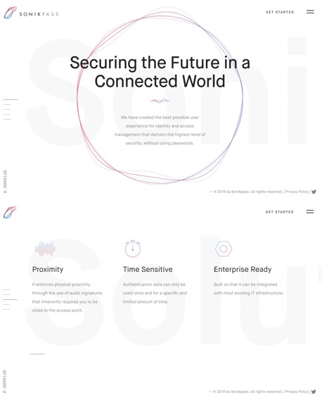
Sonikpass
https://sonikpass.com/