10 Great Examples of Sites using Responsive Design
Student Guest Post Author Info
Student Bio: Anji Sandage
Student Website: Website
Student Bio:
Published Date:
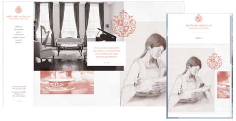
bahs.com uses responsive design with a header made up of several different images that float and resize as the window gets smaller. Once the menu bar gets to the point where it starts to wrap, it collapses down to a collapsible vertical menu instead of the horizontal menu bar, while font size remains the same. All of the most important information stays on the main page no matter what size the browser window is, and maintains a simple uncluttered design.

digitalatelier.ro has a single column design with circular image buttons in a grid for larger window sizes, but that collapse down to shorter rows and finally down to a single column the smaller the window gets, while font sizes remain the same. This allows the website to retain its fun fluid design on any device.
isabelsousa.com
isabelsousa.com uses a fluid grid format that both resizes the squares and reduces the number of columns in the layout as the window size decreases. The smallest window size reduces the grid down to a single column that the user can scroll down through the Stories in a blog type format.
isorun.com

isorun.com uses a fluid width format that has several different rows of elements all with different numbers of columns. As the window reduces in size, the columns resize and simplify while font size stays the same, until all of the rows are reduced down to a single column layout. The menu drops to a single menu button with a dropdown on mouse over.
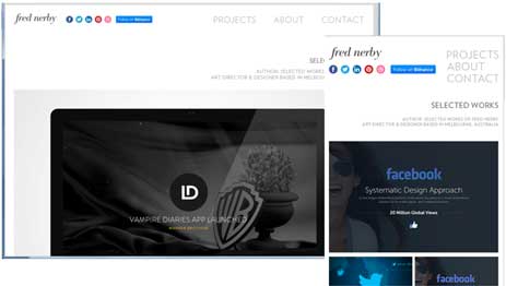
nerby.com uses a fluid width layout with several header elements that re-arrange themselves as the window size decreases. The image header resizes while fonts stay the same size as the browser window changes size, and the 5 column grid below that reduces down to two columns of images that get slightly smaller, but keep enough of their original size to provide a great user interface while retaining a slick looking design.
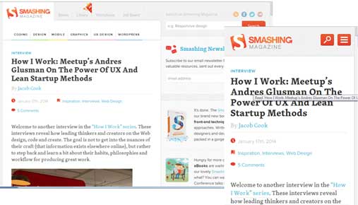
smashingmagazine.com has a fluid width two column layout that as you reduce the size of your window retains the size of the font and moves to a one column layout. In the mid size, the menu bar drops down to a vertical menu on the left side of the window, which then disappears completely at the smaller size and gives you a search button and a navigation button. The main content keeps the blog format, giving the user easy access to the magazine articles.
thepaintdrop.com

thepaintdrop.com uses a fluid width varied column layout that resizes as the window gets smaller and then changes to a single column with the menu converting to an accordion style menu that allows the design to retain the graphic elements in the menu. There is also a menu button at the top right with the header navigation menu items.
tilde.io

tilde.io uses a fluid width layout that resizes the header image and wraps the text to keep readability high while maintaining the basic layout of the page. The 3 column footer drops down to a single column and the footer menu changes from a horizontal menu to a vertical menu. The text for the most part stays the same size with the exception of the main header at the top of the page, where the text is reduced to a slightly smaller font that doesn’t sacrifice readability, since the header fonts start out a lot bigger than the rest of the page.
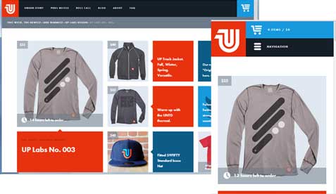
unitedpixelworkers.com
.com starts out at the largest size with a fluid width with mail large column on the left and a 5 column grid on the right. As the page narrows, the columns in the grid re-arrange themselves and move below the first box in the main column until there are two smaller columns below the main image on the left. The header menu keeps its basic layout with the store logo in the top left corner, but the menu bar collapses into a navigation button with the shopping cart moving above it for easy access to the cart.
weheartmovies.com
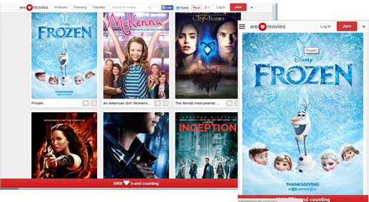
weheartmovies.com is a fluid width grid layout that changes number of columns as the window gets smaller, until at the smallest, the layout moves to a single column with a simplified menu bar at the top of the page. Items on the menu bar group into dropdown menus while the most important elements remain prominent in the header.