10 Favorite Samples of Illustrative Web Design
Student Guest Post Author Info
Student Bio: karla Vivanco
Student Website: Website
Student Bio: web Designer :)
Published Date:
Black Negative
I believe this site is pretty well build in terms of multimedia and dynamic content, however it makes this site very hard to use for the non-computer savvy user, when I was looking at the javascript code I found that is very hard to understand because is all glue together in a single .js file that originally was wrote for the jQuery library but custom code was placed at the bottom of the file, moreover the css has been programmed through an inline style. In the other hand, this site look just stunning and synchronized.

Rule of three
I do really like the single page design applied in this website, the transitions when scrolling down are smooth and syncs with the content being showed. Furthermore, the fonts and the negative space goes along with the theme of the page, another element that caught my attention was the embedded google maps widget that was also styled for this design.

BlueaCorn
The default page is very dynamic and offers some interaction within the elements, I think is a very creative way to explain to their customers what they offer and how their services are structured. In addition, the site theme is very colorful and different than the standard eCommerce site stereotype.
Denisechandler
I like how the color and theme match with the concept of this site, the breaking apart animation is simple but meaningful, moreover the rest of the site is oriented to show the owner portfolio and contact information. This site is very strong in the social media strategy.

Intacto 10 years
This site is so full of content and fancy animations, I believe it is very complex on its design and functionality, therefore it takes a while to load the page completely, even thought the entire site was created for the first tenth (10th) anniversary of their company, it looks like they have invested a lot of time and effort on this design.

Evo Energy
The animations and content are seamlessly designed to match the site concept, I love the colorful transitions and looks like their site are truly communicating the message to invite the people in UK to understand how the primary energy consumption has evolved thru the years.

Keepon Riding
This page is more like a game oriented site, at the end of the game, it displays a tile style page with a lot of social media content, inviting the people to sign up for marketing communications related with their products. I liked the game a lot, specially the color transitions when passing through their levels.
Markt
I believe this simple page site is simply gorgeous; I like the message on the beginning and the animations popping up as long as you keep scrolling down, on the very bottom of the page there is social media information about the company, this set of big font and icon really attracts my attention. Regardless of the fact that this site is only trying to get people sign up for their beta product or service, the animation is an eye candy.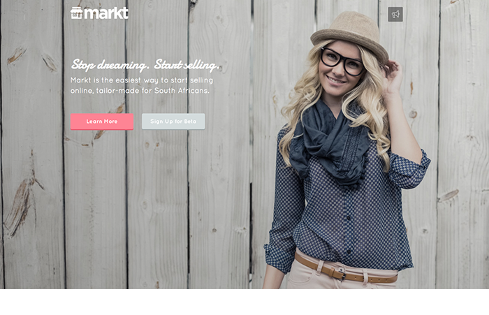
12 WAVE
I fall in love with this site, even though it takes long time to fully load, it really goes the extra mile in animation, I crave on this parallax design, color and animations that are glue together to tell a fictional story along with how they follow their business goals with every client.
Finally, I have observed the site is built with Adobe Edge, it makes me feel like it is worth to learn how to use the tool, because this site looks like perfection.

Unbox Samsung
People understand there is a common standard marketing page for a new flag phone and then you have Samsung’s new Galaxy S website, this site definitely it’s kicking it. I love the almost perfect transitions between the different steps on the page, the effects of 3D rendering for the elements make them look pretty real.