10 Exceptional Sites Using Typography in Web Design
Student Guest Post Author Info
Student Bio: Shane Porritt
Student Website: Website
Student Bio: I am a creative designer from Salt lake City, Utah and based in West Jordan, an area I have called home most of my life. I am passionate in a wide range of visual art and design, and seeks diligently to lead by inspiration, polished work ethics, and integrity to build and design the best work possible. I am a critical thinker and an exceptional problem solver, making sure that every project produced is at the highest quality. The idea of “Porritt Design Studio” came to me in 2016 with a conceptional vision, wanting and having a creative hand in almost all aspects of design & craft. I envision projects that not only delivers great design and results, but also ‘projects’ that would fit nicely in a Gallery setting. Porritt Design Studio will be a business that will have been built upon the foundation of creativity and integrity. A place of unlimited imagination. Currently, I am attending school at Salt Lake Community College finishing up my AAS in Visual Art’s with the emphasis of Graphic Design. Most recently, I have been working with Web Design using HTML, HTML5, CSS, and CSS3, all of which I have found fun, exciting, and very powerful. My passions for art and design are both shared with my lovely wife, and our two beautiful, bright, loving boys, all of whom bring complete gratitude and satisfaction in my life...Cheers
Published Date:
Daviadriansmith.com uses Typography in a very creative way that captures the viewers’ attention. The colors are vibrant and the detail in the artwork and design is well executed.

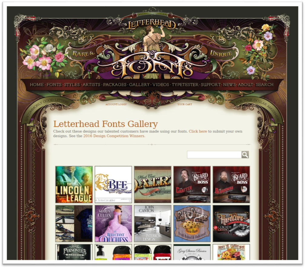
Letterheadfonts.com is surprisingly a possibility created by the same web page designer as in the first web page example, which brings a different approach in an idea. Though they are clearly a different webpage of two different businesses, the designer has executed an entirely different design. The layouts are almost identical, but the design and what they have done are clearly their own.
Micropolis.cl is visually striking. It does have a feel of modern Victorian to it, using old vintage photos and beautiful type that is clean and easy to read.

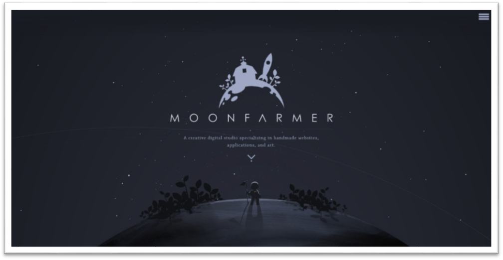
Moonfarmer.com is beautifully done. Among the many things that make this web site so cool is how they have it interact with the scroll to navigate from one page to the other, and its continuous movement of the stars. In a way, it’s kind of like a pop-up book, fun and very creative. The type is also very nice, it fits the theme of the title. Well Done!
avracollection.gr is pleasing to my eyes, clean and modern. The black and white photographs with the ancient symbols, being the only colorful element on the opening page is very cool and does not distract, a good even balance. The logo is clean and well-designed along with the choice of type used. The navigation is well done also. The typography was well thought out, easy to read even on different backgrounds.

likenowhereelse.co.uk is very interesting and give you the feeling of intrigue, and curiosity. It is somewhat confusing in the navigation, but the type is set up very nicely and works well with what they have going on.

dyosuites.com is a very striking web site indeed. I love the way we navigate through it and the type that they use is nice clean and modern. They have also played with shapes, for example: the triangle for the letter ‘A’, not overly done, but just enough to make it their own and the colors are brilliant.


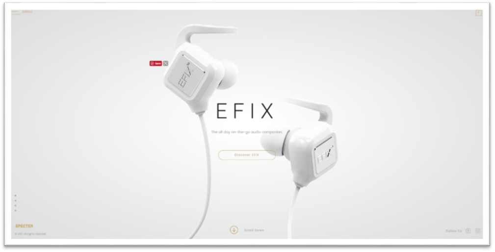
specterwireless.com is a nice visual web site. The colors are warm and light which brings the feeling of technology. The type they use is quite fitting, clean, sharp, and well thought out. The navigation is also easy.
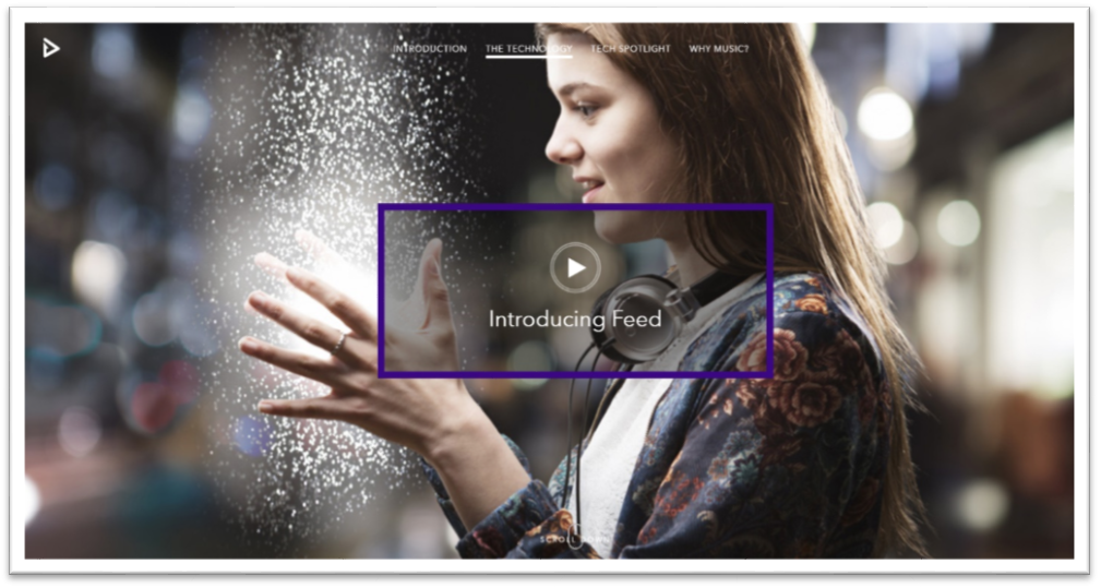
feedmusic.com Talk about a very attractive website, creatively speaking. The colors are beautiful and the video / animation is well done. The type that they use is clean, readable, and simple. You can’t go wrong with Helvetica in my opinion. When we navigate, the words or the sentences follow the direction of the curser until it is prompted to the next slide.


laperle.com is a visually striking web site. The colors are beautiful as well as the type they chose to use along with custom type. It is always nice to see a web site that has or uses nice type layout.
