10 Exceptional Sites using Nature Themed Web Design
Student Guest Post Author Info
Student Bio: Logan Law
Student Website: Website
Student Bio:
Published Date:
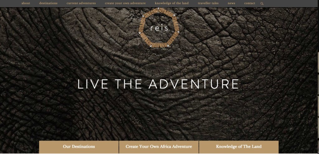
- http://reisvoyage.com.au/
This African Safari website cleverly uses a nature theme by displaying different close-ups of animal skins in the header. It has a nice organic logo as well.
- http://www.k4lab.info/eng/
This website has a more creative look to it. I like how the design at the top is animated. The art is well done and draws my attention.

- http://treegrowing.tcv.org.uk/
This site smartly integrates icons of leaves into its menu buttons, which I think is a great idea. It stands out to by doing so.

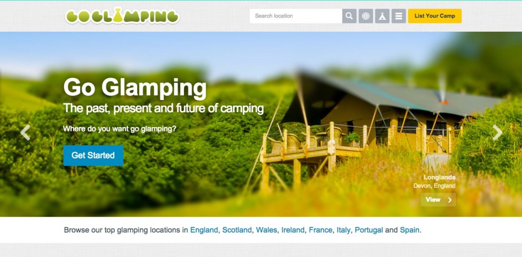
- http://goglamping.net/
I like how their logo is green and has a tent symbol as the ‘A’. The beautiful nature pictures make me want to explore further into this site.

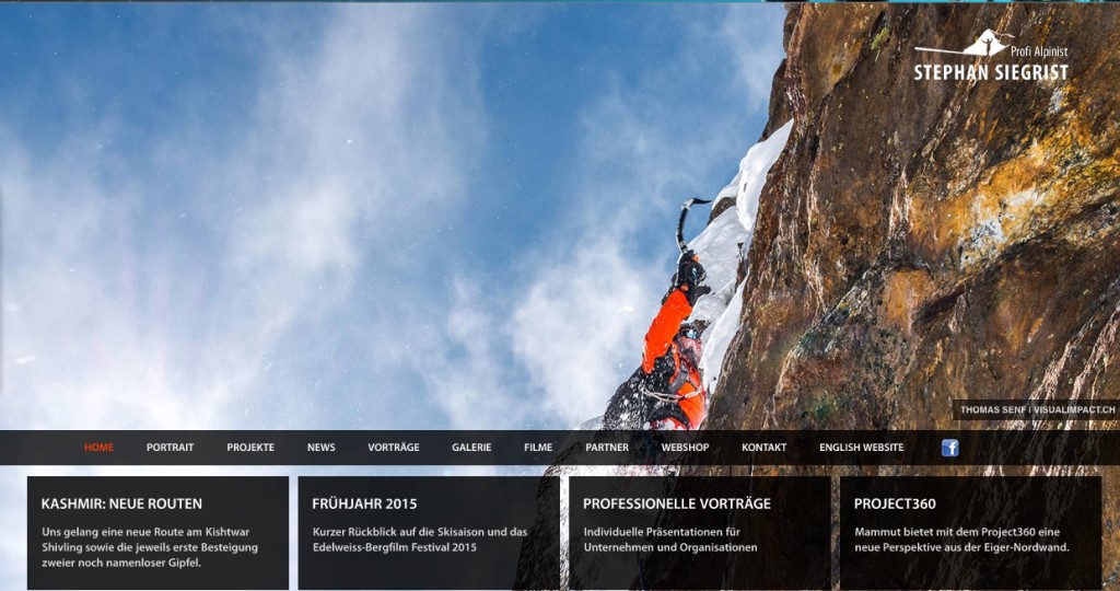
- http://www.stephan-siegrist.ch/de/home
This one is well laid out. The background automatically goes through pictures of the alpinist’s adventures, keeping me intrigued. It feels up the header area as well which I like a lot

- http://www.yodaa.com/
This website is cool because of the artwork integrated with the menu. It’s interesting how the menu looks like burlap, and in the bottom right corner there is a button to scroll to the top with that matches. The fonts work well too.
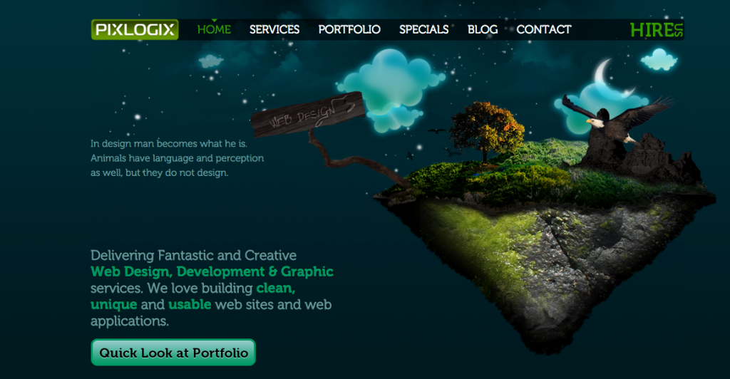
 http://www.pixlogix.com/
I like this page because it is very unique. Not only does the artwork on this page move hen you hover the curser above it, but it’s also very pretty.

- http://www.absolutebica.com/
I really enjoy the top of this page. It has a really nice color scheme and fades into the body of the website flawlessly.

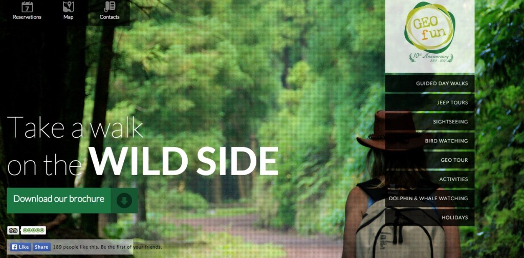
- http://www.geo-fun.com/
This website has desirable layout. I like how the bold words capture the essence of the site. I enjoy how the menu hovers on the right.

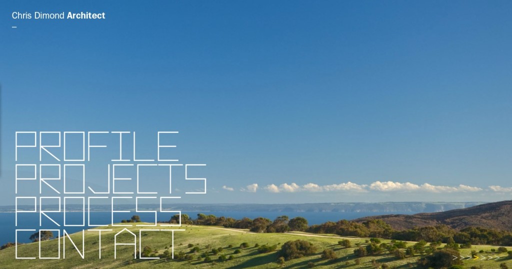
- http://www.dimond.com.au/
I love this website because of its simplicity. It’s easy to navigate and leaves a good impression. I like how the background automatically changes.
