10 Beautiful Minimalist Websites
Student Guest Post Author Info
Student Bio: Christie F
Student Website: Website
Student Bio: Artist & graphic design nerd -- budding web & UI designer.
Published Date:
1. wearesoak.com
This beautiful website caught my attention with it’s simplicity and kept my attention with some really neato (albeit almost impossible to screenshot) interactive features. The curser creates a nice ripple effect over the black background as you drag it to and fro. The words on the top of the page cycle between four different messages; each time it changes, the words gently disassemble themselves, the letters spinning off in their own directions before new letters appear to form the next message. As you scroll down, you see a description of their company (they’re a full-service design & marketing shop, so yeah… that’s why it’s so good) and a portfolio of some of their work. They do utilize a parallax effect, though it’s subtle (as are the other effects on the page).

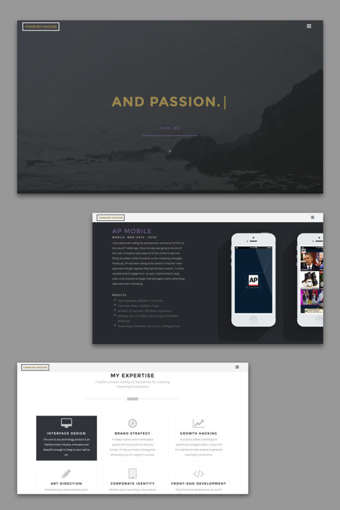
2. charleshaggas.com
Here’s another simple, yet striking website created by a developer/designer. Upon landing on the home page, a blinking cursor appears, and the words “Hello! I’m Charles.” scroll across the screen (followed by some facts about him and his work.) You can click “Hire me” (which leads to a separate page with a form to enter info about your potential project) or you can scroll down for some really beautiful, streamlined, interactive elements that invite you to learn more about Charles, his services & projects, as well as blogs and information on branding and development. The site is chuck-full of information, but it doesn’t feel cluttered or busy. I think he does a good job at keeping site clean, pretty to look at, and still fairly intuitive.
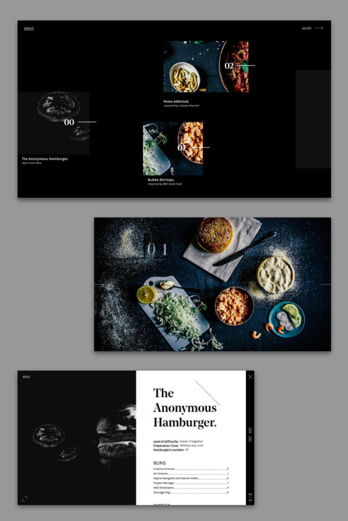
3. anonymoushamburger.com
This is a fairly well-done, sleek website (made by design geeks) about food— and no, not just hamburgers as the name suggests. Yes, the images in some areas of the site can make it a bit busier, visually. But, I still felt like the overall design was über simple and straight forward. When you land on the page you see the words “Anonymous. Hamburger. Society.” ominously appear & disappear quickly. Then, you see a plain black screen with a scant few food photos and brief descriptions, as well as some menu options like “About” and “Scroll.” They’re missing a couple features (a navigable/searchable, comprehensive list of recipes… hellooooo…. ) Also, it took me a minute to figure out scrolling down on mouse = scrolling over to next page. Not a lot of fancy bells and whistles… actually… not a lot of content… yet.
4. strv.com
This website is yet another example of a great design shop letting their talent shine through on their own website. As you land, you quickly notice how clean and simple it is, yet the background is a video which is (presumably) moving through their office, giving a little behind-the-scenes tour. When you hit that tempting little play button on the left, you’re shown a flashier (and louder) video that showcases some of the company’s work and clientele. What strikes me about this site is that it seems very… streamlined. Beyond just minimalistic and elegant, this website is tight, neat, efficient AND fun to look at and explore. Oh, and I thought the rollover effect on the buttons was a nice touch, too.

5. thelobster-movie.com
Fair warning— a bit of mildly explicit material on this website. I chose to include this site because it’s actually the website for a film. When I think of websites made to entice and seduce viewers into watching a movie, I think of flashy, loud, exciting pages— certainly not two-tone, single font, mostly-blank-space pages. But, the creators of this site had their fun in other ways. When you land on the page, you’re greeted with the invitation to “determine your second chance animal.” If you aren’t at all familiar with the premise of the movie, you might be utterly confused. But, throughout the little quiz process, the designers used dry wit and humor to engage the user, rather than bashing you over the head with nauseating visuals and loud music. I wasn’t a dolphin, by the way (that was my second time around when I was playing with the answers. ) I was actually an elephant.

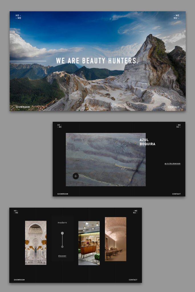
6. marmoelite.it
This website (made for an Italian marble and rare stone marketing company) feels luxurious and indulgent, but remains fairly clean and simple in overall design. When you land on the home page, you see a beautiful photo which quivers and swirls beneath the words “WE ARE BEAUTY HUNTERS.” In case it isn’t obvious to the user, there is a cue to scroll down, where you are invited to learn more about the company and take look at the collections. I really loved the gallery, with its simple lay out that let the stone speak for itself. I also loved the clever, but simple little widget to navigate to the different sections of the showroom— it seems like just enough interactivity and cleverness without feeling forced.
7. davidbastian.red
This is another great example of a solid designer portfolio— minimalist, simple, clever where it needs to be and not too much clutter. When you land on the home page you see a vast white space with a red dot (and instructions to drag said dot in order to navigate.) When you drag the dot, as instructed, you end up scrolling left and right through a selection of the designer’s work. You can click on any project and see more detailed information on said project. I liked the creativity of the “red dot” navigation, and, whenever anything is loading, you see big block numbers that look like some old-school analog counting device, letting you know the percentage of the page that has loaded. Like I said, clever where it needs to be, but still pretty neat and clean.

8. toyfight.co
Okay, this one is a bit self-indulgent, but… stay with me. In my search for good minimalist web design, I actually saw these guys come up more than once. And, when I visited their site, I couldn’t help but fall in love with their propensity for playfulness and humor, while still keeping the design simple, clever and clean. Just a heads up — there is some toy nudity depicted, so sensitive audiences, be warned. But, funny visuals aside, the site is actually great. Landing on the home page, you see the visuals (as described above) but when you scroll down, you quickly see how clean and clever the design really is. A diagonal axis rotates and sets itself on the page, along which visual elements align themselves. I love the fact that this is a solid theme that ties each area of whole site together. And… they’re funny as hell.

9. panache.fr
What the whaaaat? Okay, I included this one because I think they used some basic tools pretty creatively in a neat way. I don’t know enough about the technical side of things yet, but it almost seems like they were using some sort of parallax effect to accomplish these really cool visuals that happen as you scroll through the site. When you land, you’re just looking at a pretty basic (albeit pretty) home page. BUT— as you venture downward, there are some really cool, trippy geometric patterns that begin unfolding & evolving, and my logic/math brain just wants to make sense of it. How did they do that? I’m sure any web design professional would easily be able to explain it, but I would guess that they would agree that it was a creative use of the technology.

10. designobjekt.se
Minimalism 2.0! When you land on the page, you’ll probably notice that your cursor is now a cute little circle, and that the whole site is just… white… with a very elegant little logo (a D and O) drawing itself repeatedly. Then, the website loads, you realize these guys are really pushing the boundaries of minimalism in design. And, I think it works. Designobjekt is basically an homage to design— a carefully “curated feed” of beautifully, thoughtfully, elegantly designed objects to ogle and admire. Of course it was created by a bunch of design-fanatics, and of course they’re going to make the page as gorgeous as all the items they’re showcasing. Even though the site is quite… sparse… it was still quite successful at drawing me in and keeping my attention. I couldn’t stop scrolling, I wanted to see more.
