10 Awesome Examples of Typography In Web Design
Student Guest Post Author Info
Student Bio: Malorie Baker
Student Website: Website
Student Bio: SLCC Web Design Online
Published Date:
10 Examples of Typography in Web Design!
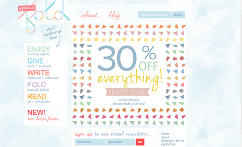
Uponafold.com.au
Uponafold.com is a great example of typography because it has a mix or cursive and sans serif that both look handwritten. The cursive typeface is the best example on the page, but I also loved the color and playfulness of the site.
Vintagehope.co.uk
Vintagehope.co.uk has a really cool feel. The handwritten typography part comes in right away when the page is opened. The whitewashed and painted on words are nice and go really well with the feel of the company. Their subheads also use a nice sketched typeface that looks great with the sans serif body copy. I love how the site focused on sans serif typefaces…..It is my favorite so far!

Poppiesflowers.com.au
This website has a chalkboard background that highlights the chalk lettering. They use a mix of cursive & sans serif hand lettering that give a trendy and clean feel. I think that this site has a more personalized feel, compared to the others I have seen, because it looks handwritten.

Kylesteed.com
Really cool site! I love that there is a variation of handwritten typefaces. Scripts, serifs, sans….all styles! Not one is exactly the same as the next, so it definitely looks “sketched.” It’s all really nice. I’m sure that this man created these typefaces, so it contributes to the authenticity of the site.

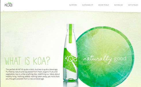
Koawater.com
This website is bright and clean, two of my favorite things. They used the handwritten style of the “naturally” and the headline work nicely together. The handwritten feel carried throughout the entire site. It is nicely done.
2013.inspireconf.com
This website has a great handwritten look because it is so typography based. It’s the type of website that I admire because I love the look and the handwritten feel. Some of the letters are more “sketched” looking than others, but the variety is great! You can tell that someone took a lot of time to make the typography and refine the typeface. The site is also one page, which is unique.

Gnosh.com
This site has that bold painted-on type of look that I love. The subheads scattered around the homepage also have that same painted-on look. It has a modern and casual look that is very appealing. This is a prime example of handwritten influence in web design. I will be coming back to reference this site in the future.

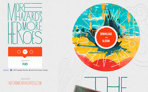
Morehazards.com
What made me choose to include this site wasn’t just the nice tall letters, but the use of typography. It’s very unique and modern. The tall letters though, are wobbly looking so they look like someone actually “sketched” them just for this site. Also, there is something about a sans serif that gives a handwritten look.
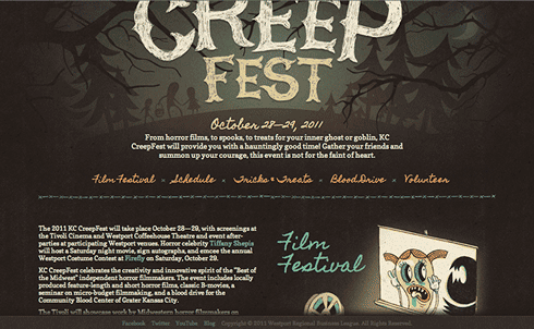
Kccreepfest.com
Kansas City Creep Fest’s website is awesome! The “Creep Fest” title is totally the sketched look and all of the other main points on the page are a cool handwritten looking script. The illustrations also contribute to the originality of the site. Whoever designed this did a great job.
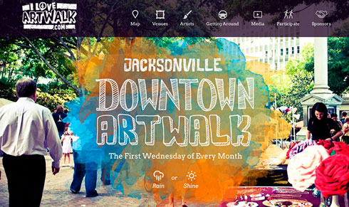
Jacksonvilleartwalk.com
The bright and bold colors on this page compliment the white of the sketched type. There are quite a few sketched typefaces used, but they all work really well together. This site is, so far, the best example of handwritten/sketched because it makes the “sketched” part the focal point, and that’s what will draw you to it.