Websites Using Excellent Animation
Student Guest Post Author Info
Student Bio: Sienna
Student Website: Website
Student Bio: Design student in Salt Lake City.
Published Date:
Animation on the web is beautiful and enticing. It makes sites stand out. Here are some amazing examples of very well executed design and animation – from JavaScript to HTML5. You’ll need to visit the sites to actually get a sense of how they work. It’s more fun than my explanations anyhow.
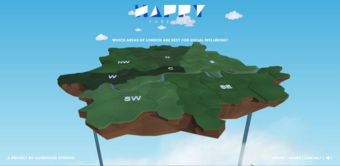
Happy Forecast
This map interacts with mouse movements and hovers. It also travels through the selections beautifully. Added bonus of really lovely music, and you have a smashing happy forecast!
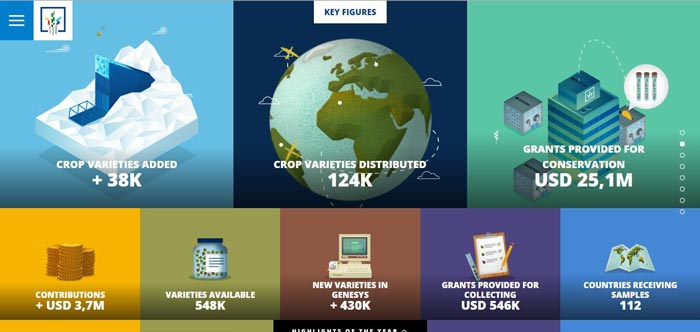
Crop Trust
Lots of work put into this 2014 report. The website utilizes parallax, subtle animations, and a gorgeous layout. You’ll find yourself scrolling through all of it. It’s so beautiful the actual information contained in the site seems almost irrelevant.
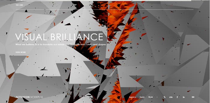
Node Plus
This site is chocked full of funky interactions, sounds, and slightly cryptic information. It may or may not work, depending on how hard your browser is willing to think. In the event that it’s taking a break: basically you’ll be greeted by a fractured pattern with swirling, shifting fragments that track with your mouse and re-arrange into shapes and letters without warning. The portfolio need do little more as the landing page is more than enough explanation of expertise.
Pauline Osmont’s Portfolio
This site is all about elegant, subtle animations. Most of it is achieved simply through HTML and CSS. Take a close look and notice that nearly everything interacts. It’s beautiful, achievable inspiration.
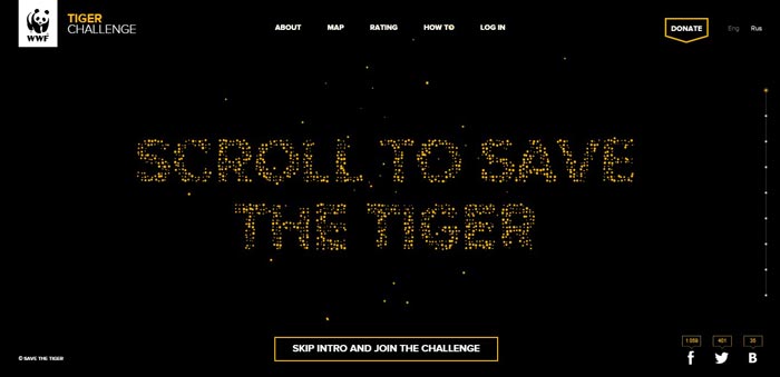
Tiger Challenge
One of my favorites, World Wildlife Fund’s “Tiger Challenge” is an incredible piece of art. The small dots re-arrange themselves into images, and scatter as you glide your cursor through them. While you’re playing around for the next couple minutes, also take time to appreciate the more subtle animations. See how many you can find.
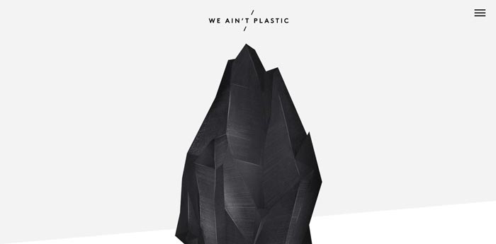
We Ain’t Plastic
This site isn’t striking in it’s richness of animation. But I had to point it out because of subtle little things included. Notice the wonderful parallax, the typography, and even the menu. It’s a wonderful example of how small touches can take a rather typical (although certainly well done) portfolio into a true master piece. It’s all in the details!
Larepenger
This is a pretty extravagant customer recruitment campaign for a bank. It’s full of adorable little animations. And more than that, it’s exploding with interactivity. Although these animations won’t blow your mind, they demonstrate a nice marriage between UX and design.
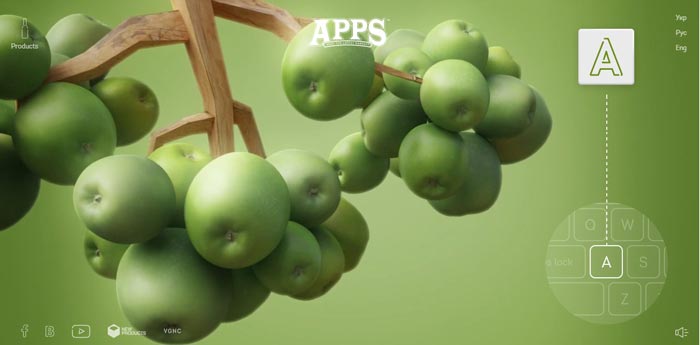
Apps
The animation shown here wasn’t made with CSS, that’s for sure. Don’t be discouraged, web designers! This site certainly shows what is possible. Go ahead an immerse yourself in more traditional animations that have the added bonus of being interactive.
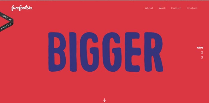
Five Foot Six
Check out these animations, which look to have been made in Adobe Aftereffects. After ooo-ing and aww-ing over the easing, you’ll notice that it’s the only animation on the site. But I’ve included it because one little well placed animation can change your entire site. See?
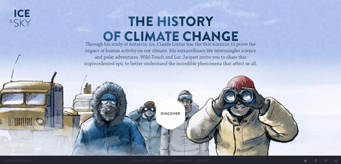
Ice & Sky
Another favorite! This site is so comprehensive in it’s use of animation. It’s cinematic, user friendly, wonderfully designed, and so much fun to explore. I encourage you to visit at least a few of the parts. Also, make sure to pause and enjoy the interactivity included in that state.
