Top 10 Dark-Themed Websites
Student Guest Post Author Info
Student Bio: Vig Mikulis
Student Website: Website
Student Bio: Check out my portfolio at Holybee Designs
Published Date:
1. Natural Selection 2 Home Page (http://unknownworlds.com/ns2/)
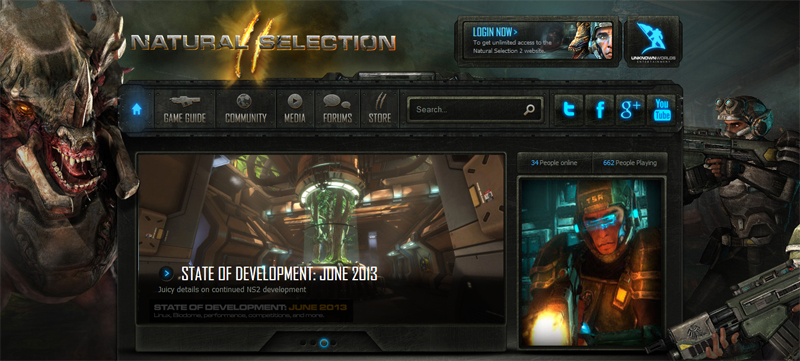
This page has a great contrast of black and light blue. This contrast causes the mouse-overs on the top main links to appear to be glowing when selected. This dark themed site appears more advanced than it really is based on the layout and, as I pointed out, really good color scheme.
2. Fully Illustrated Home Page (http://www.fullyillustrated.com/)

This site is really forcing all attention onto the middle display banner. The entire site is basically black drawing attention to other colors, preventing the user from becoming disoriented. Other images and links not seen in the screen shot are grey as to not draw the user as much.
3. Kerosene games Home Page (http://kerosenegames.com/)

While I don’t agree with this websites layout, I do really like the color scheme at the bottom. The top of the page seems a little disorientated to me, but after you scroll down a little you can see great care and thought was put into the site design using dark tones with white and red highlights. Doing this they manage to turn a boring “Why Us” into something I will read because it looks good.
4. Black Tusk Studios (http://mgsvancouver.com/)

This site follows the old saying of “less is more”. It consists of nothing but black and gold/yellow. Its really simple and very easy to navigate, I think being dark and focused helps it with that. My only criticism for this site would be the home page domain name not matching the studio name.
5. Analogue Interactive (http://analogueinteractive.com/)

Analogue Interactive have a neat little website. Its thick black boarders really make their products pop out on the white backgrounded image flipper frame drawing my attention directly to it. By having everything else grey scale my attention goes straight to the colors and then slowly looks out onto the other links and information.
6. Wow Reach (http://www.wowreach.com/?/Home/)

This site isn’t dark with just black and white like my previously listed examples. Wow Reach uses dark reds an oranges to keep with a shadowy theme while looking different. I enjoy that the background casts a sort of gradient getting lighter toward the top of the page.
7. Confetti Special Effects (http://www.confettispecialfx.com/)
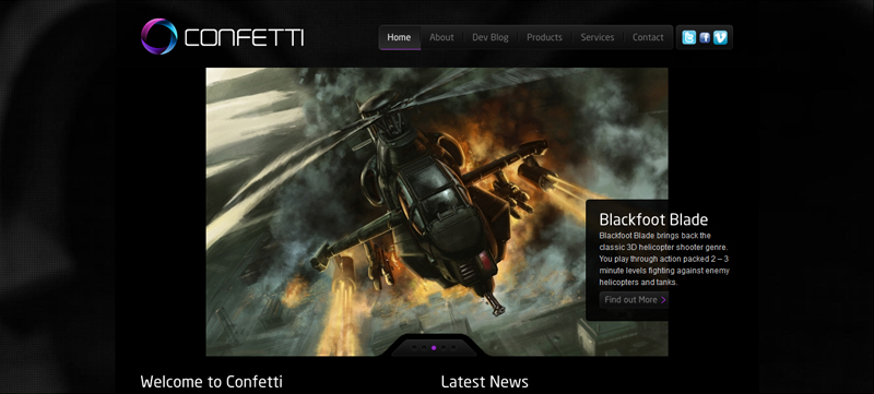
Confetti Special Effects uses a calming pink, blue and purple to contrast its dark black webpage. Buttons are tinted grey/black until you hover over them. As before all of this causes the users attention to be drawn to specific areas of the home page. My only issue is the amount of time it takes to load all the images when starting up this site.
8. Dead Frontier (http://www.deadfrontier.com/)
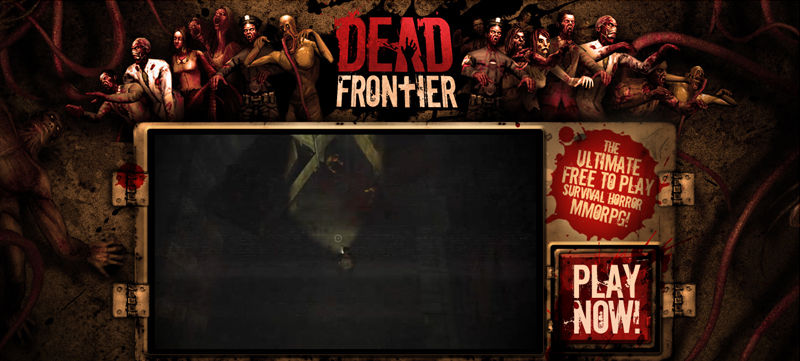
This site uses a red gradient radiating from the center (lightest) outward (darkest). The background isn’t a static color, it has red vines giving it the appearance of popping out. The dark red blends in all the blood splatters and given that this is a zombie shooter it fits well.
9. Voodoo Controllers (http://www.voodoocontrollers.com/)
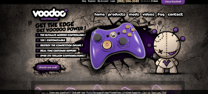
This controller site went with a black, grey, and purple scheme. I really like how on some of the links, when highlighted, turn a bright glow of purple, it really makes those links pop. Other links just have a basic mat purple background when highlighted and that looks good too. The dark contrast on the home page makes this site a top dark one.
10. Hydra Games (http://www.hydragames.de/)
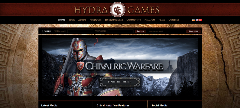
On Hydra Games I like the subtle darkness made with tan, red, and black. While the links don’t really pop out, and nothing happens with a mouse over, I still think that this imagery and color scheme (with light textures) make this one of my favorites.