Large Background Images in Web Design
I like how http://super16.dk/ has the boldstylized text that has a great animated transition over a shuffling landscapes.

http://richlanddubai.com/ is attractive because it starts with a slideshow that showcases it property with the contact information easily viewable and a site thats easy to navigate.

https://www.jardan.com.au/ starts with a colorful animated slideshow and makes it feel like it’s presenting something new with the way it animates the text and has its brand labeled.

http://richlanddubai.com/ is attractive because it starts with a slideshow that showcases it property with the contact information easily viewable and a site thats easy to navigate.
https://karta.kolmarden.com/overview interests me because of the maps that were captured by drone and drone photography is a new passion of mine. The way the home page looks makes me curious to see more.
http://www.keenfootwear.com/ catches your attention with the contrasting yellow and blue colors which interests you in reading the text. It also has a uniquely generic feel to it.
https://www.windowsetvous.fr/ is my favorite because of the way the video starts in the clouds and drops by the building floor by floor.
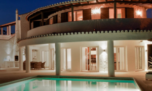
I like the contrast and reflection on the home page at http://www
.carvoeiroclubegroup.com/en. It is also very easy to navigate and find what you want. I also like how it goes a great how on showing exactly what to expect right away.


I like how the transitions are done with the home page slideshow at https://www.ehagroup.co.uk/.
All of the pictures also have a lot of information pertaining to the website.
http://www.sentinelservices.com/ also makes me curious to dive further in the website because of the picture with the family in the sunset and the way that the text and menu placed on the homepage.


