Cute Interactive Websites
Student Guest Post Author Info
Student Bio: Christine Hunsaker
Student Website: Website
Student Bio: Graphic design student. Raconteuse. Cat parent.
Published Date:
10 samples of fun and cute interactive and animated websites.
Saw this website on a couple lists of good use of animation interaction on websites, and it’s charmingly designed. All the graphic elements are flat designed, friendly little icons. You scroll down for facts about water use worldwide and the elements scroll and slide across the screen at various points. At the bottom is a little video about saving water, and it’s a low key but fun way for them to present their public interest piece in an approachable way.
Website promoting herbal essences spice. It’s set as an bazaar where you have to interact with all the booths to get facts and play games. Probably the most elaborate and commercial site I found for this list.
http://www.inception-explained.com
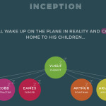
This site is a scrolling visual representation of the movie inception. It has pages for all the separate worlds or dream states and it scrolls you up and down through them in order, explaining where you are in the timeline.
Simple musical site. Little balls float around the page, hitting strings. You can grab the balls and drag them through, or it will just play something without you. Very minimalist design, (just red and white,) and surprisingly fun to mindlessly play with.
http://blacknegative.com/#!/whoweare/
I have no idea what this site is for, but it’s beautiful. Every page has a different set of transitions or navigational things or interactive stuff. Less animated and cute than all the other sites I’ve found/liked. Darker looking/colored design which I don’t typically like, but very cool here.
http://surveyofthestates.com/#map
This is an information site about students and finances in the US as well as educational costs and programs teaching students about managing their income, debt or educational costs. Click or scroll through to navigate, each page has animated pieces as well as quotes to scroll through and interactive bits all over. Really clean design and simplified color palette.
http://blog.iforex.com/water/#coffee
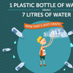
Another cute animated water use facts site. This one is a little less friendly and a little more “all the things you want waste/use huge amounts of water”. This one you also scroll down through, but each page has independent animations, too.
This is some sort of dairy site. The front page uses an unexpected parallax-y milk splash with floating cow and type that’s fun.
http://www.homestarrunner.com/toons.html
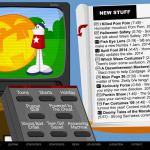
It seems remiss to talk about animated web stuff and not mention homestarrunner. I first heard about them in high school when I was using flash for the first time eleventy million years ago. It’s a lot of animated silliness.
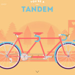
Do you love bikes? This site scrolls through various kinds of bicycles and matching themed backgrounds. They also sell these as silkscreened prints if you like their cute artwork.


