10 Sites with Brightly Colored Wed Design
Student Guest Post Author Info
Student Bio: Shelbie Jensen
Student Website: Website
Student Bio:
Published Date:
1. This site did a great job of using brighter colors without making the page look too messy. The colors grab your attention and make the page pop. http://www.huxtaburger.com.au/
2. This website did a good job of using a bright yellow but still making it look clean and professional. http://hlvticons.ch/
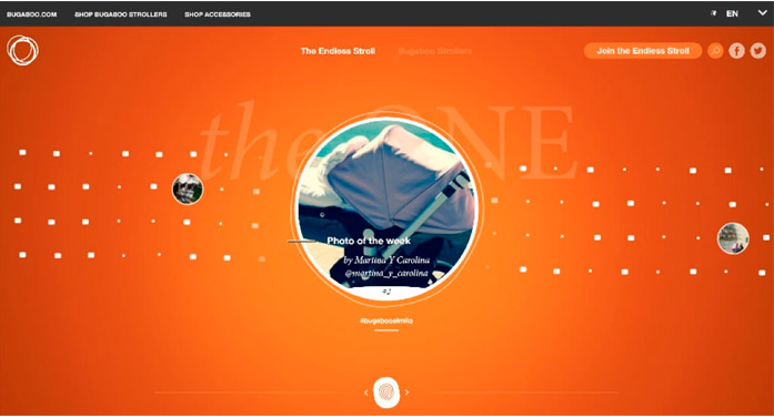
3. I feel like orange would be a harder color to use in website design, but I thought that this site did a good job of using the Ombre effect from the inside out to emphasize the focal point of the page. https://theone.bugaboo.com/
4. I loved the bright colors on this site and they really caught my attention when I opened the page. It makes the website feel fun and modern! https://3sidedcube.com/
5. The bright colors on this page perfectly matched the theme of the website and made it more fun to look at. http://mambomambo.ca/
6. This was probably my favorite website that I found because I loved how bright the colors were. The contrast of the green and pink is fun and unique but not overwhelming; it made me want to stay on their website longer. http://www.panicstudio.tv/en/
7. This website is very minimalistic but I thought the brighter colors made it a lot more interesting than just a black and white site. https://www.truedigital.co.uk/
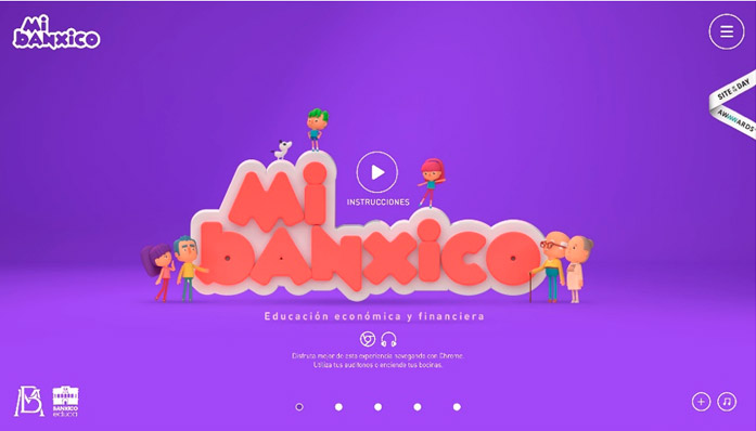
8. This website looked really fun with the characters and 3D look, I also loved the bright purple background. http://www.banxico.org.mx/mibanxico/
9. The colors on this website are simple but do a good job of making the product stand out in a unique way.https://www.oddpears.com/
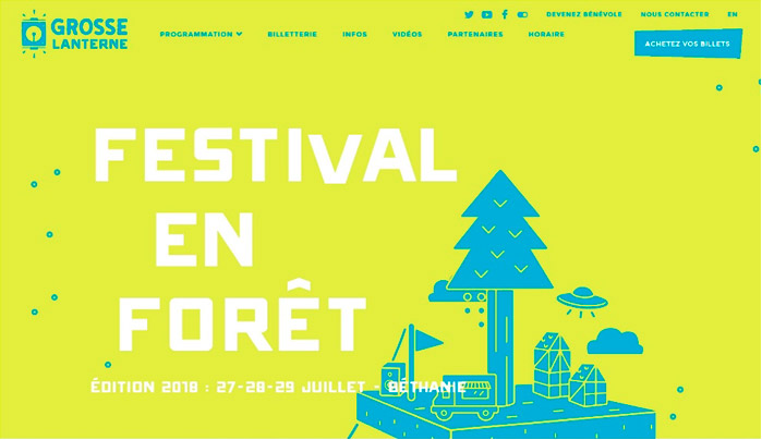
10. This was another site that really caught my attention because of how bright the colors are. I didn’t even know what the website was about, I just loved looking at the colors and the design! http://www.grosselanterne.com/


