10 of my favorite sites using good photography in web design
Student Guest Post Author Info
Student Bio: roberto lopez
Student Website: Website
Student Bio: graphic design /full time student.
Published Date:
The lookbook on this website is actually one of my favorites. As soon as you open the lookbook your instantly given a preview of the patterns used on the collection being used as the background on the site.It pretty interactive compared to of the other lookbooks.The photography gives a good feel of the brand which definitely makes you want to get some fresh gear.
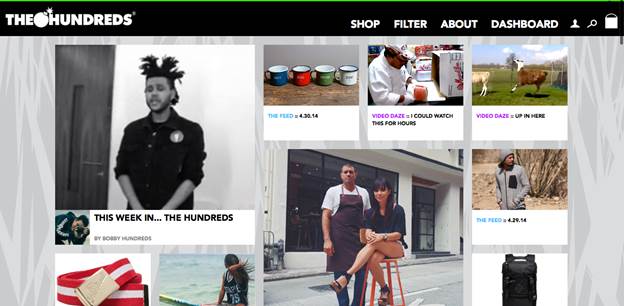
The Hundreds lookbook i think its pretty well put together, same layout as the 10 deep lookbook, on this newest collection they recently put out i think the photography could of been a little more original , the image sizes are proper it think straight to the point nothing to crazy.Maybe a little more interactive design could of helped.

This website isn’t specifically for one clothing brand or product, this website has a variety of brands and art produts,but its function is to keep you updated on the newest lookbooks from other sites as well as art shows ,etc..,i like the layout in this site they also rearrange the original lookbooks from different brands to fit their site , still pretty simple photographs,decent size and they also provide a direct link to the brands shopesite.
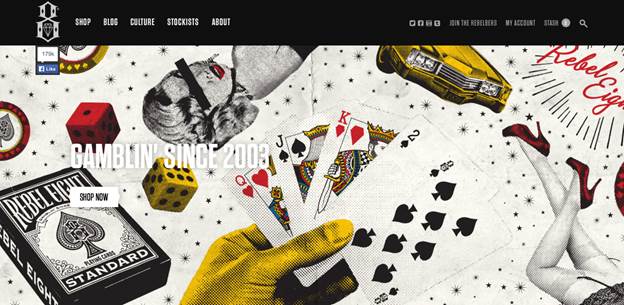
This is the rebel8s 2013 summer collection ,i like the placement of the photos they basically take most of the screen ,the photography gives a good feel of what the brand is about, also you have the options of scrolling down to actually see like a catalog version of the products offer on the collection in were you can actually click and shop
the concept of this collection is one of my favorites , they actually have some videos on their home page which gives you kind of an introduction of the collections is about. The lookbook link is on their homepage,the layout is pretty simple ,the concept used for the photography on this is way rad though.
All right this one is very straight forward , photography exact to the essence of the brand which is laid back surfer/skater feel to it .This one has a very well web design first you get to see a photograph in a lookbook style and below it you have the products showed individually listed with a direct link to a shopping cart or shop page.
As you can see the picture below the lookbook consisted of pictures of already taken polaroid pictures if that makes any sense , but i think its looks pretty cool, also if you scroll down a bit you can see a smaller version of the polaroid pictures which allows you choose directly the page number you want to see with out having to click the arrow a bunch of times to get to the picture you want.You also get the menu bar up top with a shop link.
This look book is pretty simple , the photography also pretty simple,more of a catalog feel to it . The cool thing about this design is that if you hover over the image a “view look” link shows up and if you click it you get to see a more bigger and detailed view of the products worn by the model on the initial picture,also gives you a “buy now link” .
This website has a really cool creative web design , the way the menu bar comes down once you hover the top is really cool ,also the faded photograph used as the background and well the video showing the collection .I think over all very organic feel to it , things seem to be well organized yet not boring.
Last but not least brixton.com out of all the look books listed this is by far my most favorite one. To begin with the photography in this is excellent totally gives the shopper a great vibe of the brand , aside from that you have a type of menu bar within the look book which gives you the options to choose from switching the layout views to printing a look you want,for example you can change the lay out view of the book from presentation to magazine look ,also on the menu bar you can select the full screen options as well as other really cool interactive options.


