10 Creative Websites That Use Parallax Scrolling
Student Guest Post Author Info
Student Bio: Brenda Santoyo
Student Website: Website
Student Bio: A 21 year old student currently attending Salt Lake Community College. She is currently studying art, psychology, and sociology to become an art therapist.
Published Date:
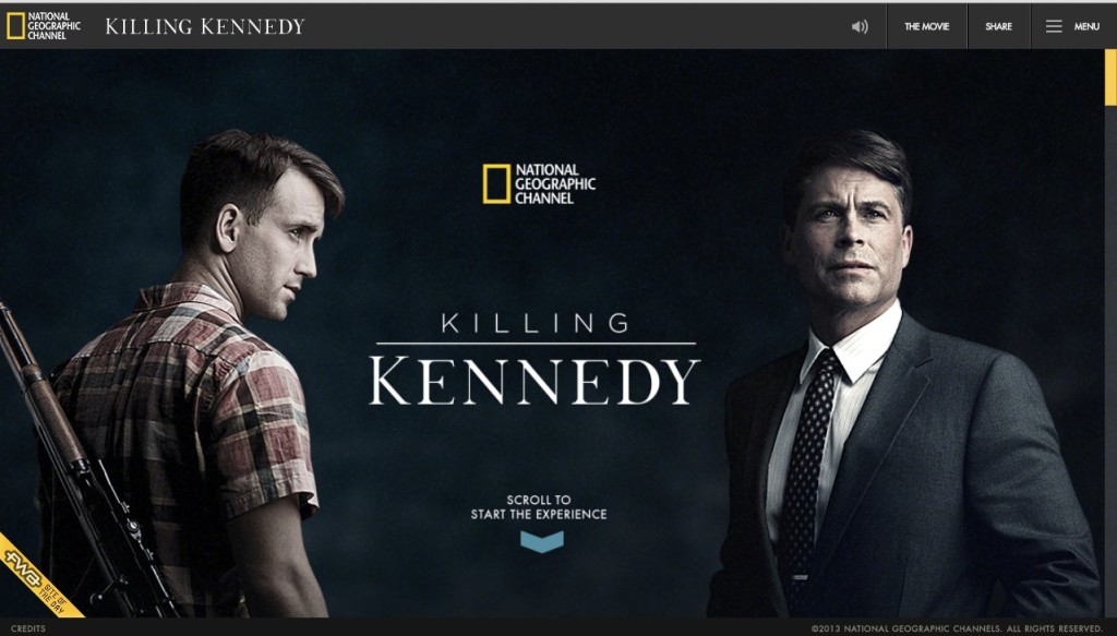
Killing Kennedy is an informational website by National Geographic. This website combines an array of graphics, text, and sound to recollect the history between John F. Kennedy and Lee Harvey Oswald. As the viewer scrolls down they can witness the history shared between both individuals and what led to their demise. These effects allow viewers to engage with the information they are reading and learning.
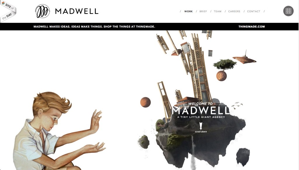
Madwell is a creative agency based in Brooklyn, New York. Their main page introduces visitors to their unique projects, designs, and overall style. Their websites boasts layers of graphics and the illusion of three-‐dimensionality that attracts a large number of viewers.
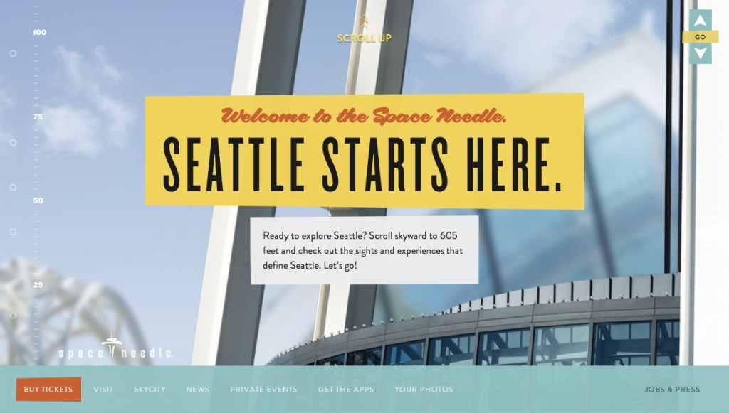
Space Needle
This website is the main source of information for the Space Needle in Seattle, Washington. This website is a unique and innovative platform to advertise this business as well as its many features. As the elevator rises to the right of the screen the height increases on the left of the screen.
Viewers can drag the screen to maneuver up and down the Space Needle.
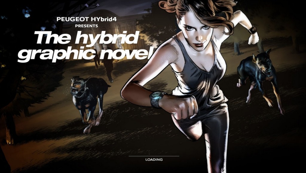
Peugeot Hybrid 4 is a creative modern graphic novel used to advertise a client and their product. This type of automatic side scrolling creates action as the female character moves at a different rate from the background or the surrounding objects. In this instance, parallax scrolling is utilized to create a story and acts as a unique platform to highlight a product.
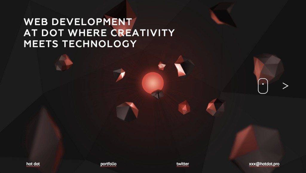
Hot Dot is a website design and development business that specializes in parallax scrolling and similar effects. Hot Dot uses horizontal parallax scrolling to showcase their portfolio. Each slide presents layers of high quality images, objects, and text. Hot Dot’s website design emphasizes on realism, and three-‐dimensionality to introduce their clients to visitors.
Marquons L’histoire combines colorfully drawn images, bold graphics, and music to present visitors with an important moment in time. These different aspects create a powerful combination and the subtle use of parallax scrolling incites progression of the story as well as the history of this team. As viewers scroll down they can witness how this Canadian soccer team has progressed in the league and how they intended to win for their home country.
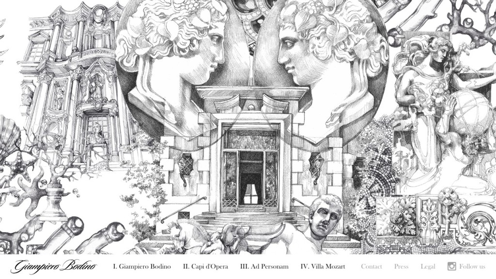
Giampiero Bodino is a jewelry company that provides a unique experience for viewers who appreciate the beauty of art and design. The main page boasts a mural of hand-‐drawn images inspired by the Italian Renaissance. Viewers can easily drag to explore and learn how their brand of jewelry is created.
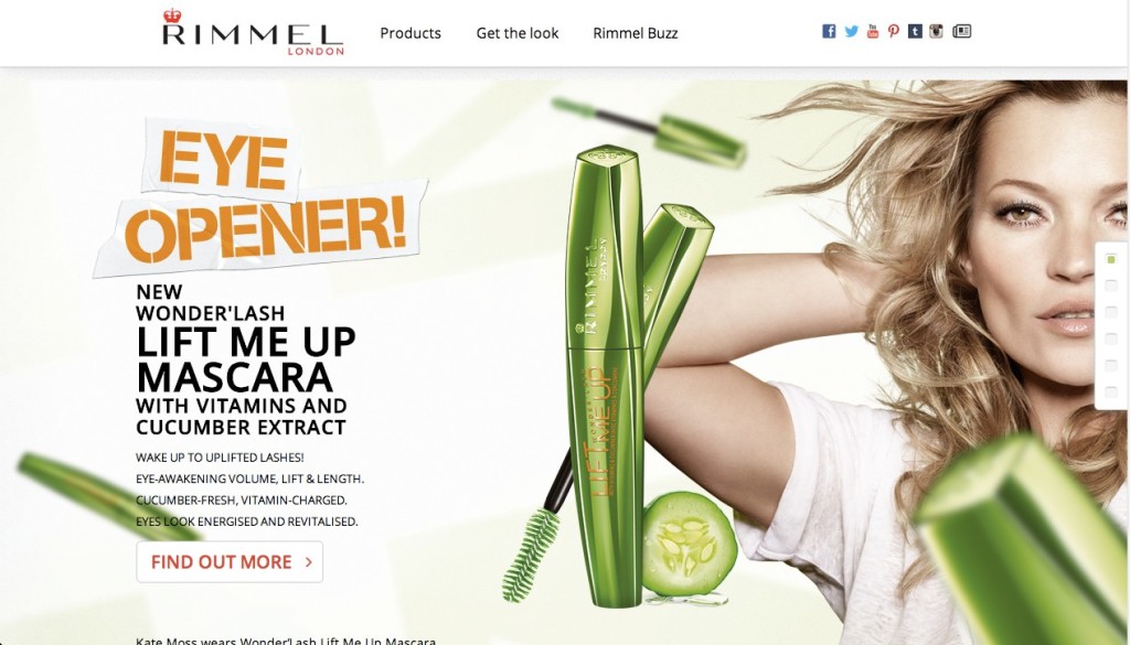
Rimmell London uses parallax scrolling to focus on their new line of products. Bold text, high quality images, and vibrant objects easily target and capture the attention of the audience. Packages of mascara, foundation, and lipstick descend as the viewer continues to scroll down the page.
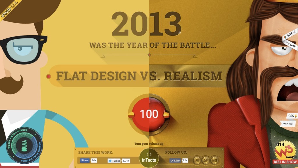
This website, Flat Design Vs Realism, highlights the differences and similarities between two varying styles. This presentation is formatted as a story and depicts a battle between the two types of design. The use of parallax scrolling creates movement between objects and smoothly transitions from scene to scene.
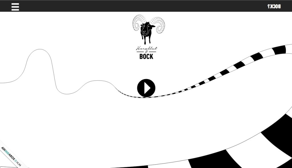
Herzblut und Block is a duo of artists that are skilled in illustration, animation, and graphic design. Their website uses parallax scrolling to present their portfolio in a creative way. The images appear animated as the viewer scrolls down the page. Finally, visitors are welcomed to enter their portfolio at the bottom of the page to view their collection of projects.
