10 Exceptional Websites using “Color Black” Design
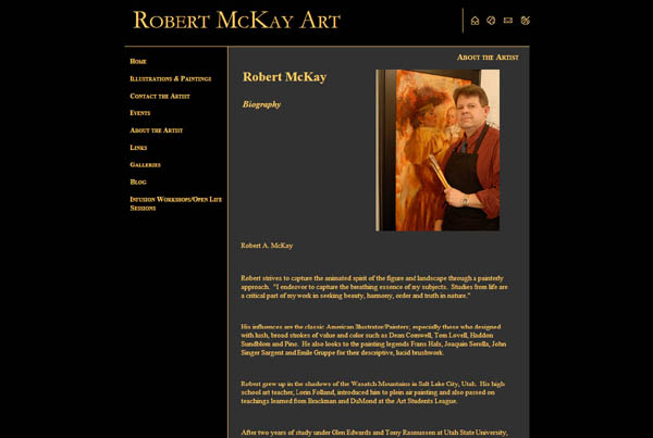
Website # 1 Robert McKay Art uses black as a background for all his pages, and it is used to showcase his paintings and other pictures. Most artists use the color black in the background to help direct the eyes to where they want you to look. Robert McKay is a local artist/illustrator and is also a Professor at SLCC.
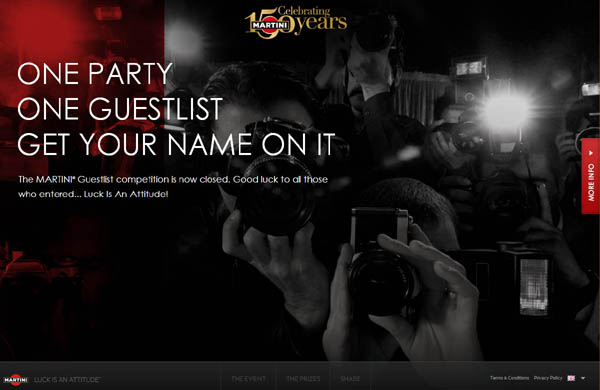
Website # 2 Martini Celebrating 150 year’s party is a good example of the use of Color Black on their website. In this case, the black is used to suggest the mood and the atmosphere of the upcoming party. It’s like walking into the room where the party will be held and it gets the visitor into the mind set of what will be happening.
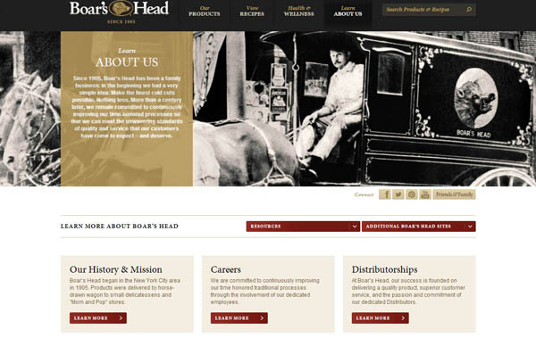
Website # 3 Boar’s Head uses the Color Black to bring depth and Nostalgia to the Heading of their site. Their brand label on their products is also black based so that this website ties in well and is recognizable to the viewer and customer. Smith’s Marketplace sells this brand in their deli, and it is both delicious and expensive.
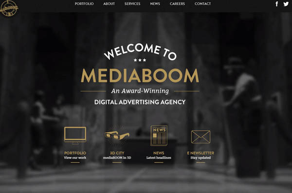
Website #4 Mediaboom Digital Advertising Agency uses the Color Black appropriately to bring the mood of the theater into play. They primarily are a video production for Website Company. Most of their work is showcased in the Color Black
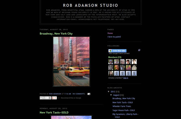
Website #5 Rob Adamson, a well-known Utah Artist and Professor at SLCC uses the Color Black as a background to display his artwork. The attention of the viewer’s eye is automatically focused upon the paintings which is exactly what he wanted.

Website #6 Royter Snow Design in Salt Lake City, Utah uses the Color Black as a background to emphasize their display of design projects and paintings for sale.

Website #7 This Bakery uses the Color Black as a background to showcase their products and create a delicate design using their products. This display does really make the viewer want to see more of their products, so clicking on the tabs is only a moment away.
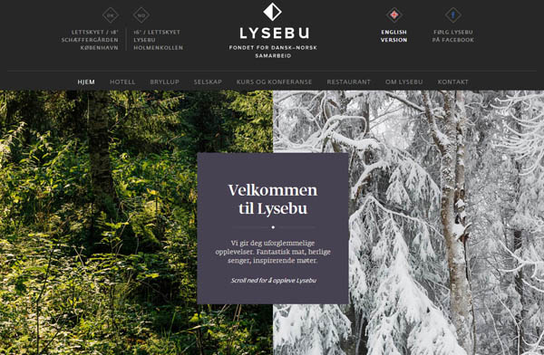
Website #8 Lysebu uses the Color Black to frame their company name and logo. They also showcase their work with photos containing the Color Black to tie everything together in content.
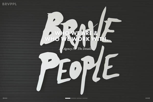
Website #9 Brave People use the Color Black as a background to make their words pop out at the viewer. It is an attention grabber. This company designs websites in Ybor, USA. Their case studies examples take way too long to load….Hmmmm…..
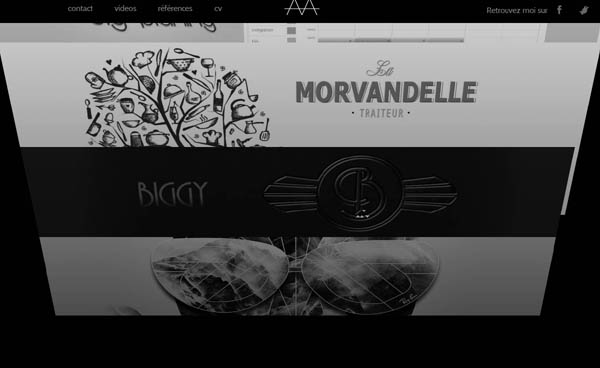
Website #10 Axel Aubert used the Color Black as a background for their unique style. They are a Paris Web Designer and won an award for this site. This site has some really cool features like this tilting of the page feature which is emphasized by the Color Black.