10 Great Texture Website
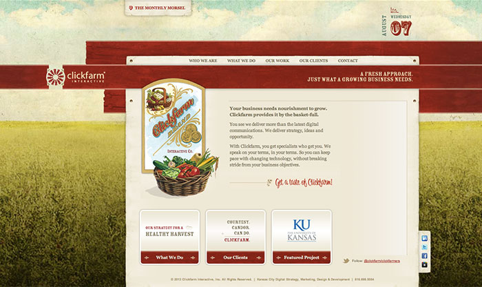
1) Click Farm
I found the background texture quite artistic. Very well assemble and usage of the texture to create a relatable background to the site overall.
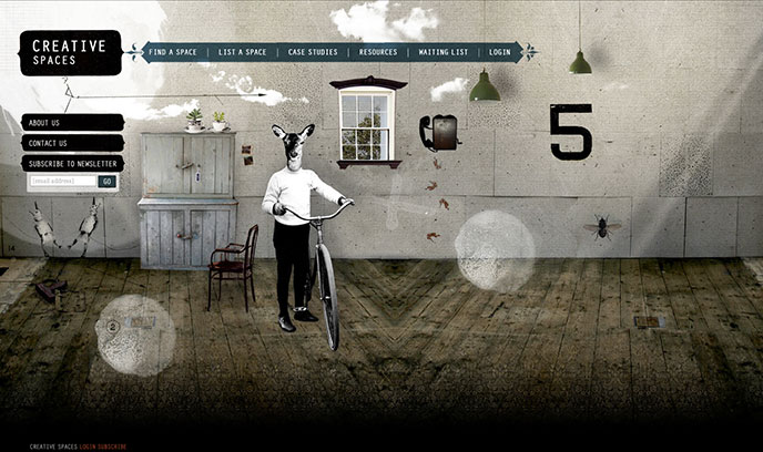
2) Creative Spaces
It would seem I’m a fan a texture especially multiple textures combine, even the ones where its obvious they don’t belong there but yet works. Thus , I give you this site where the background seems to take precedent of the main page. Even as odd the illustration is it works throughout with the multiple textures.
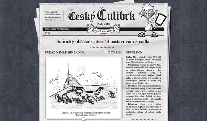
3) Cesky Culibrk
I found this website even though its in a different language I still love the simple texture of the background kind of gravel/noise look plus what I really liked was the newspaper texture that they added gives it an extra boost from a regular article and more into actual newspaper.
4) Progressive One
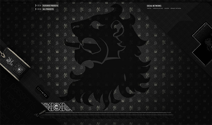 This website I love all the different texture it has and how it is combined however the only problem I have with this one is that Title “confessions of a serial stylist” under texture get a bit to much when you see it more up close. But one thing I really like is the top texture how they used it, it gives me a feel of a well design building.
5) Przeznaczenie
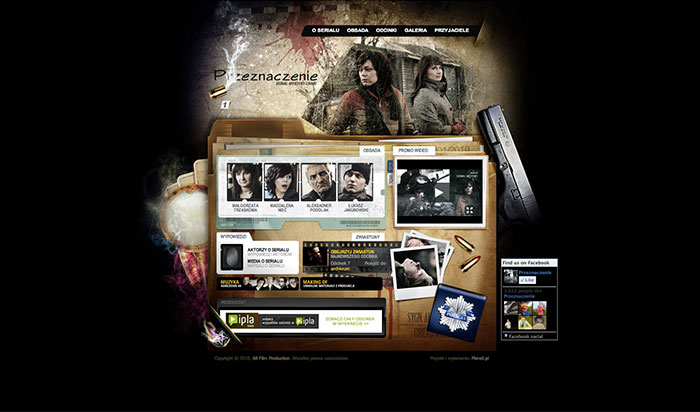 Got to say I’m loving this website background/ opening. I feel with all the texture they add it, it creates a edgy look and feel. Which I think that probably what they were going for and I think it worked out perfect.
6) Sprocket House
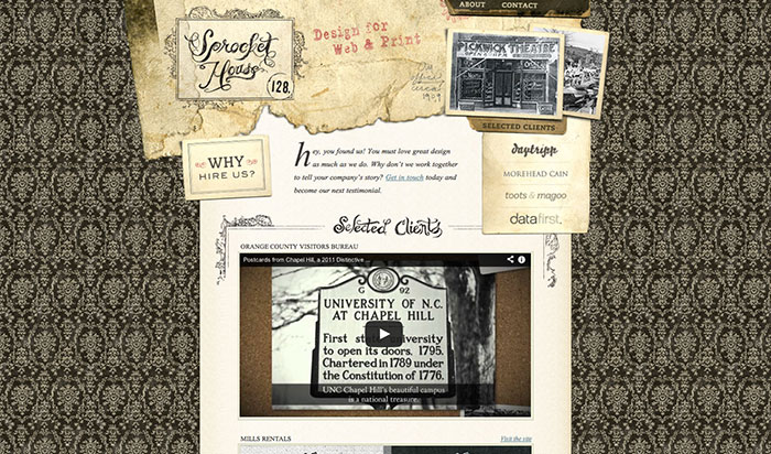 I kind of like the background texture it gives it a more elegant feel, reminds me of wall paper but same time 1800th hundred and that’s where the old wrinkle old paper texture they use on the top left makes a bit sense to me. But really I just like mostly the texture they use in the paper compare to the other textures the website has to offer.
7) The Searthings
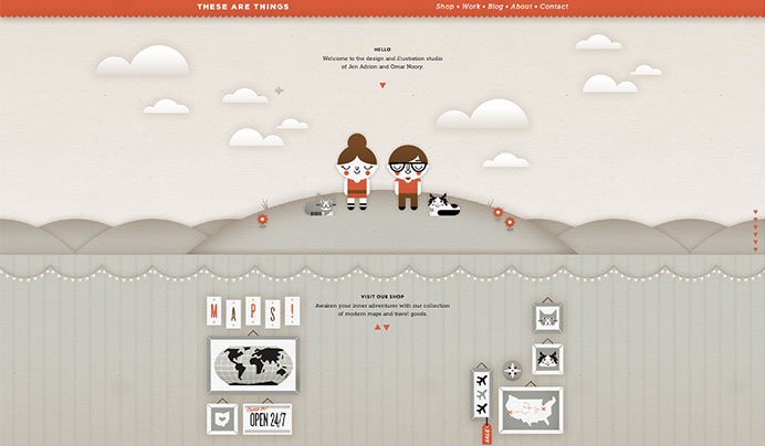 I think these textures are very simple yet are powerful because of the very fact that its very simple in combo with all the textures in the background. Also if you keep scrolling down the background along with varies textures constantly change, I think that’s pretty cool.
8) Elaine Fisher
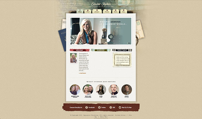 I like the texture in this site reminds me of scrap booking . Which if it was their aim they achieved it. All the texture work well together.
9) Ryan Scherf
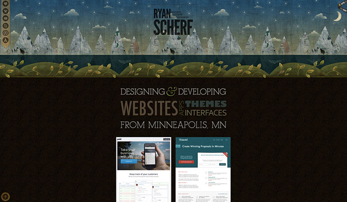 I actually like this design the way its set up reminds me of quilting but they filled in the mountains with newspaper texture along with the other drawing in there its kind of fill in the with texture which is pretty cool.
10) Krillbite
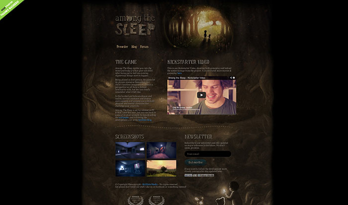 I love how they used the textures in this site makes it look story bookish which considering the site actually works well for them. Although it seems it more of an illustration in the background the subtle amount of textures here and there make it work for the site.
