10 Great Websites that Utilize Photography in their Designs
Student Guest Post Author Info
Student Bio: Erin Andersen
Student Website: Website
Student Bio:
Published Date:
It’s a simple site, but they utilized the expansion of the photo across the entire page and it’s clearly focused on the Tesla model with the blurred background. The red color car pops well and is the first thing you look at and I like the soft, muted blues and grays in the background.
They chose images with titles that make you want to click on each picture to get the rest of the information. They also incorporated a continuous looping of pictures/stories so you can see and learn about several different headlines within a matter of minutes.
Shutterfly’s main page shows some of the products that you could create. I like the top picture because it shows a family admiring a picture book of their family. It’s sweet and thoughtful.
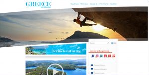
This site did a nice job of showing some of the iconic and not so known adventures/pictures that you could see in Greece. The border picture cycles through seven different pictures that draw you into the lifestyle and wonders of this country.
https://www.popularmechanics.com/space/a25697/beginners-guide-to-astrophotography/
I like this photo because I love astronomy and photography, so this is something I would want to explore together in the future and any galaxy shot is mesmerizing. It also fills the whole page making it appear as if you’re looking up at the night sky.
https://www.michaelanthonyphotography.com/
I discovered this site when I was completing this assignment and I am absolutely floored by the pictures he has created from his weddings. They are spectacular, and he keeps your attention through every photo as you continue scrolling down. He definitely has the WOW-factor in his finished photos.
This organization has done a great job by making you feel good from the moment you come onto the site. The picture of the kid across the top of the screen shows pure happiness from water. After reading about this organization and how it uses all of the money they raise to providing fresh, clean drinking water to countries who are without. Even though the woman’s face is slightly covered, you can clearly see she is very happy. The pictures show the result of people’s kindness and money put to work.
This site uses photos for all their recipes and it’s the best way to showcase what the end result should look like. Since most people eat with eyes, so to speak, these photos help readers decide if the recipe is worth trying in order to taste something that looks delicious.
https://churaumi.okinawa/en/area/the-coral-reef/
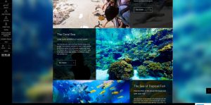
This aquarium in Okinawa is the third largest aquarium in the world and it does a great job of showcasing the different exhibits they offer. I like how there is a blurred background picture and how each exhibit photo explanation is a little transparent to show the rest of the original photo and not just a block of color.
I like how they used a creative design element from the layout of the pictures and that each picture represents different information to look at. This is something I may want to incorporate into my web design for my photography. I like the overall design of multiple picture sections that make up one block.


