Ten Creative Web Site Designs
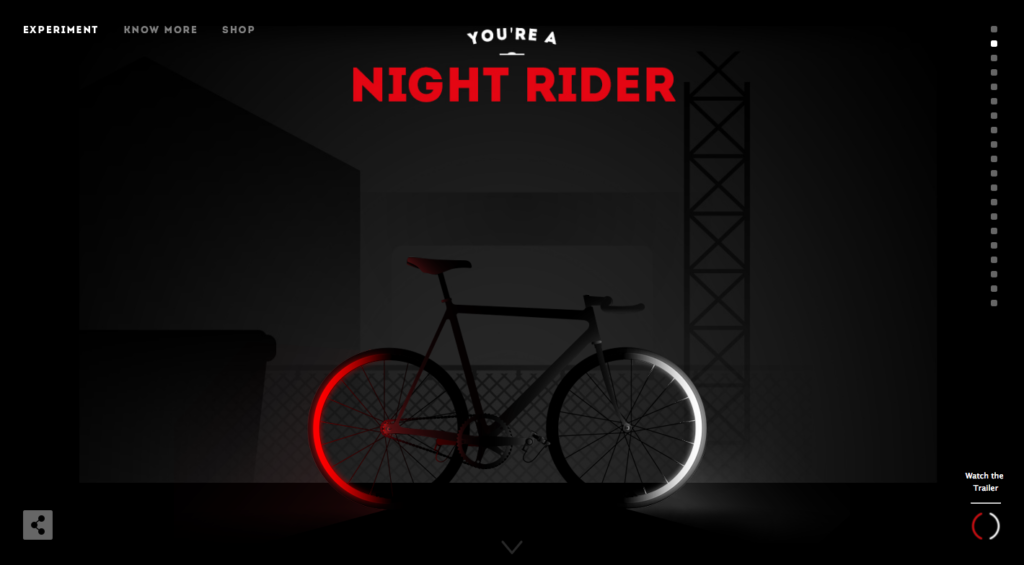
This bike shop’s website is cool because it creatively cycles through the bike selection as you scroll. As one bike enters the line of a new background a new bike appears instantly with a new title and scene. This is a great way to scroll through bikes while still being able to navigate using the navigation bar that stays at the top of the screen.
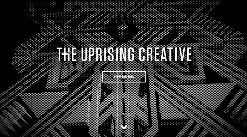
http://theuprisingcreative.com/
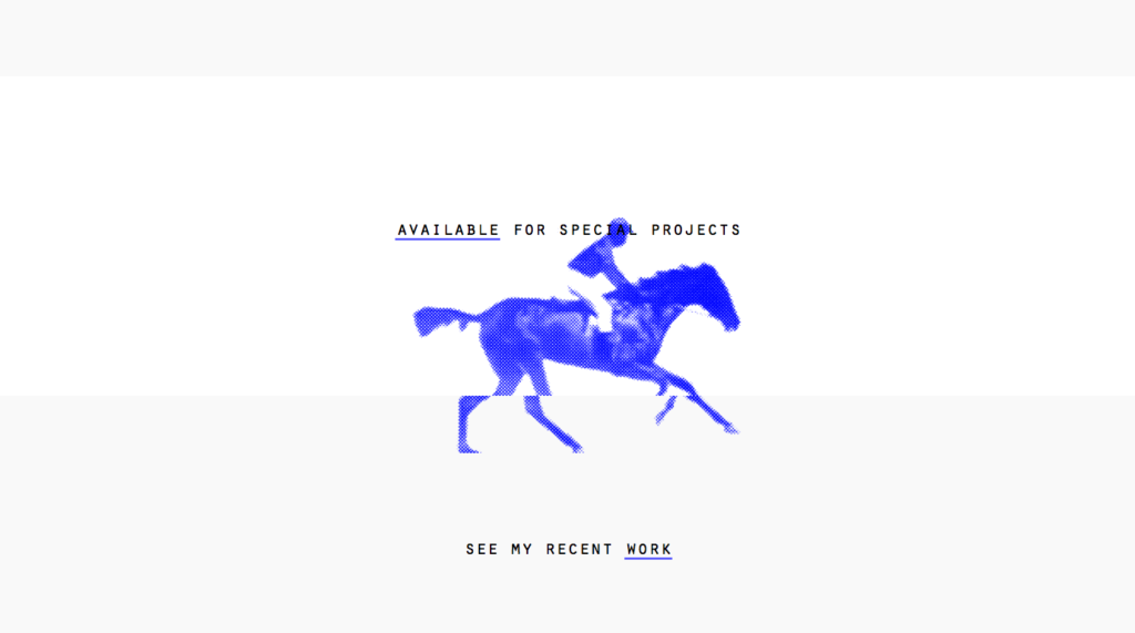
I like the use of animation used in this site with the demo reel as the first thing you see. The navigation after that is fun because when you click It animates into the next page. The simple black and white logo glitches when you move your mouse which I though was a cool way to engage the user.
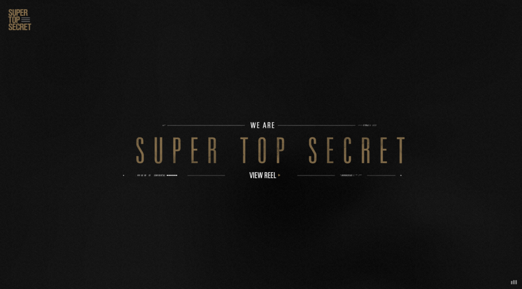
http://www.wearetopsecret.com/
I like this website because of its great use of motion. The user interaction is shown when you mouse creates ripples in the back ground. The images wipe as you scroll and it is again accompanied by music. One of my favorite websites out of salt lake city.
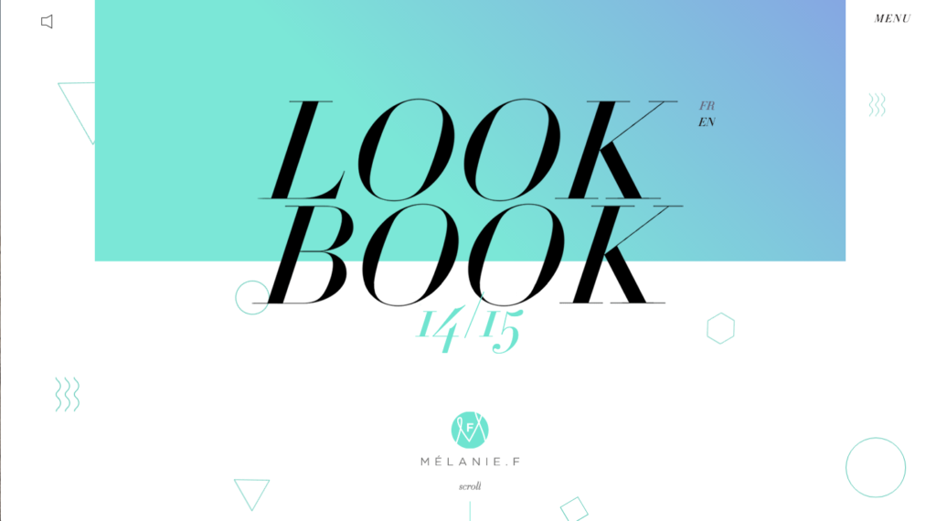
melanie-f.com/en/
This site is so cool! It introduces you with a “look book” animation that is accompanied by a soundtrack. As the user scrolls, the images slide very pleasingly and a new animation is presented when scrolling to a new product. The use of motion on this is incredible and I found myself becoming completely enthralled.
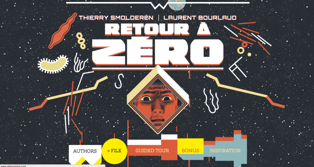
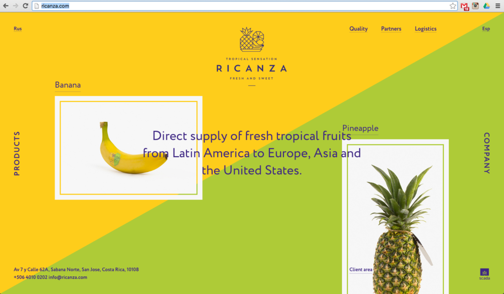
Ricanza.com uses color and movement to add interest to the few items they have listed. As the user scrolls the colors change with each product shown. When you hover over a product picture, the text overlay then goes behind the image to emphasize what you click. The separate product pages add a 360 featured image with info on origin and availability. I love the use of color and space on this site.


http://www.signesduquotidien.org/
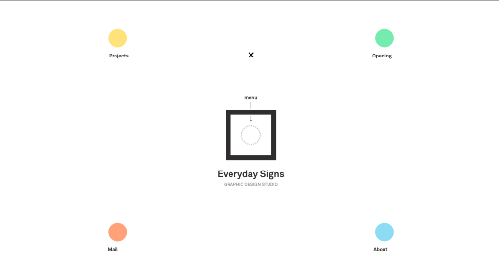
The user interaction on this site is phenomenal. It starts by welcoming in you and literally makes you think “outside the box,” as you drag the page you wish to visit into the box outline in the center of the screen. It this animates into the page you selected. Very cool.
