10 Exceptional Photographer Web Portfolio Sites
Student Guest Post Author Info
Student Bio: Danie B
Student Website: Website
Student Bio:
Published Date:
http://www.mitchellkphotos.com/photography.html
Mitchell Kanashkevich’s web page is effectively done. Although a simple design, the background, a subtle black allows the color pictures to really pop out from the screen. The web page is symmetrically done but with enough contrasts of colors the grid is anything but dull. Each photo album framed within the grid contains a description. The narrative gives a lot of character to the webpage without being obtrusive to the overall design.
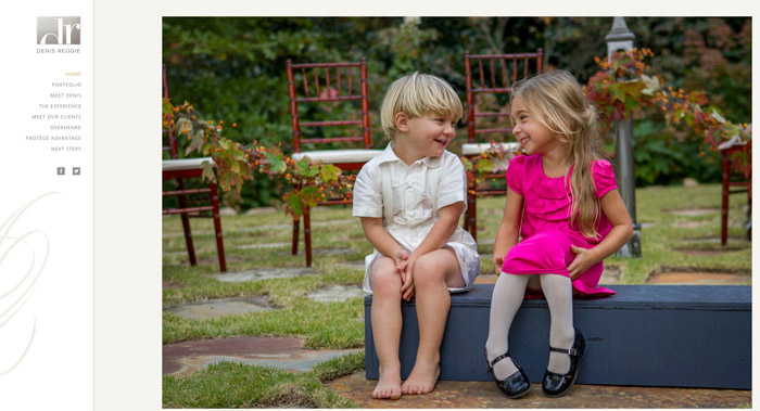
Denis Reggie’s overly simplified yet extremely stylish web page successfully captures every bride’s fantasy. The use of an all white background showcases bridal bliss. The oversized pictures rolling through a virtual album captures the attention and emphasizes the importance of each moment. The elegant sidebar flows the same through each page making transitions through the links simple and fluid.
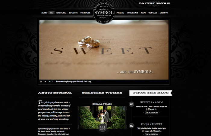
Symbol Photography’s web page is pleasing to the eye with the textured black background. Nicely centered is an embossed like logo that draws the eye to the links within the page. The font used is easily readable yet stylish. The framing of the gallery link with text gives it a nice juxtaposition.
The stationary background of cheapshotsllc.com web page makes the main page stand out. The contrast of the hot pink against the black backing is attractive to the eye. The barn wood background creates a pleasingly rustic feel.
http://www.martinlawrencephotography.com
The Martin Lawrence website is characterized by a relaxing monochromatic themed background with faint clouds focusing the viewer’s eye toward the central photo. The landscape-oriented photo is the perfect complement to the overall design.
http://www.tomtillphotography.com
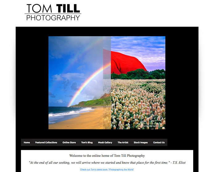
The Tom Till Photography website is simple yet pleasant. The black and white background of the site emphasizes the vibrant colors of the photographs. The phasing of one picture to the next through the virtual album is a subtle yet focusing transition that is pleasing to the eye.
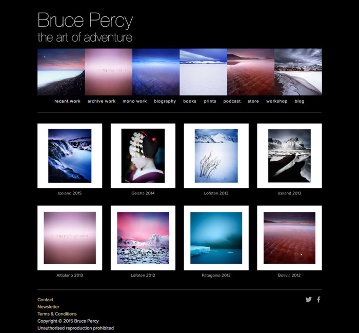
The Bruce Percy website is emphasized by the pure black background. The crisp lines created by backing the central photographs on white draws the viewer in. The location of the page links between two sets of photos ensures that they are within the focal area of the site.
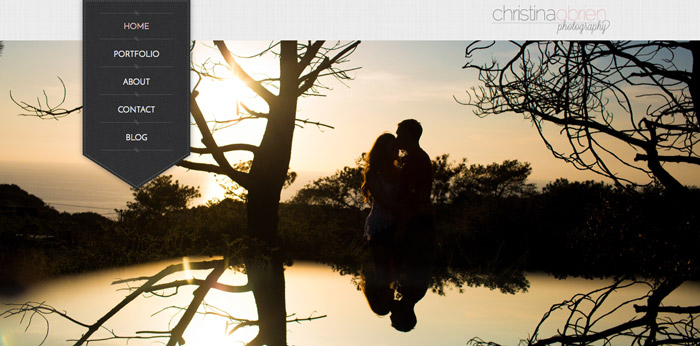
The Christina Obrien website has a harmonious feel. The cycling virtual album keeps the simple style of the site from becoming boring. The textured off white background and bookmark type link bar evokes the feeling of a photo album.
The Clayton Bozard website has a pleasantly understated quality. The white background and minimal writing on the page allows the viewer to focus entirely on the photos presented.
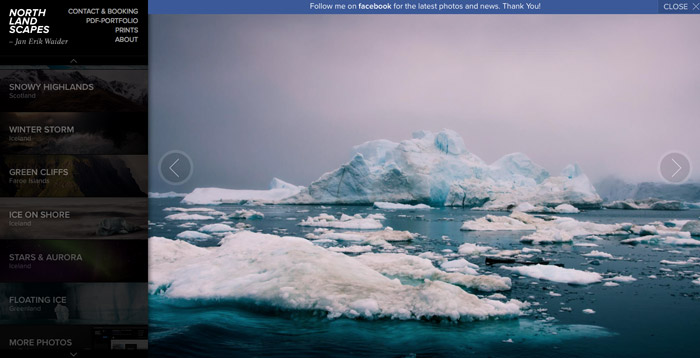
http://www.northlandscapes.com
Northlandscapes.com is a striking website. The black background offers contrast for the featured photographs. The grayed out images on the navigation bar offer character to the menu while not distracting the viewer from the main photo on the page.

