10 Inspiring Sites Using Illustration Design
10 Inspiring Sites Using Illustration Design
1. The Pixel
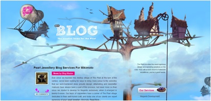
The Pixel utilizes rich colors and whimsical illustrations to draw the viewer through the page. The illustration also serves to break up the blog posts and provide a consistent theme to all icons and colors used on the site.
2. The Society Inc.
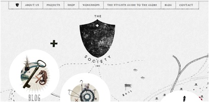
Breaking away from what is traditionally thought of as illustration, The Society Inc. uses a mix of photography and sketches to represent the different icons that visitors can click on. The sketches also help direct the visitor through the page and makes it feel more like a discovery process than typical websites.
3. Savoura
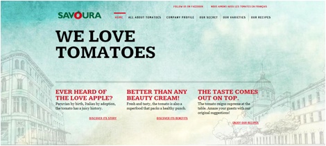
Savoura takes what could be a boring topic (tomatos) and uses subtle illustrations in the background to add interest to their website. Each page of the site has a new illustration to help differentiate between the topics being covered. I especially like how the illustration don’t overpower the information being presented.
4. Fixate Web and Design
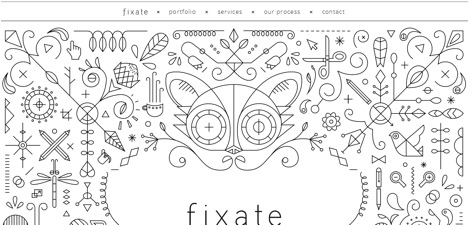
Fixate is a great example of how illustrations can be effective without using color. The simplified geometric shapes are also used as part of the navigation. They also appear in the actual products created by company.
5. Carbonica
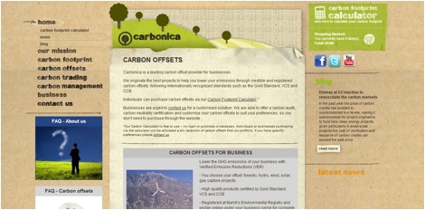
This website uses simple vector illustrations and textures to give the page an organic, earthy feel, which ties in well with the environment-conscious theme of the site. The textures also appear in the text and in the navigational icons.
6. Hull Digital Live
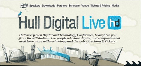
Although the use of color is limited, it works well with the illustration style to draw the eye through the page. The sketchbook feel to the illustrations is consistent throughout the site and uses repeated shapes and angles to be more visually appealing.
7. Sensi Soft
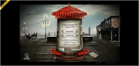
Sensi Soft uses a mix of CG and traditional illustrations to create a virtual world within their site. This world uses elements of a WWII era theme to direct the user through the page. The theme is also incorporated into navigation icons.
8. Babel
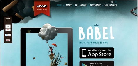
The illustrations on this site mimic traditional soft pastel illustrations, giving the page a light and airy feel. One unique aspect of these illustrations is how they overlap the text and navigation areas, which helps to tie the whole layout together.
9. Los Colores Olvidados
http://loscoloresolvidados.com/
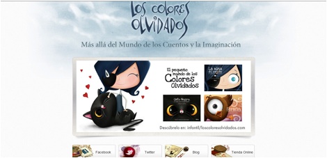
This site uses a unique illustration style and muted colors that match the subject matter. The illustrations are also mostly contained within boxes rather than being used in the background, which makes it easy to navigate.
10. Luhse Tea
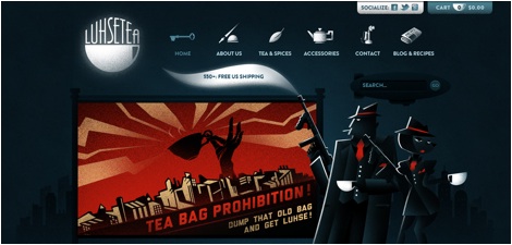
Luhse Tea uses vector images and textures to create a 1930s style feel to their illustration. The navigation icons also fit this style and are easily understood. They use the illustrations to project a certain message about their produce.