10 Great Samples of Illustrative Web Design
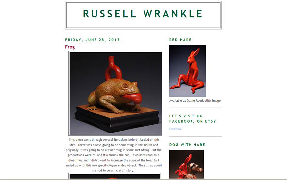
http://toquervilleclay.blogspot.com/
I think for just being a local artist, this is a very good sight. The white space helps bring out his work to the viewers’ attention. The lay out of the sight isn’t too much, I feel like there is a good even balance on this sight.
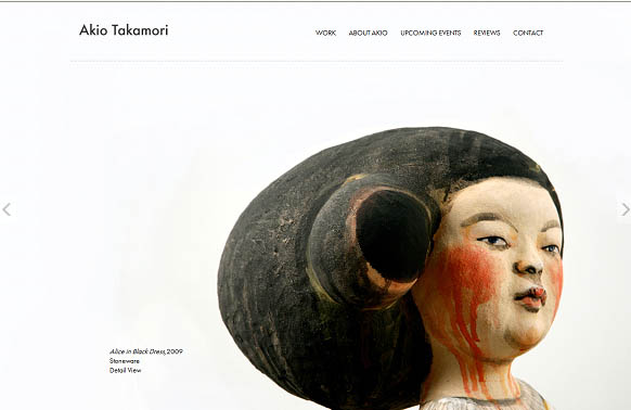
I love this sight, maybe is because of the artist work. But I also really like that the sight is very simple and there is not a lot to the sight. But the artist work, works great with all the space around it.
I think that this is a very simple sight and there is too much space. For this artist I was excepting him to use more of the space on the first page. But I just hate that there is so much open space.
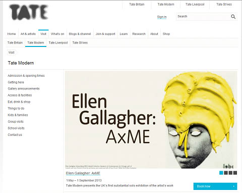
http://www.tate.org.uk/visit/tate-modern
I like the white space on the Tate Modern sight because it kind of has a repetitious look that move the views eye from the top left down throw the sight. But I kind of think also that there might be to much white space.
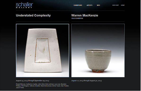
http://www.schallergallery.com/
I like this sight just because is it very clean and easy on the eyes. It is very simple and make the artist work the main focus here.
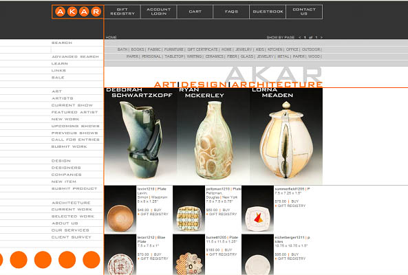
I think that the AKAR sight is very clean and makes the artist work pop out of the page. The sight make the work stand out more than the sight does.
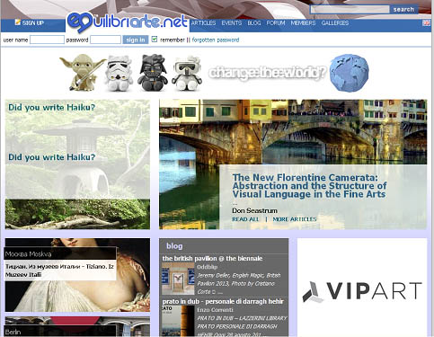
I like the white space in Equilibriarte because the different parts of the sight are broken up. It makes it easy to navigate around the sight.
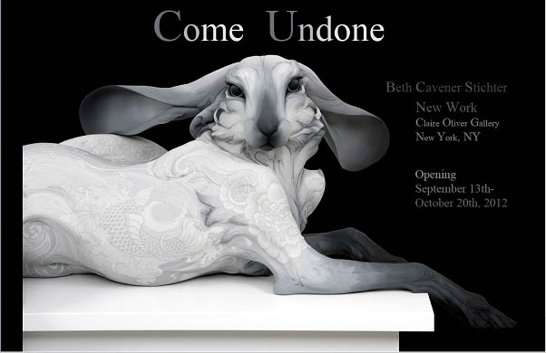
http://www.followtheblackrabbit.com/
I really like how they use the space on this sight. This is one of my favorite sights just to look at. It is very simple, clean, and I feel that that space is very well used. I like the balance between the black and white. This is a very clean and organized sight to me. Also tell you exactly who, when, and where this show is going on.
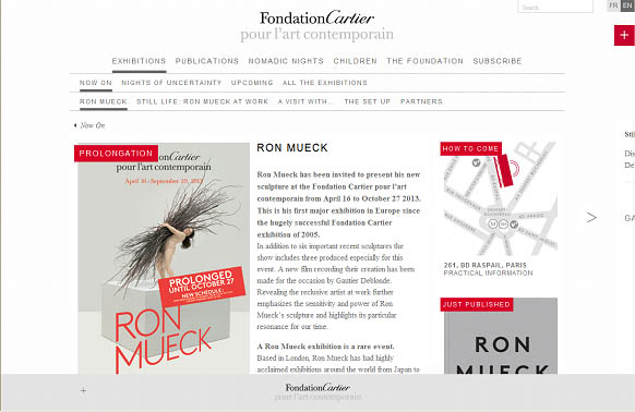
http://fondation.cartier.com/#/en/art-contemporain/26/exhibitions/866/now-on/862/ron-mueck/
I like the colors in this sight, the space helps everything come together and is very orderly. The only thing that bothers me about this sight is in the top corners. I think that there could be something done about that space.
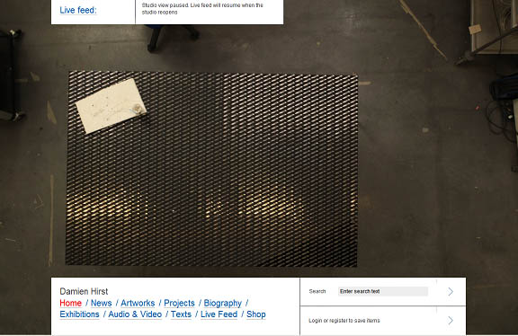
This is Damie Hirst, I think the only other thing that you could do with the space, is have one of his images of a dead cow or something that would make the sight a little more interesting.