Ten Websites That Use Web Animation
Student Guest Post Author Info
Student Bio: Kevin Bushrow
Student Website: Website
Student Bio:
Published Date:
Bioshock
http://www.2kgames.com/bioshock/ps3/us/launch.html
Bioshock is a video game created by 2K Games. Probably one of the best video games I have ever played, and the website fits the game perfectly. The menu is located at the bottom of the screen with all the options being Flash based. The best part of the website is the mini video game style movie that is above the menu. You can use the arrow keys to walk down a path, and the path has more menu options along it. Really great concept for a video game website.

Toyota
http://brandstudio.ru/works/screensaver/
This is another website for Toyota, but this one is more of a screen-saving website. Its sole purpose is to tell you that a new Toyota appears every five seconds in our world. They do it by giving you a clock on the screen, then after five seconds a different type of Toyota is animated and drops down, then drives away.

Volkswagen
http://www.volkswagen.co.uk/technology/rollercoaster
This website is for Volkswagen. It’s built to tell you about some of the features that come on Volkswagen cars, but it does it in a unique way. You are basically riding a roller-coaster that has 4 or 5 menu options to choose from. Select one of the options and the roller-coaster will take you on a tour through that subject. Each subject has a different style of roller-coaster. This is another great way to tell people about your company because you want to see what the roller-coaster is going to look like and how it’s going to react.

Cheese And Burger Society
http://www.cheeseandburger.com/
This is one of my favorite websites because it has recipes for cheeseburgers. These guys take their site one step further than just having a boring scroll-for-recipe website. They put all the recipes into a Rolodex so you can jump from recipe to recipe with ease. The Rolodex reacts just like a real one would. Great website full of great burger recipes.

Theologos House of Jewelry
http://www.theologos.gr/en.html
This company probably has the best website for jewelry out there. The whole website is pretty much animated with hovers, selections, and page transitions. It’s a very clean website, almost surreal feeling. The menu is made up of five flowers with each flower representing a different reason on why someone might buy jewelry. Find the reason you are buying jewelry and select that flower. The page will have a nice animated transition to show everything they offer that fits that emotion.

Bioshock
http://www.2kgames.com/bioshock/ps3/us/launch.html
Bioshock is a video game created by 2K Games. Probably one of the best video games I have ever played, and the website fits the game perfectly. The menu is located at the bottom of the screen with all the options being Flash based. The best part of the website is the mini video game style movie that is above the menu. You can use the arrow keys to walk down a path, and the path has more menu options along it. Really great concept for a video game website.

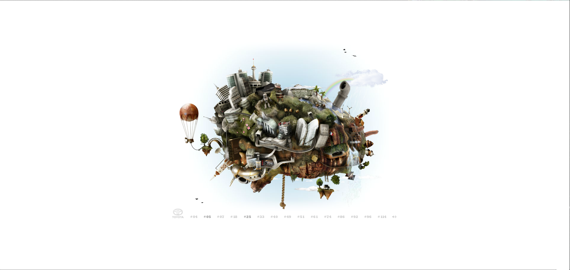
Toyota
http://demo.northkingdom.com/ihuvudetpatoyota/index_en.html
This website is for Toyota, but it’s only to give you information about Toyota. There’s this cluttered world in the center of the page that has lots of animations built into it. Hovering over sections of the world you will see little red arrows pop up. Clicking on those arrows will give you a little piece of information about Toyota you may not have known. I think this is a great way to inform people about your company because it makes people want to keep clicking on things just to see what happens next.
SensiSoft
SensiSoft is a design firm that is trying to take website browsing to the next level. Their website speaks for their work. Each page on their site represents a different city and time period. The home page is based around London 1880, where as the Contact Us page is based around Tokyo 2030. The information tower in the middle is where all the buttons and information are for the site while also acting as your guide through the different time periods. Really great idea for a website design because it makes you want to look around the site to see all the neat features of each page.

Monoface
http://mono-1.com/monoface/main.html
Monoface is a website that is Flash based. Its only purpose is for entertainment by letting people click on parts of a face to change that part. For example if you click on an eye, that eye will change to a different eye. Clicking on the mouth will select a different mouth. By doing this people can create their own unique faces and even save ones they like to a gallery. Pretty fun website to entertain yourself.

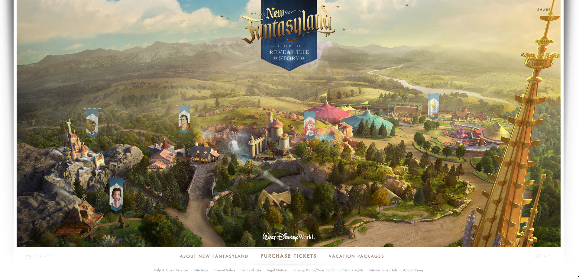
New Fantasyland
https://disneyworld.disney.go.com/new-fantasyland/
This website is for a new part of Disneyworld Theme Park called Fantasyland. I actually stumbled upon this website one night before bed. What caught my attention the most was the looping of the purple smoke around the banner at the top of the page. There are five flags for five different Disney Characters. Each flag is a link to tell you a little about the new area of the Disney Park that that flag represents. The flags themselves have a slight motion to them, but when hovered over, the flag zooms out and the motion reacts just like a flag really would. It’s a great site to get people interested in what Fantasyland is all about.