TEN EXAMPLES OF INTERESTING WEB ANIMATION
Student Guest Post Author Info
Student Bio: Alison Livingston
Student Website: Website
Student Bio:
Published Date:
TEN EXAMPLES OF INTERESTING WEB ANIMATION
by Alison Livingston
We have come a long way since the early days of three image gifs and scrolling rainbow text. Today, Web animation is sophisticated, sometimes simple, and sometimes chaotic. It is yet another tool in the belt of a well-rounded webmaster to capture the interest and attention of a user and perhaps lead them to buy, use or otherwise make contact with the product for which they are browsing.
Listed below are ten such examples ranging from minimalist animation, to full-blown web games.
1. Blue Acorn – blueacorn.com
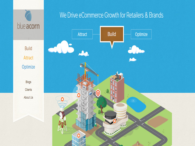
Incorporating a cartoonish cityscape along with a clean look, blueacorn.com has minimal, non-obtrusive animation elements. Tastes on the web have seemed to move in this direction as a post modernism approach becomes more popular. The clouds float peacefully by, the buildings have a little point which leads the user to certain elements of the company’s expertise
2. Denise Chandler – denisechandler.com

This whimsical portfolio follows the minimalist rules once more. Only a few elements on the page move–the roller coaster, the Ferris wheel. Letters glow when rolled over. This showcases the artist’s web design skills in a unique way. Click on her portfolio and each picture has a pop-up magnifying glass that invites the viewer to browse on.
3. Ba Ba Dum – babadum.com

Badum invites players from multiple languages and nationalities to play and learn common words and phrases via a fun, animated game which allows players to choose the correct word associated with one of four pictures. I particularly enjoy the artistic style employed. Each picture is done in an interesting way. As you click on the correct picture, a thumbs-up appears and pictures “pop” in and out in little clouds. The color scheme is interesting too.
4. Prospek – prospek.ca

Prospek employs what appears to be bootstrap coding to create a fast set of words which scroll across a screen at high speed, catching the users attention much like a commercial. After the words finish, we land on the main page, which is interactive. When one scrolls over pictures, pictures change and fade in and out. This is a more modern example of moving (or changing) elements on a page sometimes employed in animation.
5. Lowdi – lowdi.com

Lowdi has very minimal animation elements, unless you can count the video that plays when you press the big black triangle. The only animation employed on the front page is the “Lowdi” logo at the top. This calls attention to the brand name without annoying the user with too much movement.
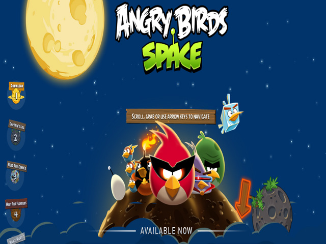
6. Angry Birds Space – angrybirdsgames.com/games/angry-birds-space
Of course games take up a large part of web animation space. This one takes quite some time to load (about 20 seconds, which could mean a week in web-time) but the general game play and animation elements make up for the initial wait. Users are treated to their old angry bird friends, this time launching them across the void of deep space. In-page games can be a great way for users to keep coming back again and again to your web site.
7. Anna Safroncik – annasafroncik.it

This particularly clever portfolio takes a second to load but once it does a pop-up circle of the main logo appears, then disappears to another point on the page, after which the main image appears. The upper menu shimmers when scrolled over and if an option is selected, the page jumps to an auto scroll down toward the information sought after. A very sexy design.
8. Tim Burton – timburton.com
Explore the weird and dark world of Tim Burton using his gaunt-eyed little friend. Click and wander through a mansion which holds Tim Burton’s accomplishments, news and extras in each room. This website is visually interesting and fun to play around on but I found the navigation speed cumbersome. One literally had to walk down hallways and click through doors to see the next thing. In this fast age, I am not sure how many will stick around for that. There is no way to skip ahead and see anything more quickly.

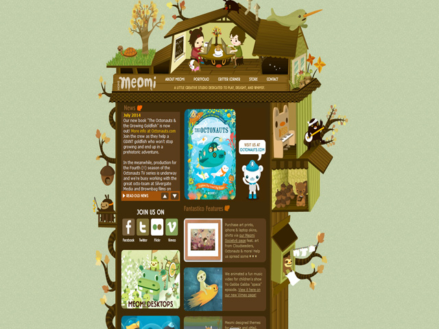
9. Meomi – Meomi.com
One of my favorite websites which employ animation. It is part portfolio, part news reel about a pair of artists responsible for the Oceanauts, a children’s show. When you scroll over the creatures on the tree house, they each do a subtle action. Sometimes there are sounds to each action, which will delight children and amuse adults. The site leads naturally to the artists portfolio, screen savers and store in which you can purchase their art products.
10. Black Negative – blacknegative.com
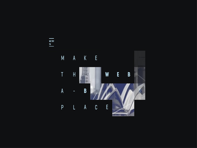
A beautifully and most fascinatingly designed website. This portfolio takes you down the rabbit hole. Each time you scroll to the right, you are treated with a different page which interacts using different rules. The page pictured above uses mouse trails to reveal a movie behind the darkness. On another page, the text goes wonky when you scroll over it as little monsters play behind a couch. Another page invites you to make the circle curser line up with other circle cursers to create the idea of “focus”. Although the design is interesting, at times its spectacle gets in the way of its message.
CONCLUSION
There are many ways to use animation in web design. Whether you want to draw attention to a certain element, or dazzle the user with your skills as a designer, a multitude of messages may be conveyed. No matter if a game or in a menu, in all cases, the animation’s overall design makes it shine.