Negative space in Web Design
Student Guest Post Author Info
Student Bio: Sandra
Student Website: Website
Student Bio:
Published Date:
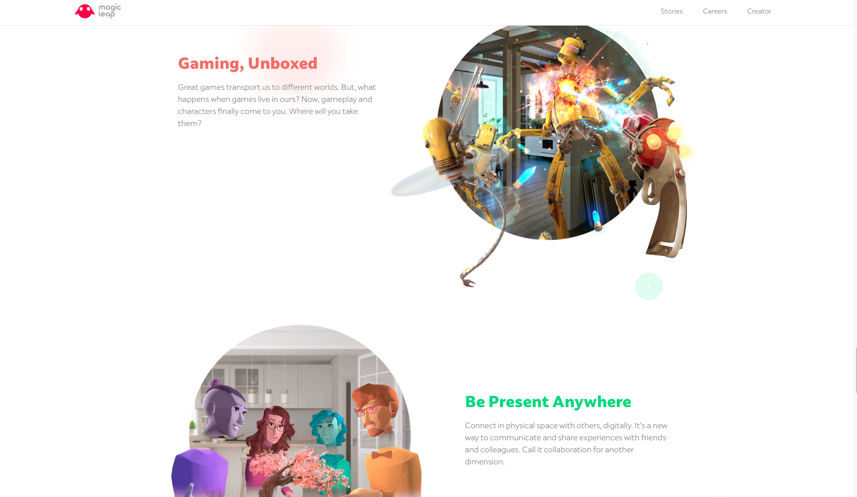
I thought this was a great example of negative space. Magic Leap was not afraid to use negative space in their design and it worked for them. As you scroll down the bubbles pop up with little descriptions to the side, this is a repeated design throughout which is nice and simple. Negative space also draws the attention into the great illustrations they have.
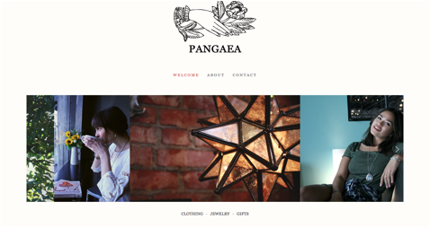
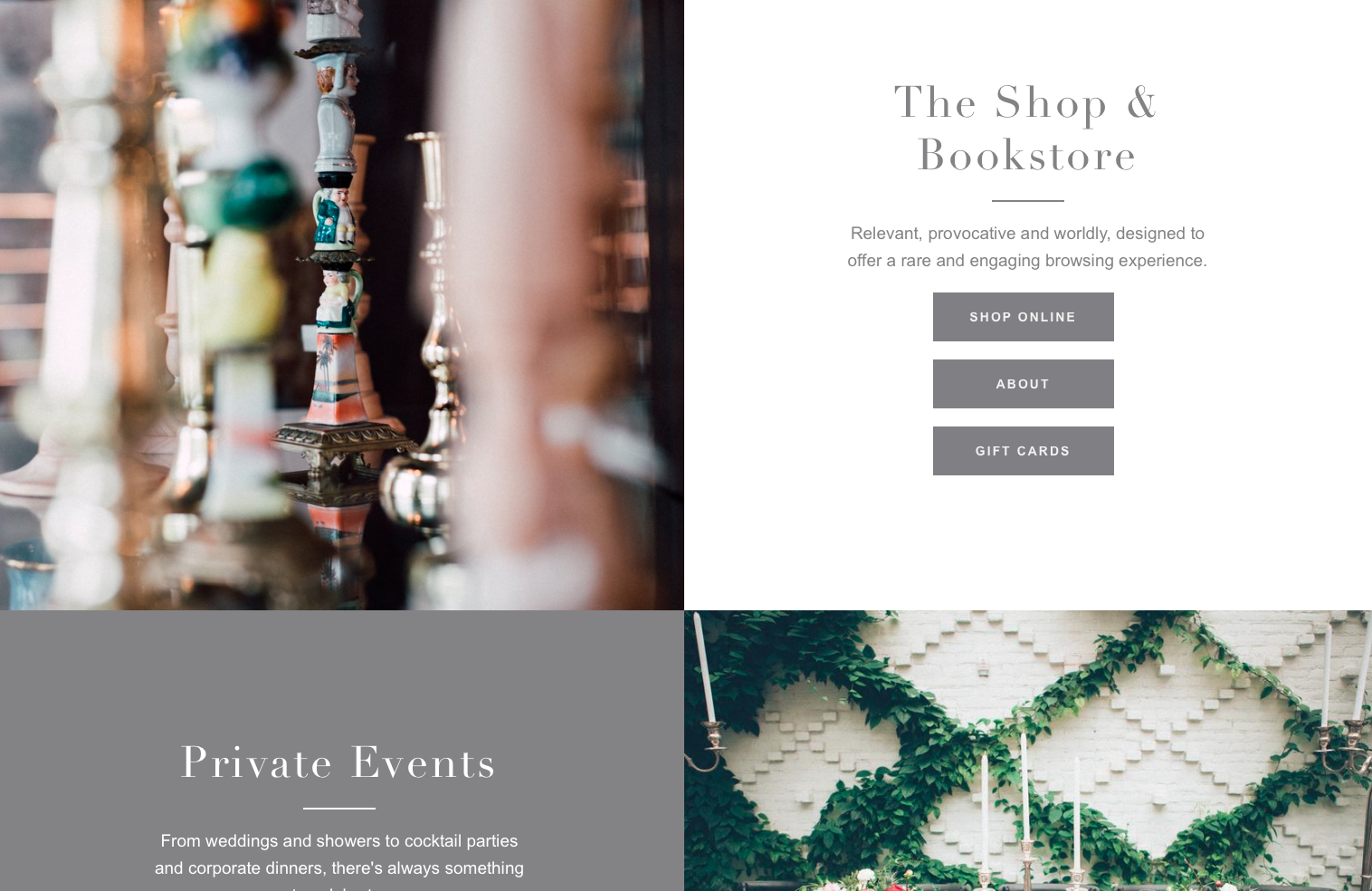
http://www.pangaeanashville.com/welcome/
The Pangaea website made their design simple and straight to the point. With a minimalistic approach and tons of negative space in this design. This website also brings in the attention with the contrast against the white background.
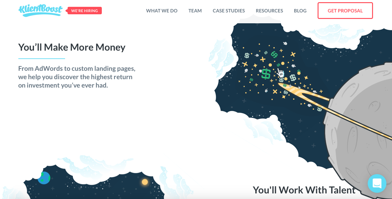
KlienBoost was one of my favorite websites. I thought it was really creative on their part on how they used the negative space as clouds. It created a great visual and nice contrast from the deep blue color they used to represent outer space. I spent quite a bit of time on this one because it inspired me and motivated my own creative mind.
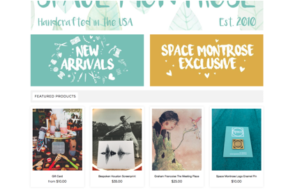
Space Montrose’s website was one of my favorites to look at because the did a great job, not only with the layout of their website but also added creative designs and more artwork to it as well. Like their “New Arrivals” and “Exclusive” tabs. I believed they used negative space in a very effective way.
This was another website that I enjoyed scrolling through. Its unique design is both appealing and eye-catching. Bringing attention to all the right places. The photos of the products are very appealing against the white and grey. This is a very well thought out design.
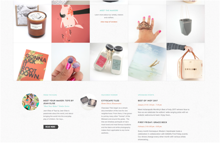
This website caught my attention because they used negative space in not only their layout design but in the pictures of the products as well. Although this takes up more space, it draws the eyes in towards the products, with the descriptions underneath as well.
This website is quiet unique as well. They took a minimalistic approach, with vibrant pictures and a motto that says “the less words there are the better.” It still has all the information needed, and is very easy to navigate through. With stunning pictures in the surrounding negative space. They also stayed consistent throughout the page.
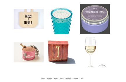
http://www.thelittleapplestore.com
This website as a title that is front and center, which reels in the eyes. As well as colorful pictures of products in the white background, that catches the attention of the viewers. Many sites have taken minimalistic approaches to the designs and this one is no exception. I like the interaction that happens when you hover over a photo. Giving more info on something, without taking more space up on the visible screen.
If you thought the pervious designs were minimalistic, wait until you see this one. With there logo front and center, and that’s about as far as it gets for the main home page. It has titles and links for different information. It even has a virtual walk though tour of the place. I like this design though. Very interesting.
This website keeps it simple and consistent throughout. It shows appetizing pictures, with white text. The red text is to catch the attention, and finally a complementing green for the price. Although it isn’t a crazy creative design, it works well with the product is it that they sell. The Dark chocolate looks even richer with the negative space around the pictures.
