Minimalistic Website Design
Student Guest Post Author Info
Student Bio: Anastasiya Bobrova
Student Website: Website
Student Bio: Graphic Design student from SLCC with a love for lettering and illustration.
Published Date:

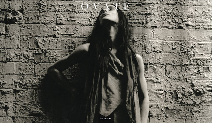
This website excels in minimalistic design because the essential content is concentrated in a simple column with links. The design of this page relies directly on the graphic black and white photograph that is used as a background. This creates a dynamic visual effect due to the diagonal, industrial lines and high contrast.
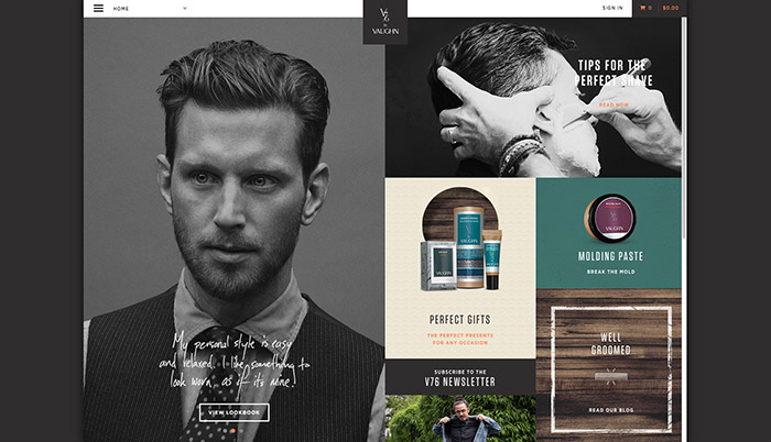
This is a website for a clothing company and the designer’s aesthetic is carried out in the way the page is set up. The design uses elegant font and a dynamic picture to interest the viewer and has an easily accessible tab to locate the functions within the website.
This design isn’t as literal in the “minimalistic” quality because the site uses quite a few aspects to create the experience. However, I believe that it is minimal and industrial in the design of the components and the organic flow of the content within the website.

This website is also used for clothing/accessories and it captures the idea of minimalism beautifully. The seamlessness between the product photos and background is an excellent touch along with the “hover over” which displays the product information. It may not have been a minimalistic effort to create the aspects used by the site but the end result is crisp and elegant.
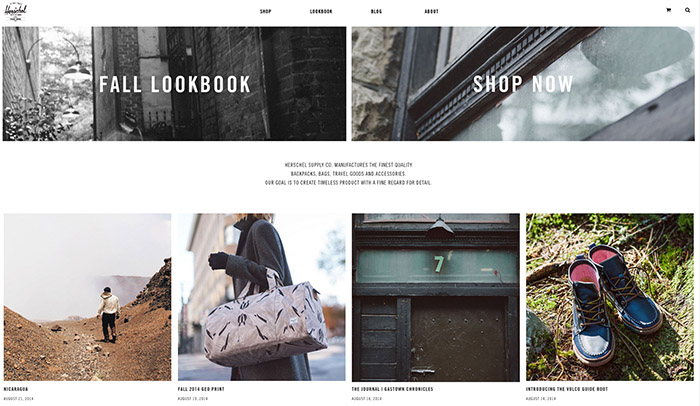
Another apparel webshop, Herschel has a design heavily focused on photos and images to display the aesthetic of their product. Simple navigation and scroll-over effects make this design clean and vibrant. The use of basic shapes as image boxes carries your eye and uses minimalistic design to create a strong impression.

This is a website for a new pocket breathalyzer. The concept is very modern, relying only on photography to draw in the customer. It is definitely not the most user friendly, I had to click on a few random spots before being taken to a different page to view the product but essentially this is truly minimalistic, using only one visible element of design to grab your attention.

This is the website of a graphic designer, and it shows. The design is very bold, and simple, again heavily relying on well-produced photos to bring the viewer in. It is engaging and self-explanatory which makes it a good example of minimalism.

I was really happy to see that one of or local magazines had such a good-looking website. It has definitely changed since the last time I viewed it and it has gone to the bolder, simpler, cleaner direction, and for the better. Again, great use of elegant typography and thoughtful layout really showcase the minimalistic element of this website.

This is an online publication and they put forth the effort to make a bold statement in a very minimal way. Like the reoccurring theme, we see here heavy use of graphic photography, simplistic typefaces, and easy navigation.
This website really drew me in with it’s color scheme. It is easy to appreciate the clean lines of their products because it is mimicked in their website design. Again, very straight-forward, elegant, with a heavy focus on design and simplistic approach to content like links.