10 Websites Using Brightly Colored Web Design
Student Guest Post Author Info
Student Bio: Brianna P
Student Website: Website
Student Bio: Web Design Student
Published Date:
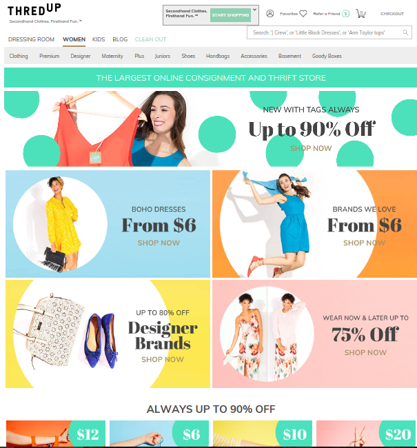
Thred Up uses a lot of bright colors. The colorful layout gives this website a bright, upbeat, happy vibe. The colors are bright, but not over the top. I liked how they used several colors that blended together nicely.
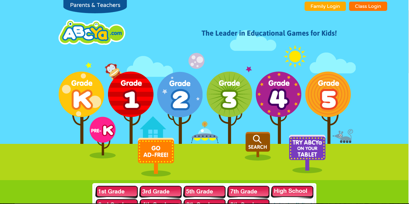
ABCYa used a variety of bright colors. The website instantly gives you a playful, fun vibe; which is great considering that it is a website based around children and education. This website definitely makes learning look appealing to kids due to their choice of color.
3. http://www.childrensdiscoverymuseum.org/
Children’s Discovery Museum is another website meant to appeal to children. This website uses a mixture of bright and more subtle colors. The sun and rainbow are the brightest objects on this page and definitely add a lot of character.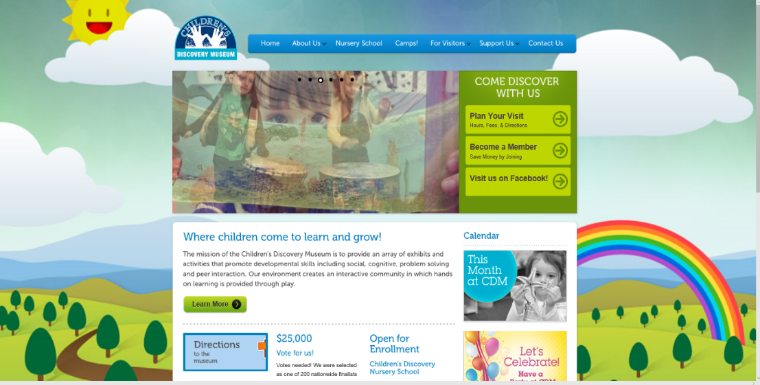
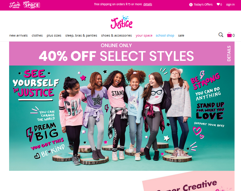
4. https://www.shopjustice.com/
Justice is a website dedicated to selling pre-teen girls clothing. This website used a lot of vibrant pinks. The usage of pink gives this site a girly vibe right off the bat. I liked how they used a teal/blue color in the background; it helps make the pinks stand out more in my opinion.
Scholastic is another site centered around children. As you can see, they use a lot of bright colors. I like how they used different variations of blue. I think the bright red and bright turquoise really make this page pop and give it a child friendly vibe.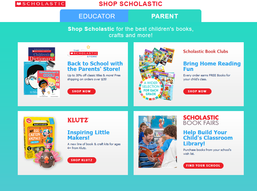
You Grow Girl is a website/blog about gardening, food etc. The color scheme is a little bit more calm than my other examples, however the bright colors they did use really made it pop. I liked the colorful arrangement of plants at the top of the page. The color of the plants automatically give you a happy, welcoming vibe and let you know that the page has something to do with plants.
7. http://www.festivalofcolorsusa.com/
Festival of Color is a Hindu Celebration welcoming spring. As you can see the bright colors they used for this website definitely have a spring feel to them. They use almost no dull colors. **Note: The screenshot is blurry because the main images is actually a video.
8. https://www.ediblearrangements.com/
Edible Arrangements is a site you can order fresh fruit bouquets from. The colors they use feel very happy and give you the feeling of summer. I really enjoy their use of purple and yellow together.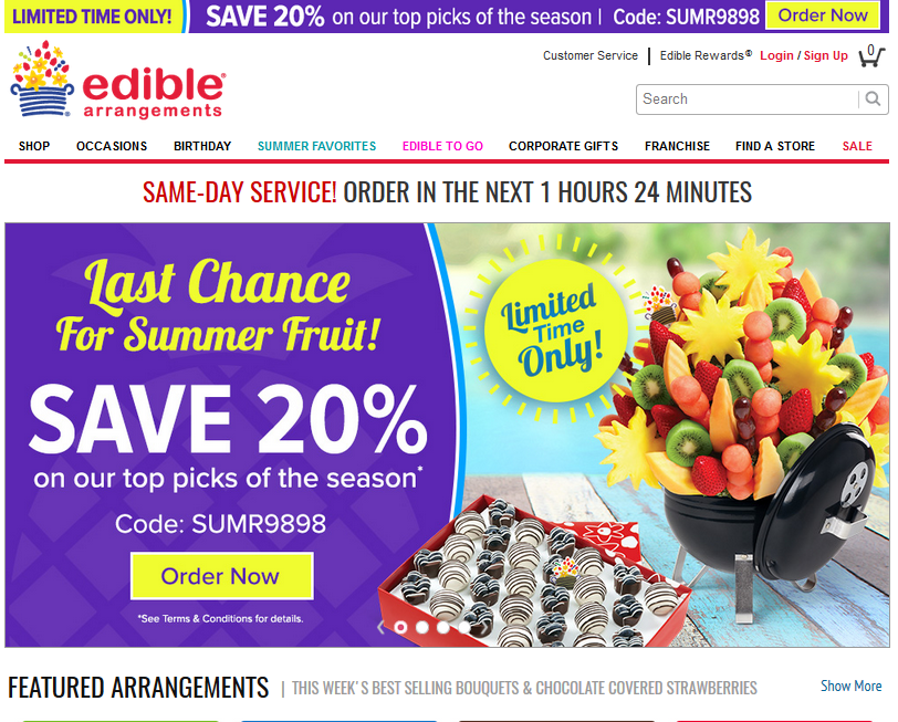
Jamba Juice’s website uses a variety of bright colors. The color scheme gives it a very fresh feel. I like how they used bright, yet warm colors (pink/red, yellow). I read somewhere that the use of reds and yellows make people feel hungry, which I can say applies to this site.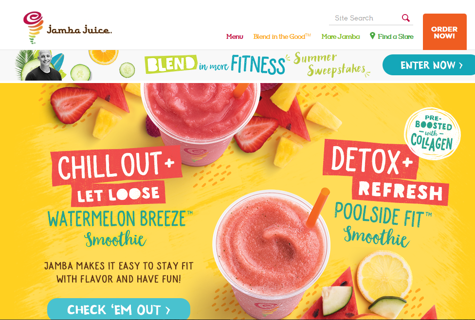
10. https://www.boondocks.com/
Boondocks is a family fun center. The use of color for this website gives it a very fun, amusement park like feel. The red on the word Boondocks really brings out the title. I think the colors make this page look very family friendly.