10 Unique Sites that Reflect Web Design White Space
Student Guest Post Author Info
Student Bio: Keawe Kali
Student Website: Website
Student Bio:
Published Date:
Square Enix (North America version)
https://na.square-enix.com/us/home
Square Enix’s homepage uses a very great deal of white space to help accentuate their updates, advertisements, and any of their beautiful images they have on the page. They make it quite obvious which of their subjects they want their viewers to notice (bigger than life image slider) and enjoy for a minute or more.

Lava Hot Springs
https://www.lavahotsprings.com/
The Lava Hot Springs website is interesting, but their use of the white space here has it feel as if it is moved forward. If looked closely at the top main banner that slides different images, you can see that the white space seems to be in front of it. The color red makes its appearance here to gain our attention on the white and the bold helps stand out but not as much. They have it layered down from what they perceive as important to the viewer when the text is concerned but the images are definitely standing out.

Ichijinsha
On Ichijinsha, the website uses the white space to present the images for their products greatly with the blue text standing out to let us know what the product is and underneath is lesser standing out price and under that is either a whitewashed text of whether they are out of stock or other. If they are lucky, the big blue button will be there to let the viewer put the selected item in their digital cart. The white really helps to bring out the blue that they use in this website.

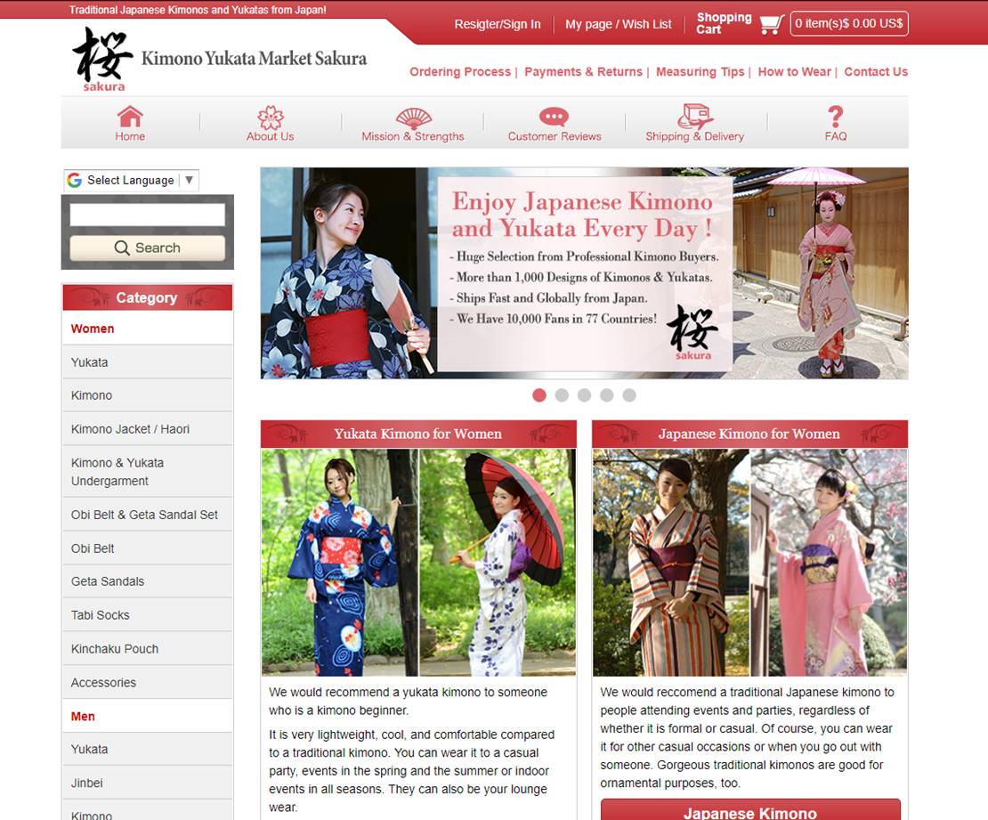
Kimono Yukata Market Sakura
https://www.kimono-yukata-market.com/
The Kimono Yukata Market uses the white space of their website in an endearing way. Using the way the reddish top bar reaches to both sides of space makes it feel comforting to me, could be because it is horizontal. With the red around, the black of their logo sticks out amongst the space. They use the white space to help frame their images but also to bring the white text among the red bars forward. This is a great contrast using the white space.
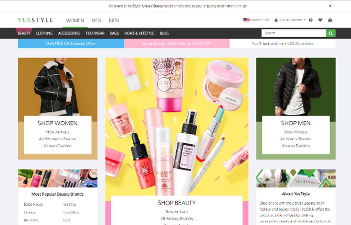
YesStyle
YesStyle is very creative in their use of white space. Here we see the use of rectangular action going on with images, BUT we have white space IN the images, the contrast is great. Going down, we see how they have almost reversed the idea, with the white space being the outline for the information within. The colors used with the white space makes feel as if they all belong on the website.
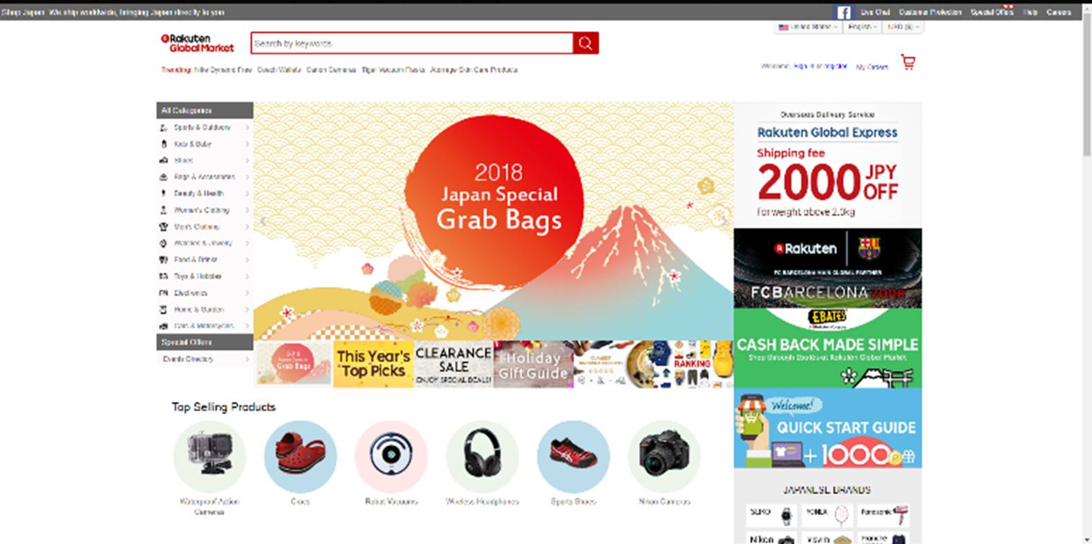
Rakuten Global Market
Rakuten uses the white space by presenting a lot of their text and images as floating in space. In a way to attract our attention, the color difference from using colored circles compared to no-colored circles directs my attention to what is most likely wants for attention, then to the grey circle then to none. Gave me an interesting path to direct my eye-sight.
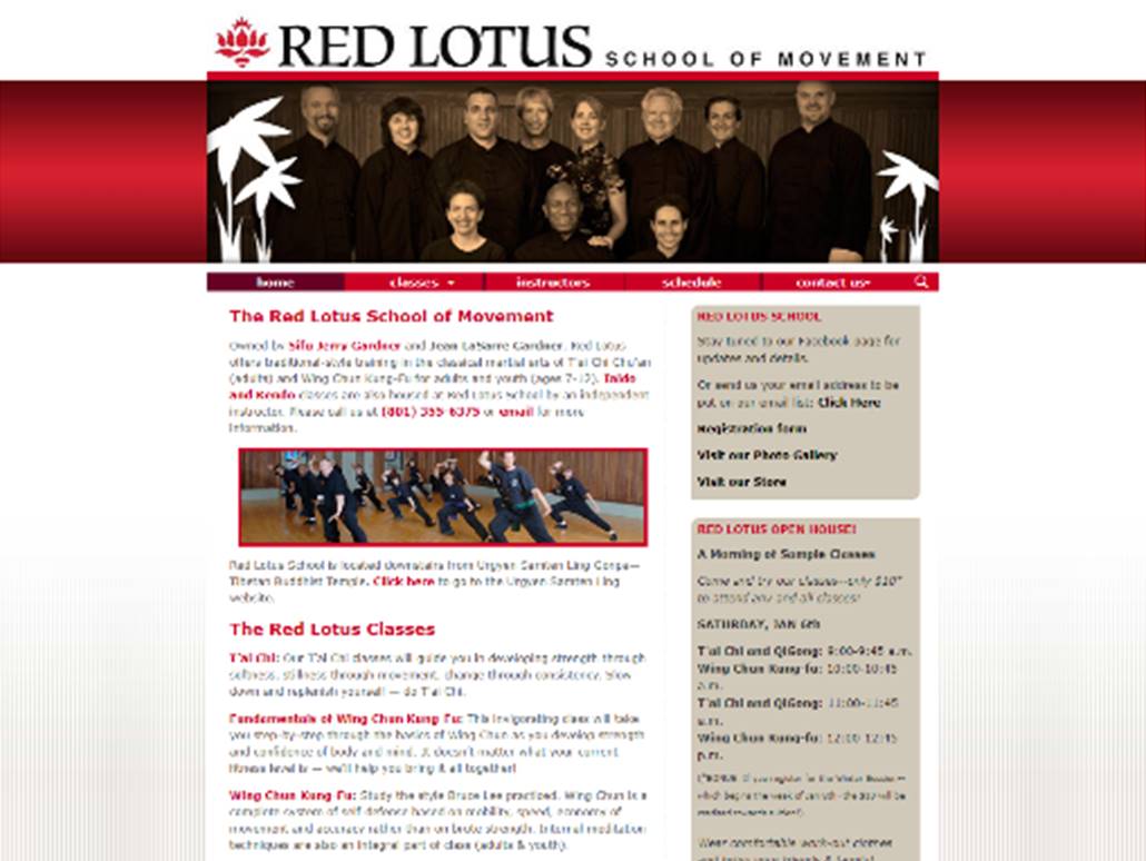
Red Lotus School of Movement
http://www.redlotusschool.com/
The Red Lotus School website definitely gives the feel of energy when the color red is used on the white space. It makes the images and the important words and contact information stand out. It’s simple and yet attractive, especially their logo on top. They use the white space to influence their main image as well with flowery images to help attract our attention from the contrast.
Nitro+Chiral
Nitro+Chiral uses the white space effectively, whether it’s from their logo in on top, the useful tabs to direct us (bonus points for the added English), a lovely highlight of a teal horizontal line to section off one white space from another where I would expect to find images to help catch my eye to whatever I would find the most interesting and therefore tempt me to click on it. Of course, after image usually I’d look at the text to see if it is worth my time or if it is teasing me. Aside from that, the updates are posted in the center with the white space giving more to the colored titles, like スタッフ雑記帳 (sutaffu zatsukichou = staff blog) if we are curious.

Etsy
Etsy uses the white space on their website to help pop out the images that present the products better. It helps draw attention to their orange logo and the search bar, a number one recommendation for a large database full of variety of products, and the warm images that draw in the our eyes. The text is, in my mind, optional to influence the viewer, but I do believe the images draw them in. The bold text on white helps attract what we would find important, such as the price.

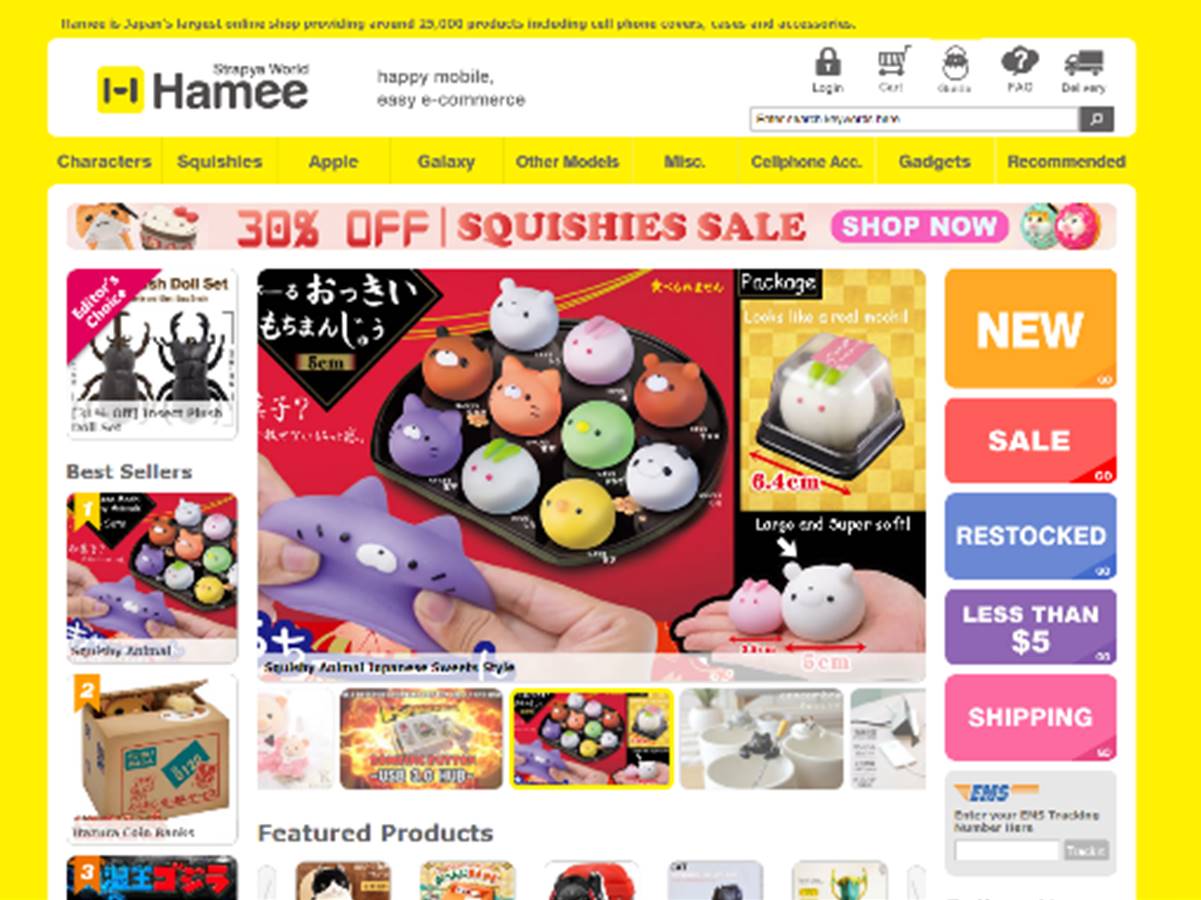
Hamee Strapya World
Hamee Strapya World uses the white space bring out their logo and important login access that a user can immediately spot. Then, by using the white space grab the viewer’s attention towards the products as a contrast to the heavy yellow background. In my opinion, it helps direct the eye from title, to main topic of our interest, then to the background accentuated tabs if we don’t find anything on the main page to our liking.