10 Sites Using Great Color

http://www.chiragjsolanki.com/
I like the jewel colors of this site on the chocolate background. This site is using a triadic color scheme.
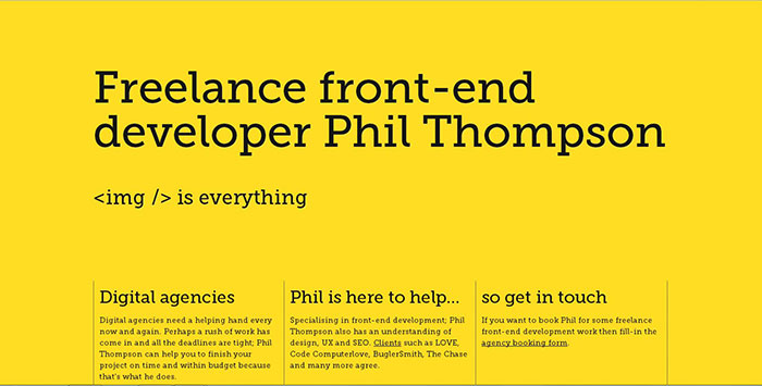
This site is using a monochromatic color scheme. A yellow background with black type is the most eye catching use of color, which is why it is commonly used for traffic signs. It’s not my favorite because it is very sterile looking.
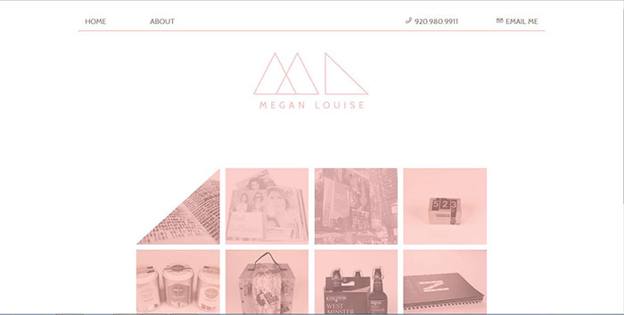
This site is using a monochromatic color scheme with pink. Using a color tint on the photographs makes the page cohesive and not one single element stands out from another. I like the simplicity and clean look.

This site is using color discord for the color scheme of the logo. I like that all the illustrations are in the same hue.
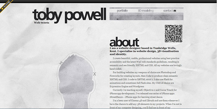
This site could be considered to have a monochromatic color scheme, but it is actually grayscale. The simplicity of it is nice. I like that he used a crumpled paper look for the background so it isn’t completely sterile.
http://simonspring.prosite.com/78171/work
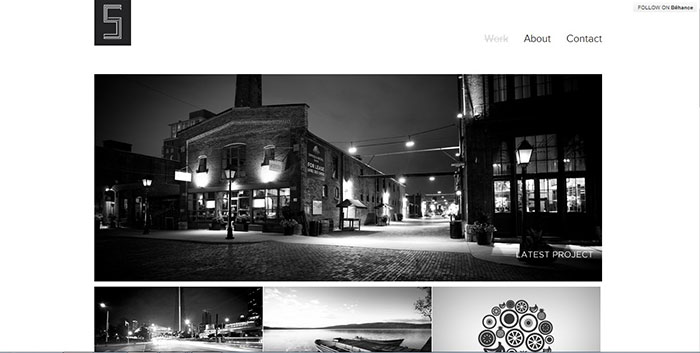
This site is all done in black and white. Keeping the photos and illustrations all grayscale gives it a more upscale look. Each element carries the same importance.

This designer was very clever with his home page. Keeping the “coder” side desaturated and the “designer” side artistic with color splashes shows his 2 personalities coming together. This is very creative.

http://www.andrewshanley.co.uk/
This site is essentially monochromatic. The image under the intro window is partially desaturated so it doesn’t take away from the images he has in the window. I don’t know that the color is all that dynamic, but I like the look of this site.
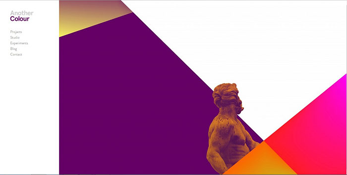
This is an analogous color scheme. Bright colors were used with a large negative space creating more emphasis on the figure in the middle. I like how bold it is.

http://www.imaginariacreative.com/index.html
This site is using an analogous color scheme with the orange and gold text in the background. I like the muted colors of both the image and the text.