10 Sites Using Color Usage in Web Design
Student Guest Post Author Info
Student Bio: Amanda Randall
Student Website: Website
Student Bio:
Published Date:

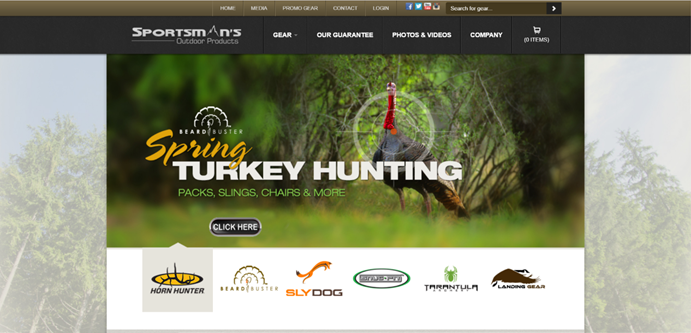
Horn Hunters use color to catch the eye. They use yellow and brown/black color to use some contrast. On the home page they have a slide thing that changes, and each one still catches the eye from being bright and having contrast.
2. https://sophuntinggear.com/
SOP hunting gear also uses color usage in web design. However, they use a different color. Their page has darker colors. They use more of an “outdoorsy” color range with greens and browns.
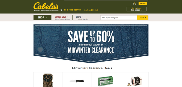
Cabela’s still uses color, but in a different way. The color on their site is in the Header, they use yellow and green. The page has color in other parts, but the main background is white. Cabela’s uses pops of color to catch your eye.

4. https://amrandall.weebly.com/
amrandall takes a different approach to using color. It takes soft, neutral colors to not distract you from the whole page. It is very simple with the light brown and yellow tones. With the lighter tones it makes the page calmer and not so poppy and drawing attention to it.
5. http://childhoodsecrets.weebly.com/
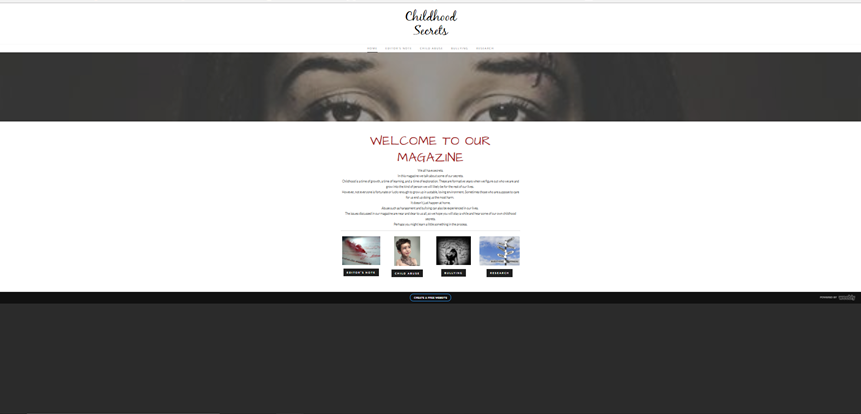
Childhood Secrets uses color in a different way. It uses darker tones to set a mood for the site. The darker colors make it appear sadder and that the site doesn’t have happy things. The pictures also bring that sad appearance to it too, the pictures are also darker and not bright, which bring the same mood as the darker tone colors.
6. http://www.slcolibrary.org/
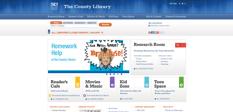
Salt Lake library’s page is bright. They use a bright blue as their main color. They then use different colors on the home page to represent different things. All the colors they use are bright and happy and catch the eye. With using different colors for different sections, it also organizes the site as a whole.
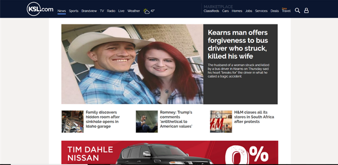
KSL is another website that has both color yet still has a lot of white in the background. Their theme is a dark blue and white. They use these color subtlety to focus more on the information they are giving.
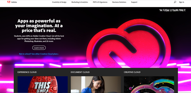
Adobe uses color in a really good way. Adobe has apps that you can be creative and make your own things. So, their theme is very artistic and colorful. It also uses black as an accent color that adds to the creativity.

Microsoft is yet another website that offers simplicity. Its mostly white, but still has some color to it. The color is a blue. They also have a large banner that offers different colors, mostly neutral colors that catch the eye.
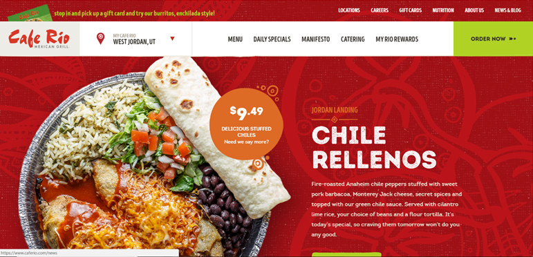
Last but not least I found that Café Rio’s site catches the eye with the very bright colors and background. They use pretty much every basic color and some. They make it look so good and inviting with how much color they have.