10 Nature Themed Websites
Student Guest Post Author Info
Student Bio: A. Bird
Student Website: Website
Student Bio:
Published Date:
I enjoyed the nature themed photography on this page mixed with design elements. Every pictures has something from nature in it. The page is set up in a grid layout and is easy to navigate. The typography is easy to read and I like how they alternated the stroke colors using their complementary color theme. I thought the teal and orange colors were a nice pop of color mixed with the neutral colors.

2. https://www.visitarizona.com/
I loved the layout of this site, I thought it was very user friendly and visually appealing. I enjoyed the slideshow and the visuals of the different destinations you could explore. There is a lot of information on this site and different things to click on but I feel like they did a great job of not making it too overwhelming. They kept their color palette neutral and let the photographs be the pops of color throughout the page.
3. http://www.absolutebica.com/
This nature themed website was so neat and so different than the others I looked through. The designer kept the same simple layout for the site but up in the right hand corner you have the option to change the theme. When you click on change theme you can choose if you want the site to be set at sunrise, afternoon, sunset or night. Everything stays the same on the page except the colors and the sky. I thought this was such a fun little element to add and made the site unique!
4. http://cleartheairchallenge.org/
This website was very simply laid out with contrasting white and blue as the main colors which reminds you of air which is what the website is about. I thought the way the site moved and flowed with the arrow pointing and numbers changing and the pictures moving in and out made it interactive and interesting. I liked how easy it was to read and navigate.
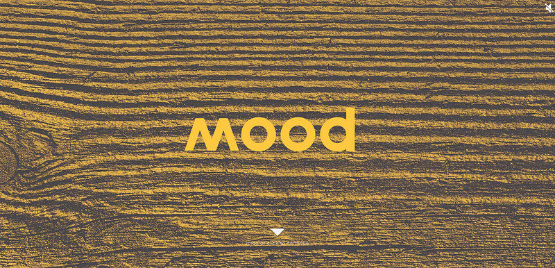
5. http://moodfurniture.com.au/
I loved the natural texture on this website. The typography they used for MOOD was great and you can easily see the word WOOD in it, I especially like down further on the page where they wrote WOOD in the same font and added mimicked the grain of the wood. They yellow, black and white were a good contrast.
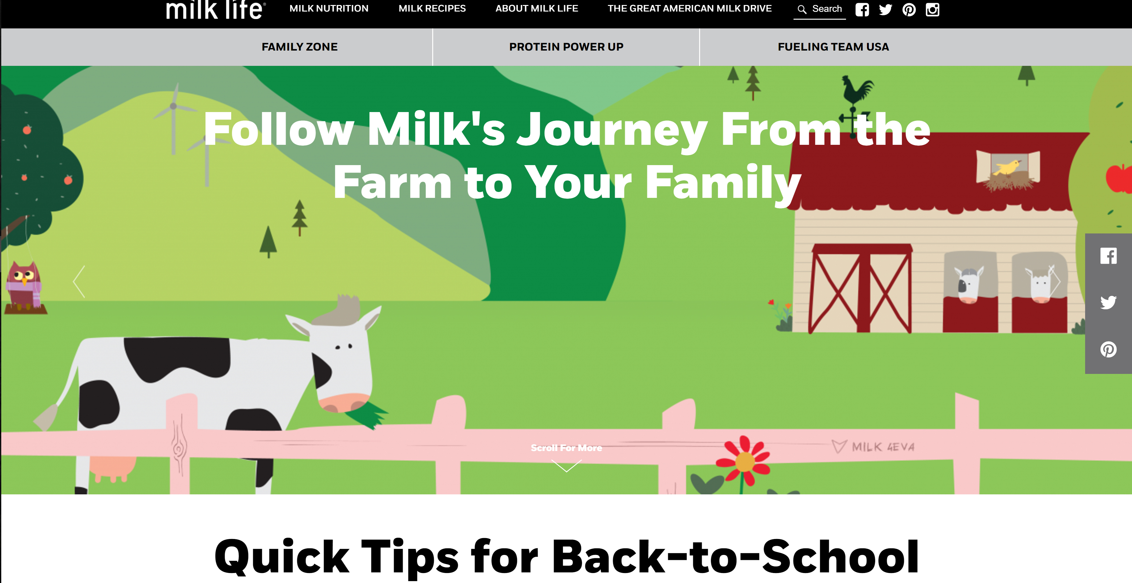
Milklife.com kept their color palette neutral with black, gray and white. And let the visuals have the pops of color. This page contained a lot more information but I like how it was grouped together in several different grids. You could clearly see what information went together and it was clear where the separation was, either by a box or white space.
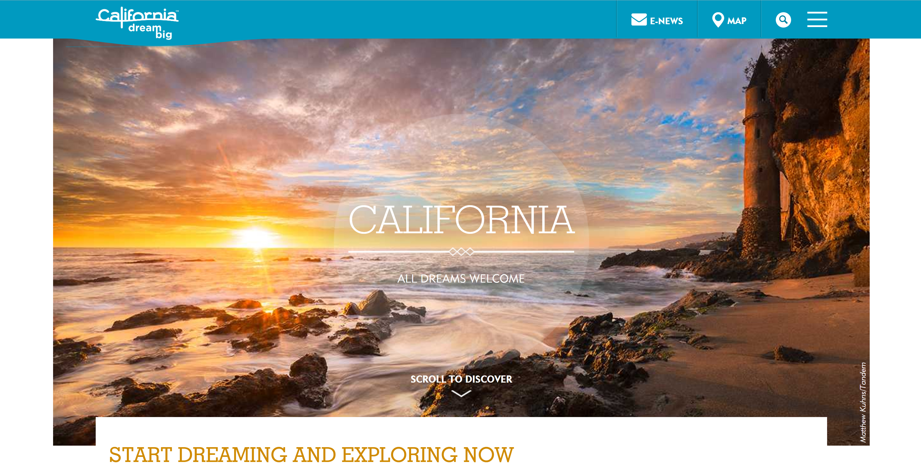
7. http://www.visitcalifornia.com/
This website was well laid out, visually appealing with a very simple palette letting the pictures do most of the speaking. This page scrolled vertical more than any of the other pages I have visited. They chose to use large pictures to spread out the information and lots of white space.
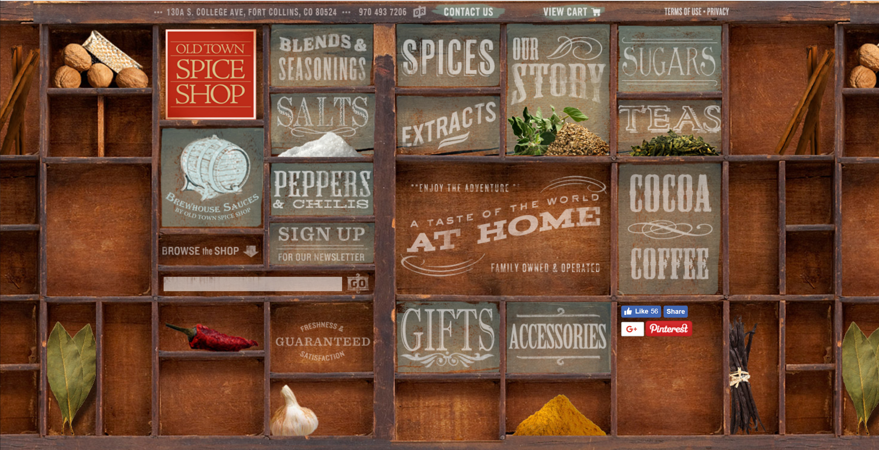
8. https://oldtownspiceshop.com/
The natural colors of this website was very appealing. This site was unique because the page did not scroll at all, all of the information was right there for you to see and click on. I liked how the picture in the background created a nice grid to contain the information in. The typography was fun and really helped develop the page to look like an old spice shop with the different signs promoting the different items they sell. I thought this site was very creative and well thought out.
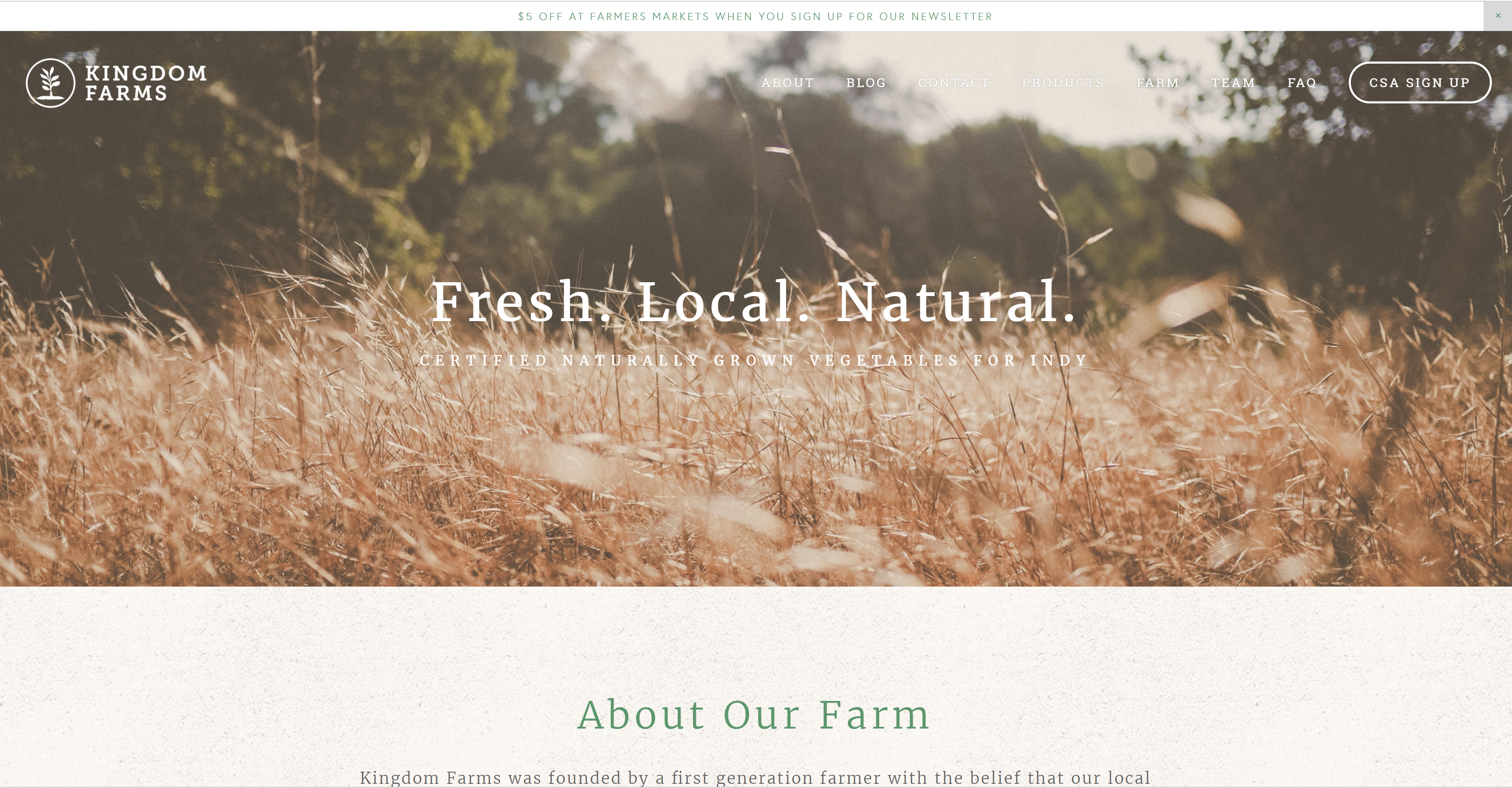
9. http://kingdomfarmsindy.com/
Like many of the other nature themed sites this one used a neutral color palette and let the photographs be the pops of color. I liked the main picture at the top of the site and felt it was sunny and welcoming. The rest of the pictures are appealing as well and they did a nice job of dividing up the page. I also liked the speckled texture on the background I think it helped tie the whole page together, the texture in the background mimicked the textures in the photographs and went really well. They layout was very nice and clean, simple and easy to read and navigate.
This site had a nice refreshing monochromatic color scheme. The colors felt very clean and the images were not overpowering. The layout was just like one big column and everything was divided nicely with white space. I think the page was balanced well.