10 Inspiring Illustrative Websites
Student Guest Post Author Info
Student Bio: Suzanne Nikolaisen
Student Website: Website
Student Bio: Suzanne Nikolaisen is a freelance designer/illustrator working out of Utah. Trained in illustration, she works digitally and with oil, acrylic, and watercolor paint, ink, and charcoal. She has experience designing websites and UI.
Published Date:
1. SandraVargas.com
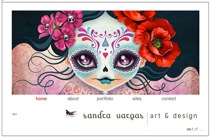 SandraVargas.com appears to be a Flash based website. The site excels as an example of illustrated design. There is a “wow” factor on the main page where they’ve used a simple slideshow to display a themed portion of her portfolio with a wide range of color, using large impactful images. Eye catching illustrations, from familiar fairy tales hold visitors attention as familiar stories like Red Riding Hood, Alice in Wonderland and a beautiful Day of the Dead illustration. The artist’s style is recognizable from the first visit. An animated gif of a dragonfly, while different from the art, works as a nice accent in the footer. Each page shows consistent follow through with further samples of Sandra’s artwork.
2. MalikaFavre.com
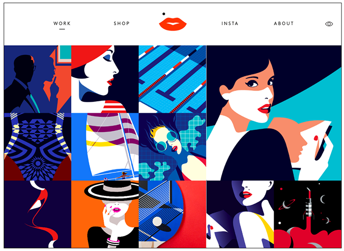 MalikaFavre.com is a bold presentation of an illustrative website. The images are displayed on a grid, but are far from boring. A color theme and and style flow between the pictures; with curving lines, bright colors, and hues of a set palette of orange, red, blue, black and turquoise. The accent of lips in the middle of the top navigation follows the illustrative style of the site.
3. RLeonardi.com
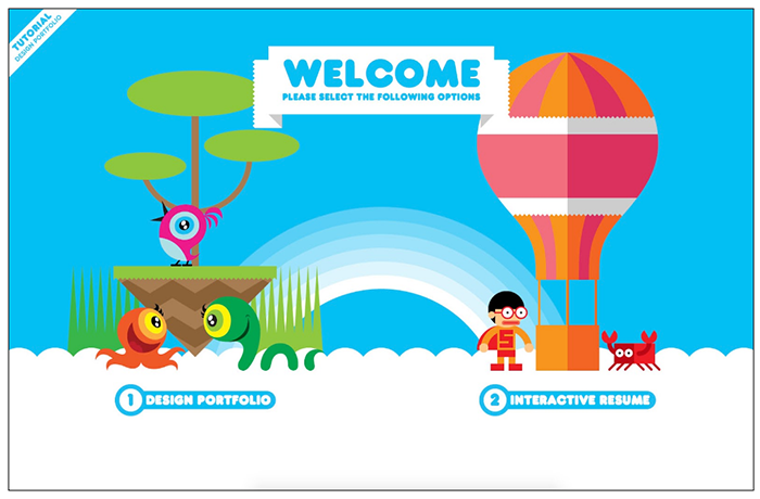 Robby Leonardi’s interactive resume takes you on a classic Nintendo, or side-scrolling video game journey showing his job skills (animation and web design) in action. This a one way to make a resume more interesting. By scrolling through the page you learn about his expertise in illustration, levels of proficiency in software, and his awards. The illustrative style is simple and consistent from beginning to end.
4. IceAndSky.com
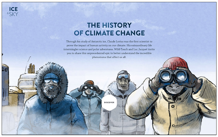 The IceAndSky website was drawn in a sketched, watercolor, marker style. When I went back to review it again for this assignment they had changed it substantially from the screenshot. I thought the hand drawn site was more unique, but the new site is well done and beautiful using photographs instead of drawings. I like the drawings, it was very unique and stood apart as a hand illustrated website.
5. DouDouBlues.com
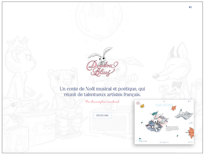 Doudou Blues is a very cute illustrated site introducing a story, characters, and is originally in French. A sweet mix of font faces keep with the storybook style. As you click in you are given the history and introduced to characters. It’s very charming, and relies heavily on illustration of the characters, and as seen in the thumbnail, accents on other pages of the site. I think the hand illustrated style is a welcome relief on the web.
6. ReverendDanger.com/
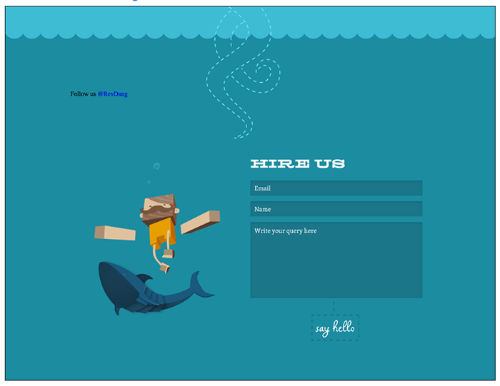
You follow the site as you scroll down. The illustrations are done in block style and squares mostly. The illustrations are consistent and the site has a little bit of an old west or outdoorsy feel due to the combination of the illustrations, font and subject matter, for example, the main character has coffee/tea with Sasquatch around the campfire. Whimsy mixed in with the message of their design studio gives the sales push a lighter vibe.
7. ForBetter.Coffee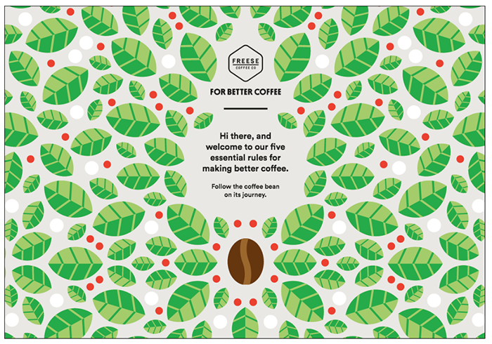 ForBetter.Coffee has a striking landing page with coffee leaves and beans creating a symmetrical repeating pattern. Really nice, and very unique. I like that the visual impact when first visiting the site. It’s very striking, and different from other sites. As you hit rule 1, of their five essential rules, you leave the beautiful pattern behind but follow the flat bean illustration down.
8. HDLive09.co.uk
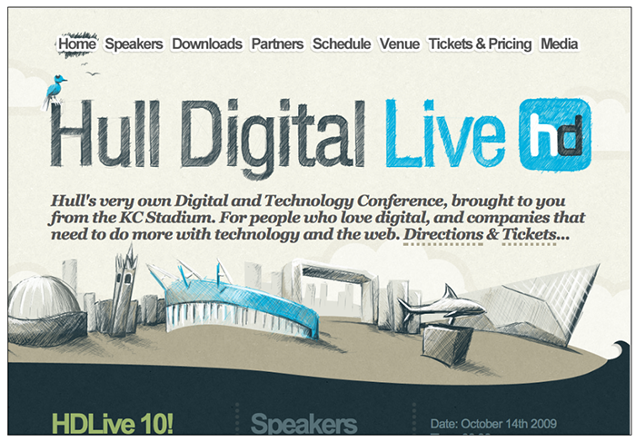 Hull Digital Live site is a mixture of hand sketched illustration and computer generated graphics. The style of the conference site looks like a sketch. The sketch style is also in the navigation background as an accent to show you what page you’re on. The hatching and crosshatching make the site pop compared to pre-packaged sites. While the “sketch” may have been created digitally it still has a hand drawn look and is well designed and consistent with brand colors.
9. nDesign-Studio.com
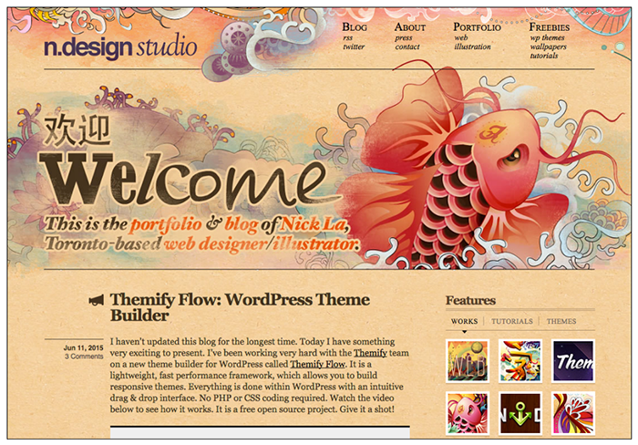 n.design studio is the portfolio/blog of Canadian, Nick La. Samples of his illustration and web designs are posted as well as free wallpapers. His scrolling, decorative style frames the top navigation and the footer. His portfolio shows polished final pieces. I like the big koi on the main page that splashes out of the water to greet the guest. The mixed type faces add a playful informal, yet interesting design element.
10. Hundefutter-getreidefrei.org
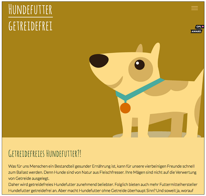 This website is for grain free dog food, and is in German. The best part of the illustration is above the fold on the first page. Der hund is very cute and while the illustration style is flat it fits well on the screen giving the dog top billing. The subsequent icons match the illustration style, but are less impactful and cute to look at. I liked the colors used, and the consistency.