10 Great Examples of Dynamic Web Design
Student Guest Post Author Info
Student Bio: Joseph Sumner
Student Website: Website
Student Bio: I am currently a student at Salt Lake Community pursuing an AAS degree in Visual Art and Design with an emphasis in Web Design. I plan to start my career at a web design firm doing design work and front-end development. I might, after a while, delve into the realm of mobile app design or, eventually, even software design. There are many different directions I could go, but who knows what the future may hold?
Published Date:
STAR WARS
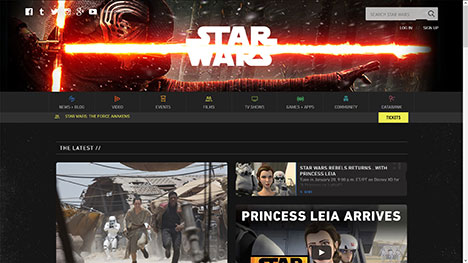
The Star Wars website has great contrast between the dark grey and brighter colors such as white and also yellow. It uses fluid layout in a way as to allow the user to still have easy access to all of the content. The site doesn’t start to really change until it takes up just under a third of my screen width, except for resizing that starts to happen once my browser shrinks width-wise to just over half of the way. When I squish the browser window to approximately one third the screen width, the two columns of panels merge into a single column of panels. When I scrunch the page all of the way, the search bar shrinks to only the “magnifying glass” search icon and log in, sign up, and the row of social media are moved to the more options fly-out that looks like “three lines”. The fly-out, when clicked on, becomes “two clashing lightsabers” which is really cool!
WEEBLY
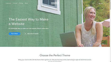
Weebly’s website has bright colors in its background image with what looks like reduced opacity; this allows the white text to pop while giving the photo much of the attention. The girl’s smiling face cleverly directs the visitor’s eyes to the sign up button located on the top-right corner. As far as fluidity, the site’s first five paragraphs begin at about one line long and as one readjusts the window width of the web browser, the text readjusts to take up less horizontal space. Also, the layout simplifies when re-”widthed”, as the sign up button eventually splits into a sign up with Facebook and a sign up with email button. The subheading disappears and the sample themes reduce in number from five to three. There are many more instances of this on the home page and also in the site builder if you sign up and use Weebly’s features.
TYPEKIT
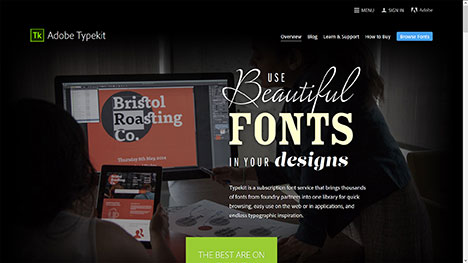
Upon entering typekit.com, I am instantly captivated by the beautifully “typographed” heading and the vibrant green and blue that is laid on top of black. The contrast of the text against the dark background image is absolutely stunning! The fluid layout is very successfully implemented. The featured fonts, essentially logos cropped into tiles, start out in an arrangement in the shape of a diamond. Like most of the other sections which are also tiled, all of the featured fonts become viewable through a horizontal scrollbar. The many linked subheadings found in the using Typekit section near the bottom of the page are arranged in a cloud formation and they readjust to form a vertically scrolling setup commonplace to smartphone apps. At the top of the page, the three main menu items titled menu, sign in, and Adobe retract to show just their icons.
SMASHBURGER
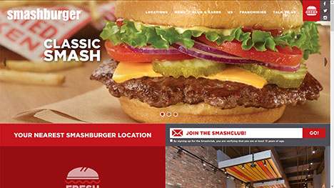
The first thing I notice upon entering Smashburger’s website is that the designer made a conscious decision to make the food be in your face by implementing a carousel. As you squish the browser window pretty much everything gradually disappears. All that’s essentially left is the essence of a ridiculously simple app interface. Pretty much just the restaurant title, more options, and the locate, order, and menu buttons remain. Everything that seemed to vanish got sucked up by the more options fly-out menu. This example of dynamic web design keeps the focus on the food and ordering the food, which is what the main focus of this site should be on.
W3 SCHOOLS
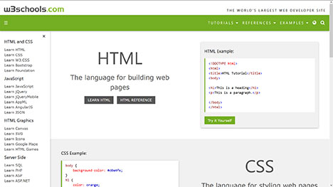
The site for W3 Schools is immediately apparent as a site for learning web coding languages. W3 Schools makes use of a clean interface that is white space-heavy. It utilize a semi-bright green across the navigation banner which emphasizes a few of the many possible navigation choices, namely tutorials, references, and examples. All of the other navigation choices are chunked into easy to process pieces through proximity and navigational hierarchy. The bread-and-butter coding languages, html, css, and javascript, start out with an example to either the right or the left side. As you horizontally shorten the webpage, all of the headings shrink and simplify to be almost mobile layout-ready. Everything simplifies to one column of panels.
PIXELAPSE
When I enter pixelapse.com, my curiosity is sparked! Why do I say this? The slogan in white and italics captures my attention, the diagonal angles of the laptop and phablet excite me, and the perspective those objects are shown in makes me feel like I am standing over my workspace getting ready to get into the groove. The vivid blue button popping out of the medium blue background interests me. Create a free account?! I don’t mind if I do! As I smoosh the website, the Macbook and Blackberry shrink like I am backing away from my desk. There isn’t much to the fluidity of this site, other than the zooming out and text reflowing. Simplistic design at its best.
STEAM
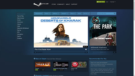
The Steam website is well organized and has a very subdued color scheme. The analogous color scheme definitely works, although it’s a safe design choice. The color scheme gives the site a technical, nerdy feel which I am sure is exactly what they were going for, being about computer games, and such. As in Typekit’s site, certain sections, in this case new on Steam, recently updated, and under $10, make use of a horizontal scrollbar to conserve vertical space. The navigation bar and search bar become a vertical list of dropdown menus. The spotlight, and the recommended for you, as well as the specials section skip to below the panels at their left when the browser window is resized.
ANDROID DEVELOPERS
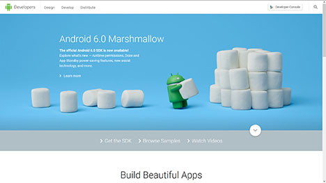
Android’s developer website currently features a little green robot stacking marshmallows which means that Android 6.0 has arrived! One thing I first notice about this site’s homepage is that it does not have a ton of information it has to worry about including. This fact alone gives this website a far from cluttered, spacious look and feel. The site only features a total of four main sections that take up little room. This easily accommodates the attention span of most people. What further adds to the comfortable feel is the use of white space, or “grey space” near the bottom of the page. They found no need to add a fancy textured background and neither do I. If ain’t broke, don’t fix it! A fluid layout seems like a natural choice to incorporate into the design. Android is after all a mobile OS, so why not give the website a similar feel? At about half-width, the panels in the page, surprisingly, increase in size and they become their largest size at a little less than half-width. From there, though, the panels get smaller and smaller until they become the size they started out as when the page approaches minimum width.
WEB DESIGNER DEPOT
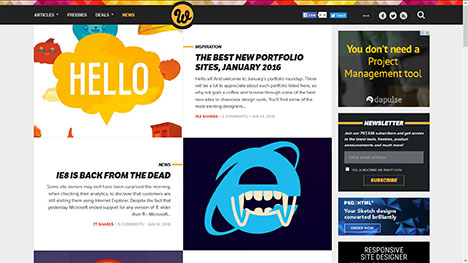
The first I notice about Web Designer Depot is how bright and colorful it is while still having plenty of contrast, notably where the multicolored banner meets the black header. This website has many cool articles that give helpful tips and information for budding and seasoned web designers. The tiled arrangement is consistent and straightforward for visitors to navigate. Ad haters rejoice! It only takes a width reduction of one-fourth (at least in Firefox) to make the ads completely disappear. The navigation bar starts out stretched out and including all of the pulldown menus and social media icons. Once the browser window takes up just a third of my screen’s width, the pulldown menus and social media relocate to the all-too-common “three lines” more options menu. The header collapses to include the more options menu, cursive “W” badge, and search icon. One feature is lost, however. The page navigator disappears altogether.
WUNDERLIST
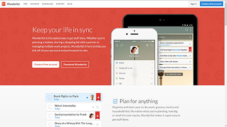
It’s not hard to see that wunderlist.com is laid out in a very simple way as to bring the main focus solely to how they can help you organize and keep track of your life’s to-dos. With lots of white space and the use of just a couple of colors (red as the primary color and blue as the accenting color), you will mostly just take note of the features. As far as the fluid layout, the site readjusts in pretty much just two ways: the section text moves below each section image and the content shrinks in size. These two things happen at exactly the same time: when the window reduces to a little bit less than one half of my screen’s width. A third thing also occurs at this time: The section titled Wunderlist at a glance, which begins as three columns by four rows, becomes two columns by six rows. Thank goodness it doesn’t become one column by twelve rows, because that would be a tedious amount of scrolling!