10 Exceptional Sites with Highly Usable Web Navigation Menus
Student Guest Post Author Info
Student Bio: Sarah Landeen
Student Website: Website
Student Bio: Sarah is a newbie web designer with a vision to create a space where she could rant about annoying drivers. The result is driversfromhell.com. She would particularly like to emphasize the "newbie" part of her title. She would also like to invite you to report annoying drivers on her website.
Published Date:
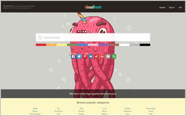
This website lets you search for free high-quality stock photos. I like it because the very first thing you see when the site opens is the search bar. It’s big and prominent on the screen. It’s the reason you came to the site and they didn’t hide it. Scroll down and you see a list of words that are commonly searched. One of those words might be what you are searching for and you don’t have to type it now. Scroll down even further and you’ll find popular photos. At this point the more you scroll the more photos load. Everything the average customer needs is right on the home page. Not an average customer? Are you actually a photographer wanting to share your work? Click upload in the top right corner. It’s next to Sign In and Join, other useful pages if you use this site often. As far as site navigation goes, this website is easy to use and well made.

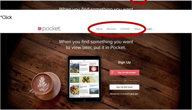
The thing I like about the Menu on Pocket is that when you first load the site you see the word “Menu” in the top right corner. Click on Menu and the navigation menu opens. The menu then gives you options including “Sign Up.” The first thing you see on the home page is “Sign Up.” Scroll down the home page, read what Pocket does, and then there is a giant call-to-action button that says, “Sign Up Now.” Sensing a pattern? Everything about this site’s navigation is to get you to sign up for their product. This site wants you to participate, not just passively browse its pages.

This one is a little biased because I helped create this website. Cirris Systems is the company I work for and part of my job was helping redesign the website. We spent hours and hours discussing the navigation of the site. We had to decide where each product, article, and other pieces of news would live. All the information from our old site (*shutter) had to have a home on the new site. The experience made me think a lot about the way customers view and navigate websites and the control designers have over that decision. We want customers to look at our products, but we also want our contact information accessible in case they decide to make a purchase. We also have a Learning Center with all the articles organized to make the information easy for customers to find. This site isn’t perfect, but I’m including it in this assignment because of the things I learned when I helped create it.

I’ve run a few marathons and St George is by far the most organized race. Its website is a good example of organization as well. From the home page, you can find where to register for the next race, information about the race, and all the boring stuff like sponsors. (I mean, thank you, sponsors, for making the race possible. You aren’t really boring.) Ignore the fact that the site needs to update its information for the 2017 marathon and I’d consider it a good website for signing up for a race. It even has a countdown clock to help you know how many hours until your death sentence—I mean marathon.

The website I want to make is partly inspired by this website. The homepage is almost the soul reason of this site, to show the rantings and stories of people who have had funny/horrible experiences with clients. The navigation is simple. There’s a giant call to action button in the right-hand corner if you want to submit a story. To the left are other options. You can read the top stories and listen to the podcast. I like that the site also provides resources. This site shows me how to keep the navigation simple.

This is the website for one of my favorite authors. The navigation menu at the top of the homepage starts with the most important thing an author can have on their site: Books. Click on it and you get a list of the different series Brandon is working on. Mouse over it and you get additional choices such as “Where do I start” and “Future books.” This is helpful for first-time readers wanting to know what to read first and veteran readers wanting to know when the next book will be available. The mouse-over-menu is a great resource to use for navigation.

The thing I like about this website’s navigation is that it gives you instructions. I know a lot of websites do this, but I’m going to use Expresso to show what I mean. The point of this site is to help writers improve their writing. That means they need a sample of writing to analyze. The very first thing you see when you pull up the site is, “Write or paste some text here…” Below that is a bit of information about the site. To the right is the analyze button. Above it is the website menu. Even without the menu and text, you know to enter some writing and the site will analyze it and provide feedback.

This is a freelance artist whose work I admire. I’ve decided to include her site in navigation because it shows how prominent social media needs to be in the menu and navigation of the site. Not only does she have social media listed in the site’s menu at the top of the homepage, but the social media icons appear on the right side of the menu bar. The artist wants to promote her work and social media is one way to do that. That is why it appears multiple times in the site’s navigation.

Brian Crain is one of my favorite composers. I’ve bought sheet music from his store before and it’s partly due to the navigation (honest). There are some composers that make you buy sheet music without ever seeing it. Brian lets you see the first page of a song before making the final purchase. That way I can see the difficulty, and buying it will be worth learning the song. The Sheet Music Store in the site’s main menu is labeled so it is easy to find. Then each piece of music is listed by name with the type, album, difficulty, popularity, and price all shown next to it. Click the magnifying glass to bring up an image of the first page, as I said before. You can also add it to the cart and check out. The music is a PDF so you receive it immediately and can print and play in a matter of minutes.

Stitchfix may touch the line for what is an acceptable website to use for this assignment because it is a bigger company, but it has an organization that I really like. When you first open the site, it asks you if you are a man or woman. Click on your gender. It takes you to a new page with a “Get Started” CTA. Click that and it takes you to a form. So far this is really easy. Fill out the form and click the button to take a quiz. Every click leads you further into the website. The CTAs aren’t asking you to commit to a purchase. Everything about the navigation of this site is to gently lead the customer toward their goal. The customer isn’t left clicking around searching for help, they are guided directly to where they want to be.
