10 Exceptional Sites Using Minimalism
Student Guest Post Author Info
Student Bio: Layla Fiod Pitaluga
Student Website: Website
Student Bio: A traveler who loves art!
Published Date:
– Wonder Sauce –
Wonder Sauce (http://www.wondersauce.com) excels in the minimalism style with a sophisticated home page, contrast colors (grey/white) and a clean typeface choice. The background is attracts the viewer attention because of its content – short videos showing the office and moments of a work day. Lastly, simple geometric elements such as the two buttons below the headline complement the minimalist look.
 – Focus Lab –
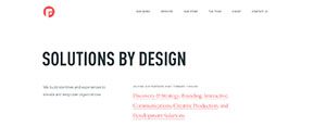
The focus lab website (http://focuslabllc.com/) used two contrasting colors and a clean white background to make the minimalist tematic. The choice of typefaces and the leading on the body text adds to the idea of comfort/clean looking. The logo on the top left corner in bright orange color is simple and still drawn the viewer’s attention.
– Esseninternational –
Esseninternational (http://esseninternational.com/) chose the black and white style for their website – with few colorful images when you scroll down the page and a lot of white space in between them . The moving from black/white to colorful give the minimalistic theme a little bit of fun/freshness feel.
– Radio Kultura –
The radio kultura (http://radiokultura.pl/?p=home) follows the same idea on the color theme and typeface as esseninternational. There are complementar details such as the side bar with the icons to click and to go directly to pages where the apps are – the side bar in somber colors (grey/black) gives a more minimalistic idea. The punctual choice of the orange color adds some focus to the design without subtracting the orderly image of the website.
– LLI Design –
LLi Design (http://llidesign.co.uk) website started with a classic minimalistic placement – the big transitioning picture in the background related to their product/service and the choice of only the essential items to be up in the page: the name of the company, menu, arrows to slide to the other pictures and a bottom to play/pause the images. In addition, the all in white color reinforce the feeling of clean/organized brand.
– White 1921 –
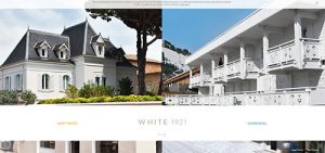
White 1921 (http://www.white1921.com/en) invest in the same elements as LLI Design – photographies with an elegant looking occuping most of the layout and the minimalist/essential details in the body text – the difference here is the use of a warm and a cool color to contrast the body text links in addition to a more neutral color (brown/beige) in a larger font size to represent the logo of the company.
– Maemo Restaurant –
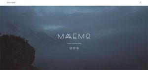
Maemo restaurant (https://maaemo.no/) choice of typeface for their logo in addition to the background picture brings a modern idea to the website layout. The top of the page in white with only the essential to navegate through website adds to the minimalistic style.
– The Outpost –
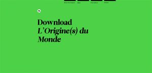
The Outpost (http://www.the-outpost.com/) chose a solid green color for the background and a variation on the font style to emphasize the text they wanted. Black lines on the top and a bold type below it with enough white space between them adds on the minimalistic layout.
– Coop –
Coop (https://coopbrand.co/) uses a lot of white space in their main page giving a graceful feeling. The choice of few elements in the page and the decision of using font sizes and colors to make the focus difference brings a positive look at same time it excels in the minimalist idea.
– Space Vanderlanth –
Space Vanderlanth (http://space.vanderlanth.io) places the black background and grey values for text and icons in addition to a lot of space to give the minimalistic look. Even though there is no addition of bright color (like Coop) it has a elegant/technologic look.

