10 Exceptional Minimal Website Designs
Student Guest Post Author Info
Student Bio: Olyvia Thompson
Student Website: Website
Student Bio:
Published Date:
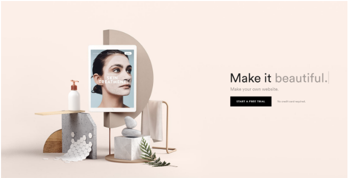
Squarespace: Most of their website and homepage is very minimal being that it has a lot of white space and is not congested with text or images. The colors they use are pretty neutral or close to, making it feel open to the user to make it their own. (https://www.squarespace.com/)
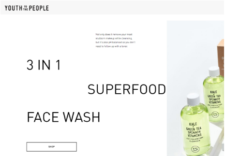
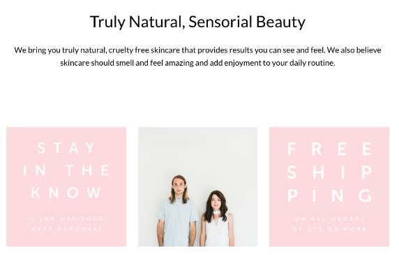
Youth to the People: They are a skincare company focusing on healthier products. A lot of their products focus on greens and cleaner ingredients. They used whites, light greens, and blacks to show this. (https://www.youthtothepeople.com/)
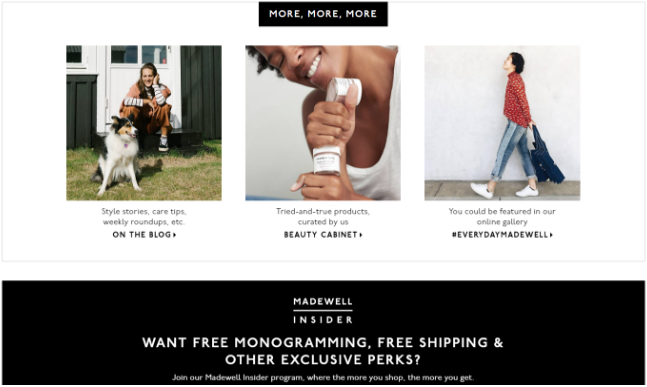
Madewell: A lot of their website consists of large images and text. They don’t have a color scheme, so most of the website is black and white other than the images. They are all spaced out really well and it flows well. (https://www.madewell.com/)

Consider the Wildflowers: Their company offers minimal jewelry and so they have a minimal look to their website. There is a lot of images on their website that have calm, cool tones to them They are spaced out pretty consistently and any font that they use is simple. (https://considerthewldflwrs.com/)
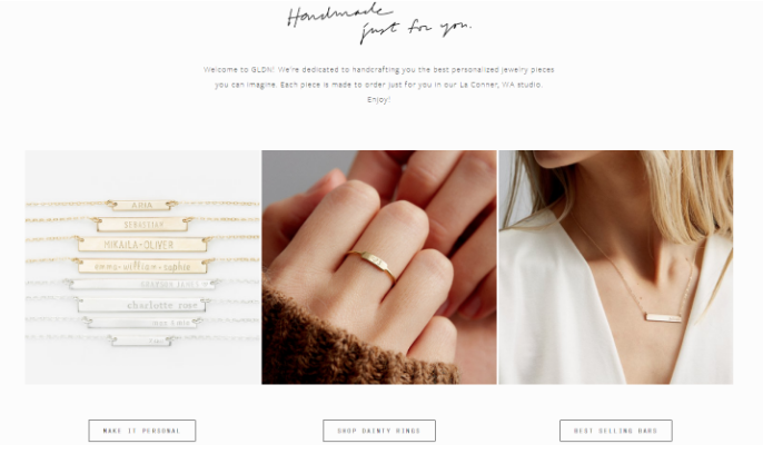
Gldn: They are similar to Consider the Wildflowers. They also offer minimal jewelry and with their name being similar to the word “golden”, they use those tones and that color scheme throughout their website and images. Their small font is perfect for a minimalist website. (https://www.gldn.com/)
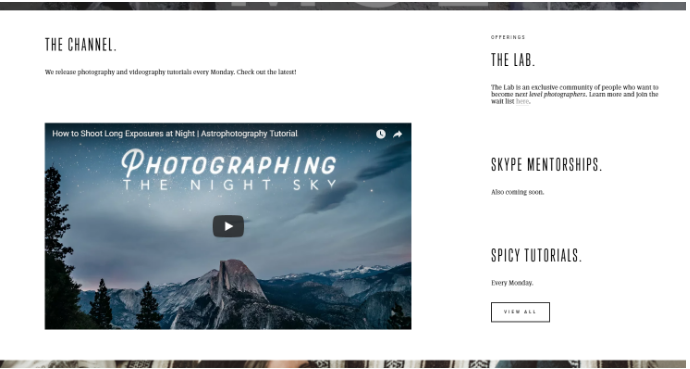
Mango Street Lab: They are a photography company that also provides tutorials for other photographers. Their style is very “vintage” in a sense that they use moody neutrals such as black, white, and tan/brown. Since they are a photography company, their website has mostly images, but any text that they have is simple and the navigation is easy to follow. (http://www.mangostreetlab.com/)
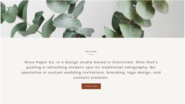
Olive Paper Co: They are a design company that also provides hand lettering services as well. Her style used is very clean and minimal. Images used have great composition and do not feel cluttered with objects. (http://olivepaperco.com/)
Herbivore Botanicals: This popular skin care company has minimal packaging and design when it comes to their website. They use a lot of large images and white space very well throughout their website. They also stick to using pastels and colors that are not too bright, which helps with the minimal look. (https://www.herbivorebotanicals.com/)
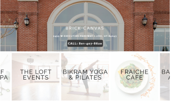
Brick Canvas: Their website consists of large images as well, large, simple easy to read font, and their images to to their other pages.They use a lot of white space between images and around the edges. (https://www.brickcanvas.com/)

Piper & Scoot: They are a clothing company so most of their website consists of clothing that they offer. It is clean, white, and without a ton of font used throughout. (https://www.piperandscoot.com/)