10 Exceptional Graphic Designer Portfolio Sites
Student Guest Post Author Info
Student Bio: Amy M
Student Website: Website
Student Bio: Amy is a design major.
Published Date:
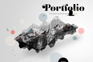
Axel-aubert.fr is a site of a French multi-media graphic designer. This
designer employs ingenious moves such as tilting the screen to reveal the
menu at the top of the page when you are moving around with the
cursor. The image on the home page follows your cursor around. When
you enter the page, the projects are available by a vertical scroll down
method. The screen is in black, white and grays until you position the
cursor over a project. Color fades in to highlight the project you are
viewing and you can click on it for more information. Photos and images
are diverse and well done.
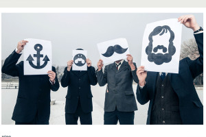
Burodestruct.net showcases the talents of the designers who comprise
this company called Buro Destruct that is based in Bern Switzerland.
Their motto is “Small City, Big Design”. This reflects their quality work for
local, national and international clients. The website plays with symbols
and icons they have created to introduce their designers on the home
page. Their portfolios are clearly laid out in the menu and easily
accessible to the viewer by clicking on the desired name(s). The website
invites you to explore the whole site to see all of their innovative
creations and offshoot websites such as typedifferent.com.
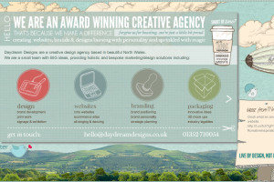
Daydreamdesigns.co.uk does a great job of setting up the website to feel
like a very creative day dream through color, images and type. The
content is very expressive of who they are and what they do. From the
beginning they set themselves up as award winning quality designers.
The menu on the top horizontal line is easy to navigate and gives you a
sense of what’s included. The view tab allows you to click on a box to
highlight the project and it turns from the colors of the website to the
actual project colors. Great site!!
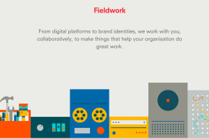
Madebyfieldwork.com showcases a focused team of doers and shakers
who specialize in engineering engaging experiences across brand
creation, digital and web platforms. They were created in 2012 by Loz
Ives and Andy Gott. Not only do they showcase their work in socially
conscious ways, but their portfolio gives an example of work created for
a brewery. Also, this website shows you how they created their brand
and leads you through their process. Their website is easy to navigate
and the content makes it impressive.
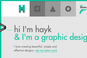
Hihayk.com is a great site that highlights the creativity of this graphic
designer and musician. His tabs are clear and are delineated by visual
icons. He also has a call to action to hire him. HIs color scheme is
unique and he ties in his illustrations throughout the website. Its also
refreshing that his website shows an accurate reflection of his skills to
date.
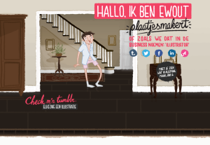
Iwit.nl is from the Netherlands and cleverly showcases the work of this
graphic designer. When you enter the website, the artist is there in
cartoon and welcomes you in written words. Depending on where you
click on the home page you are either first led to illustrated posters he
created or the website moves you down as though you are on an elevator
looking at the site. You are introduced to a place where you could click
to view his book or continue on down through cartoons to a video then
characters to be downloaded. You end with posted illustrations and a
way to contact the artist. This cleverly illustrated website showcases his
work in a variety of ways and it invites you to check out all the links, etc.
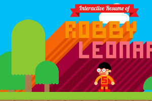
Rleonardi.com is a very fun cartoon like website that showcases the
talents of this multi-disciplinary artist. By using the arrow keys, you can
make the main figure lead you through the website telling you about the
artist, skills, portfolios etc. Its colorful, playful and inviting. The
character’s eyes follows the path you lead him on with the arrow keys.
Very fun!
Hellomomonday.com uses imagery and language that is casual, inviting
and accessible. Its fun as while it is loading, it loads the days of the week
to get to Monday. Once into the site you realize its unlike anything you
thought it would be. You are introduced to projects on a vertical scroll
down bar, projects are color coded. The culture section talks about who
and what Hello Monday is. Not only did I find the projects varied and of
high quality, but I liked the culture section and it made them be real
people who are designers and presented the whole company layout,
philosophy and context very well.
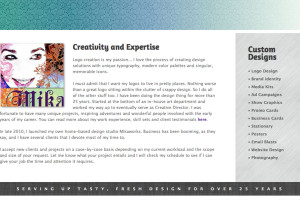
Mikaworks.com is creative and well done. Mika introduces herself on the
home page both in illustration and written language. She sets the tone
for the website both in color, tag line and menu. On the top there is a
banner that changes to show her areas of expertise, each defined by
different type. Above that is a menu that is easily navigable. This
information is reinforced by a vertical list on the homepage. Its really nice
that when you click on a tab, the specific project opens, but the rest of
the samples in that tab are available for perusal at the bottom of the
page. Nicely done, interesting, clever, and easily navigable
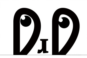
Jorgerieraflores.com uses type and movable layout in a unique way. The
website primarily uses black and white. Color comes into play when a
work sample is selected and opened. Starting from the home page, there
is a type figure with eyes that follows the cursor. When the tab “WHO I
AM” is selected, the screen slides to change and the type figure moves to
create his name Jorge. The patterned manner in which work samples are
showcased is clever, clean and interesting.
