10 Exceptional Graphic Designer Portfolio Sites
Student Guest Post Author Info
Student Bio: Lisa Hall Nord
Student Website: Website
Student Bio: Summer 2017 - Currently a Graphic Design student at Salt Lake Community College, in Salt Lake City, Utah. I look forward to graduating with dual degrees in Graphic Design and Graphic Communications in December 2018.
Published Date:
Heather Shaw’s website features an overlay of photos on top of each project, with a block of color to provide visual consistency. The typography and block design make it very easy to navigate to view the designer’s work. This design is very appealing and makes you want to search through her web site to see what else there is to see.


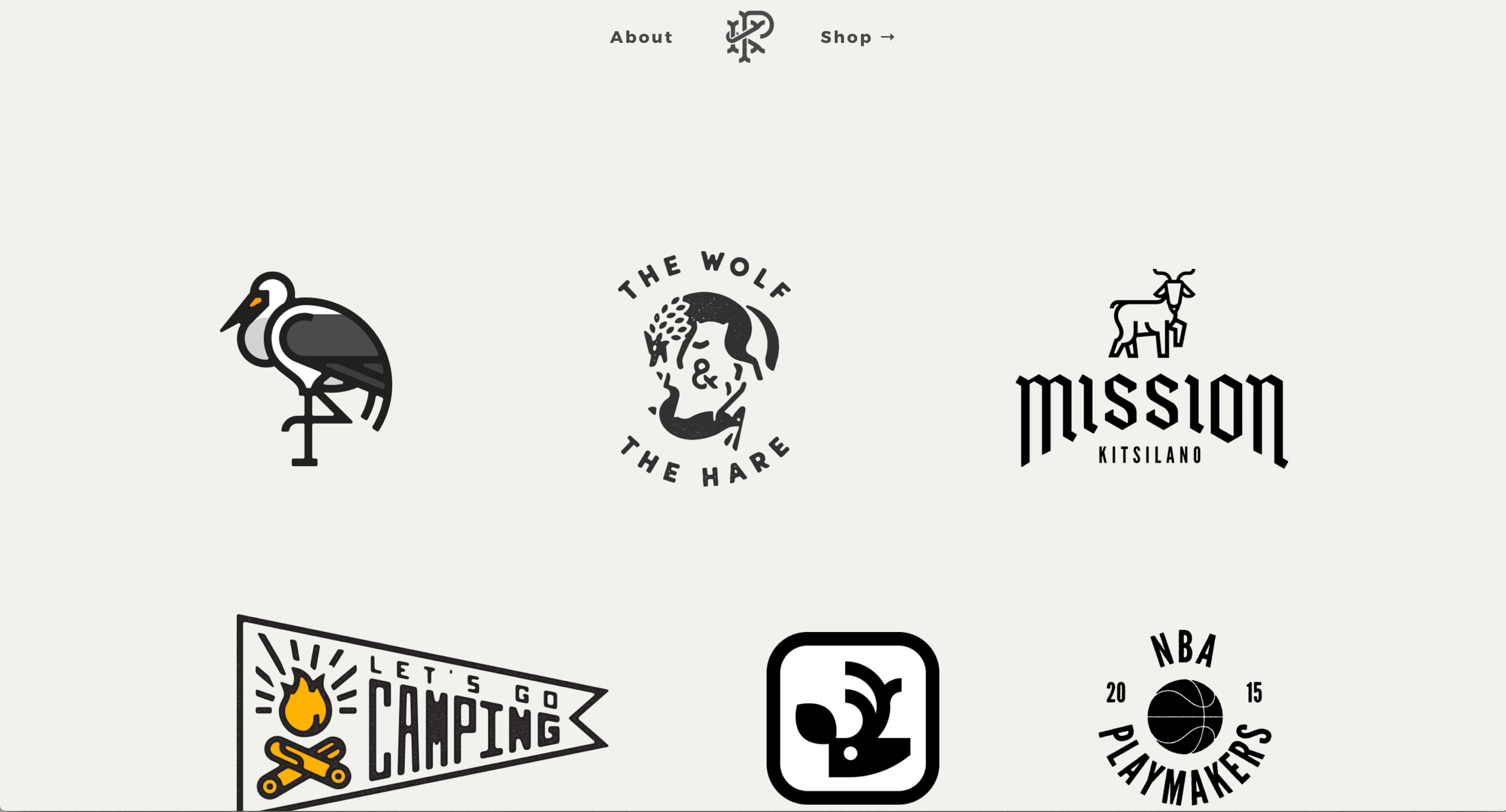
Peter Komierowski’s homepage takes a different approach, featuring just a small number of logo designs, surrounded by plenty of white space. The minimalist look, with just the logo designs, tempts you to click on each one and see what else lies behind the logos.
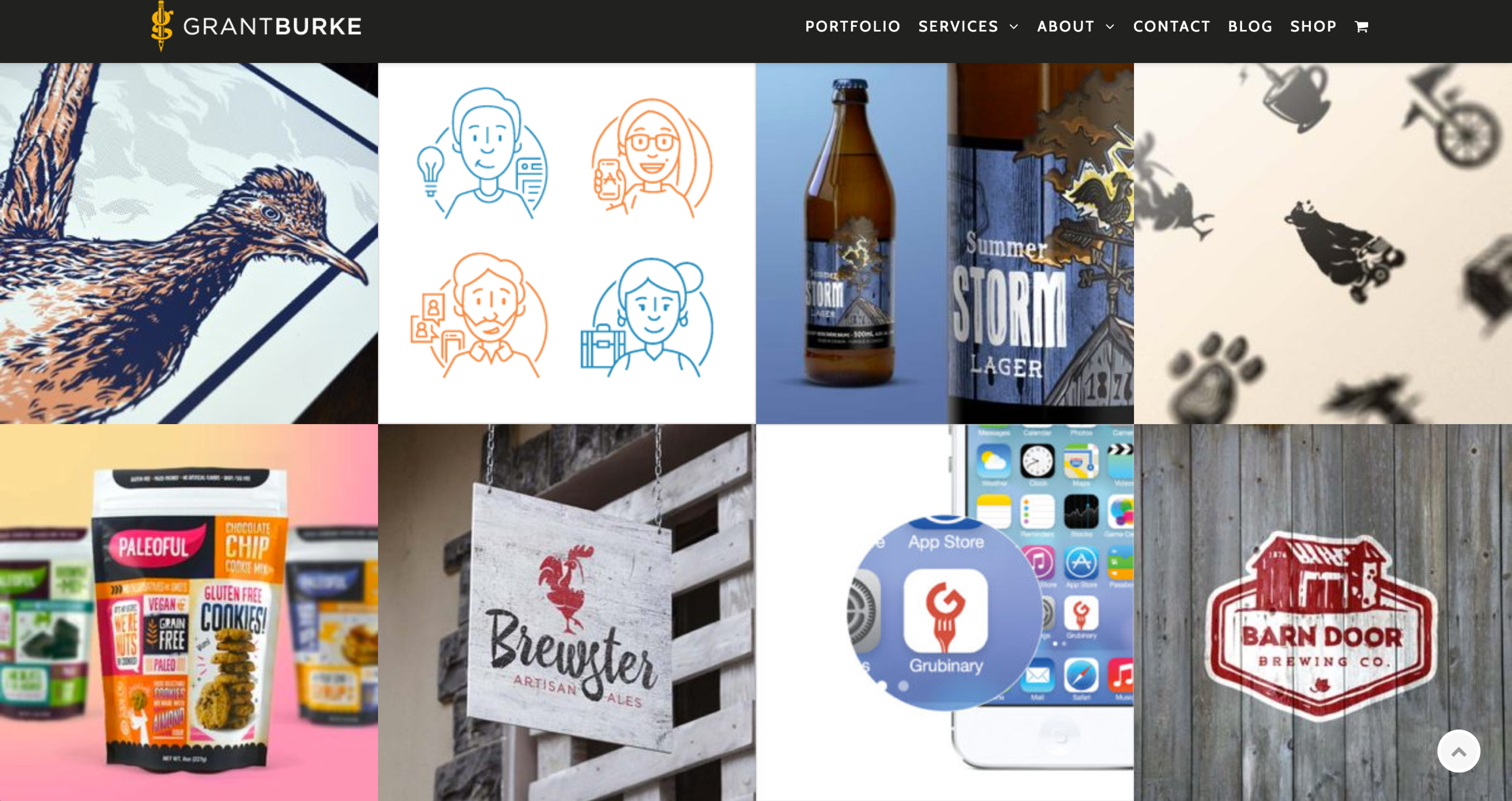
Grant Burke is a Toronto-based freelance graphic designer and illustrator, and his homepage is atypically text-heavy for a designer portfolio. But when you scroll down or click on “Portfolio” you see a great selection of his work in a grid format. You can hover over each square for a summary, or click through to see the full work.

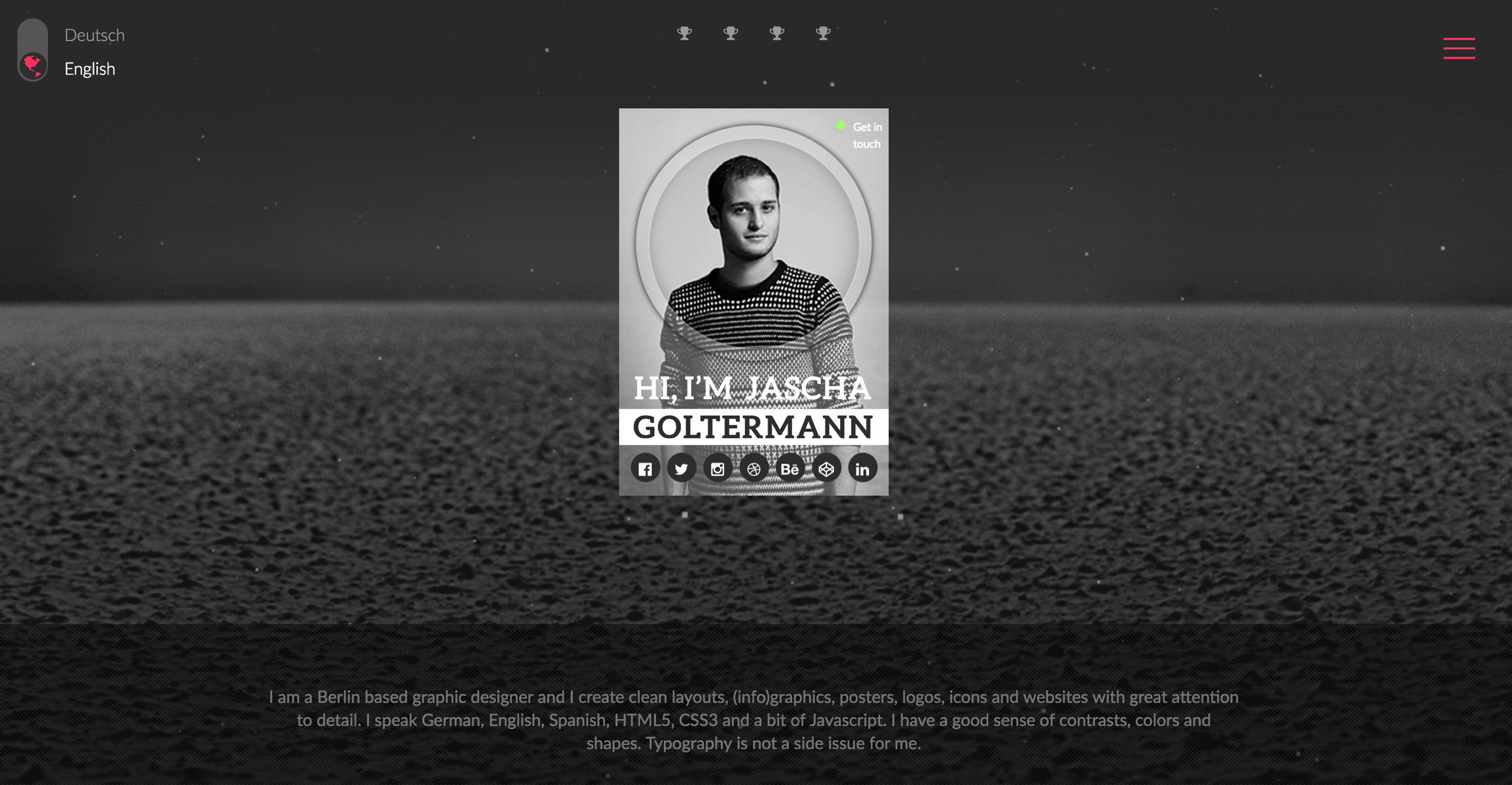
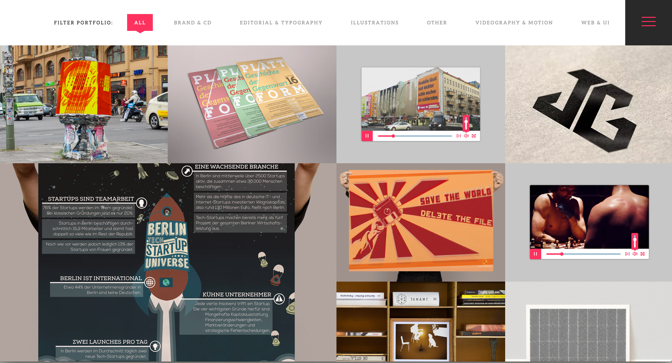
The website for Jascha Goltermann is surprisingly interesting, because when you first land on the home page it appears quite bland, maybe boring. But then you hover over his headshot and the photo changes. Then, thinking there has to be more to it, you scroll down and you’re happily surprised at the artistic picture-grid layout of his work, as well as an intriguing graphic showcasing his experience
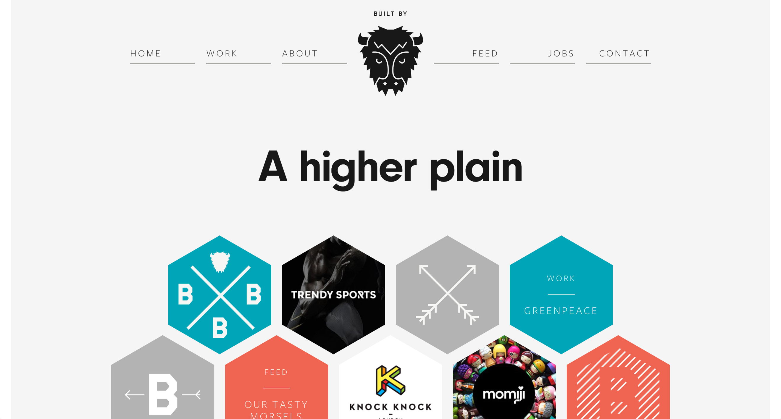
Built By Buffalo grabbed my attention right from the start. From its simple and clean header that includes a great logo for the company, to the hexagonal design used to highlight different projects, to the infographics at the the bottom, this unique design would surely catch the attention of someone looking to hire an innovative graphic designer.
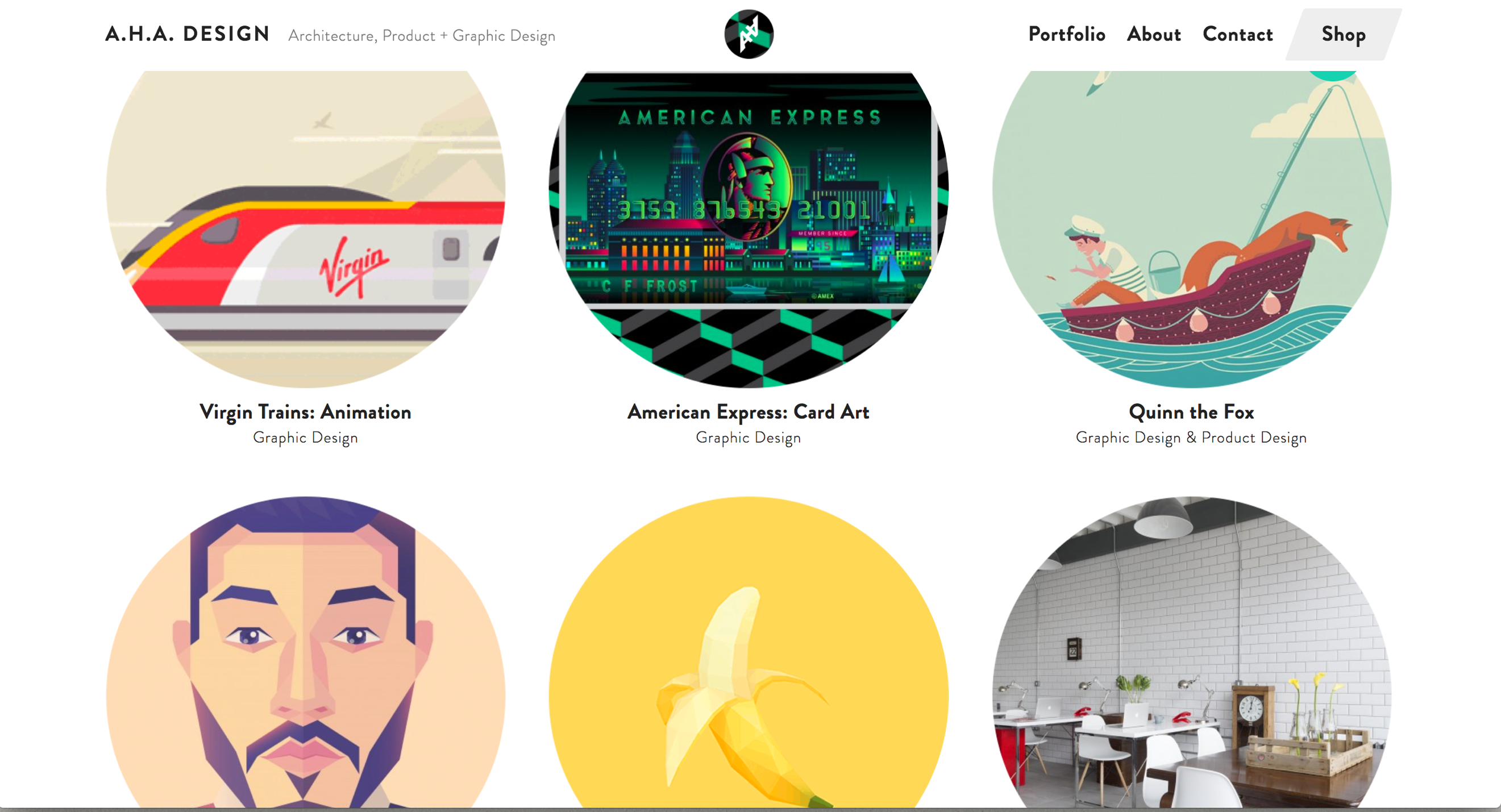
This site opens to a simple header at the top of the screen, with an equally simple circle in the middle. But this circle changes images, showcasing some of the designs this graphic artist has created. You can easily click on “Portfolio” in the header, if you want to see more of this work, or you have several other equally user-friendly ways to navigate around the site. You can click on the links for Architecture, Graphic Design, or Product Design, or simply scroll down past the opening circle and see more circles with samples of the design work, again, some of them animated and moving through different images within the circle.

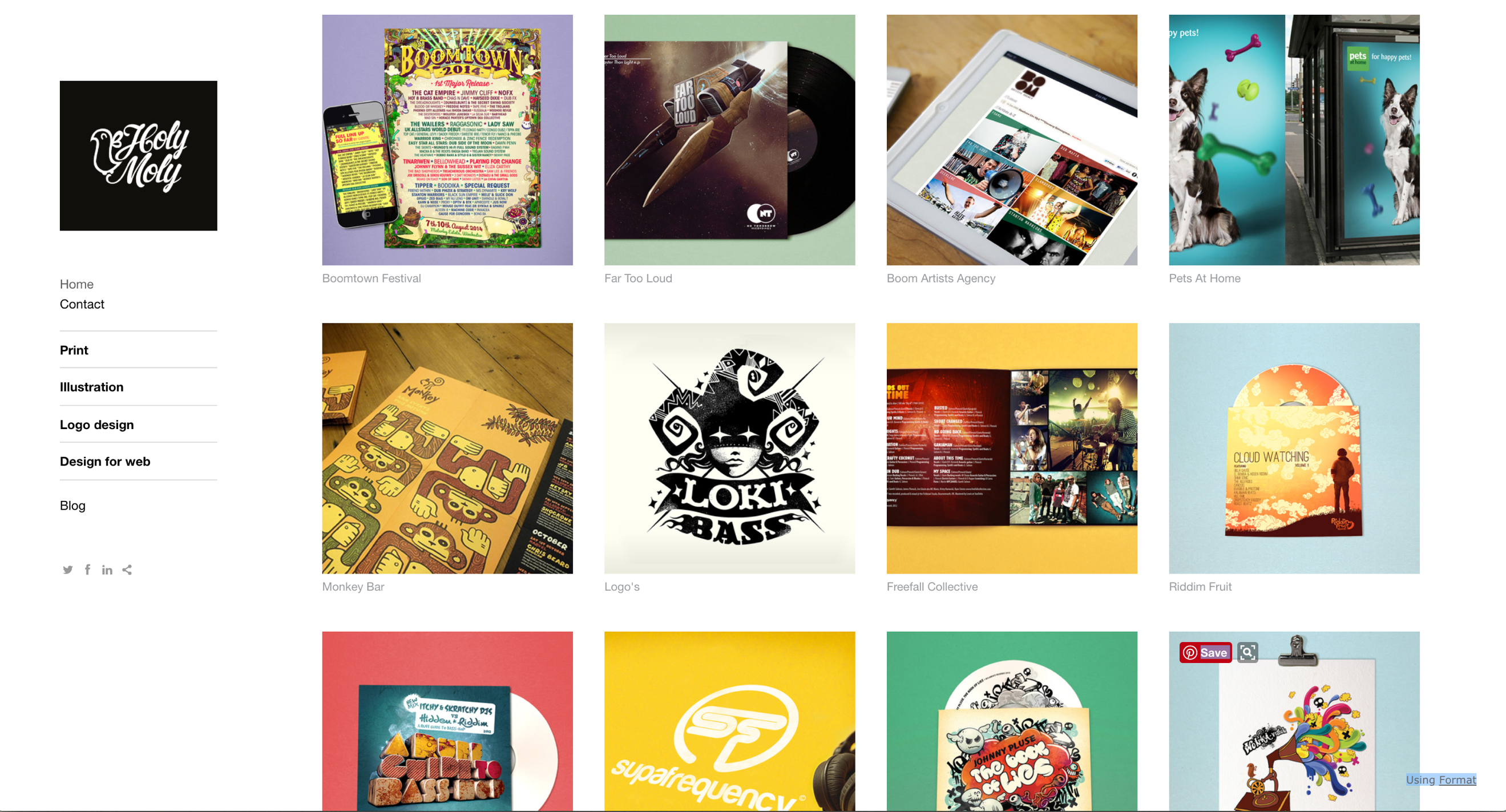
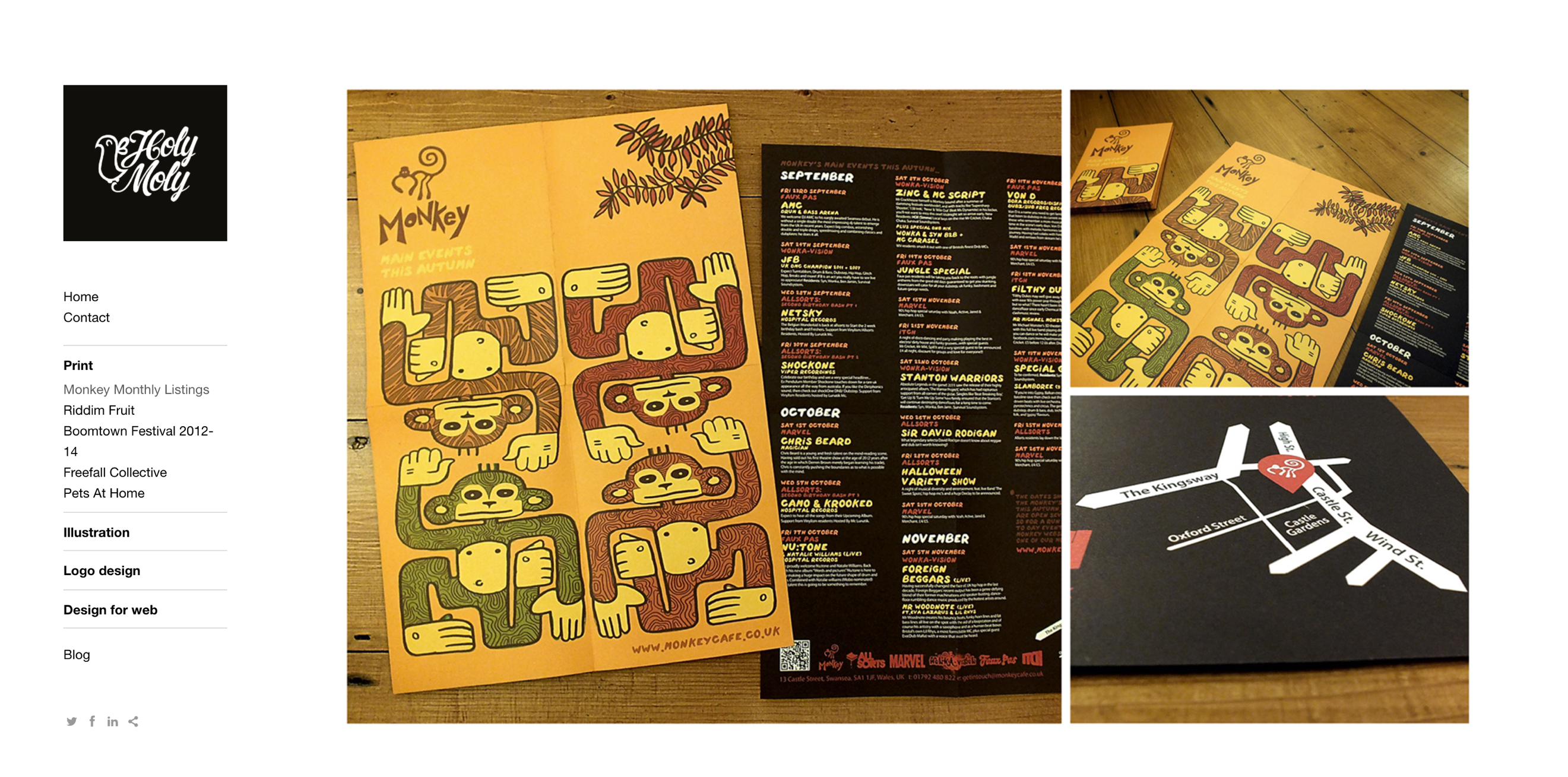
http://www.holymolycreative.co.uk/home
Such a clean, simple web page layout, but very intuitive to see the work this designer has created. The links on the side panel open up into clear, beautiful visuals which perfectly illustrate the different projects in detail. Very aesthetically pleasing.
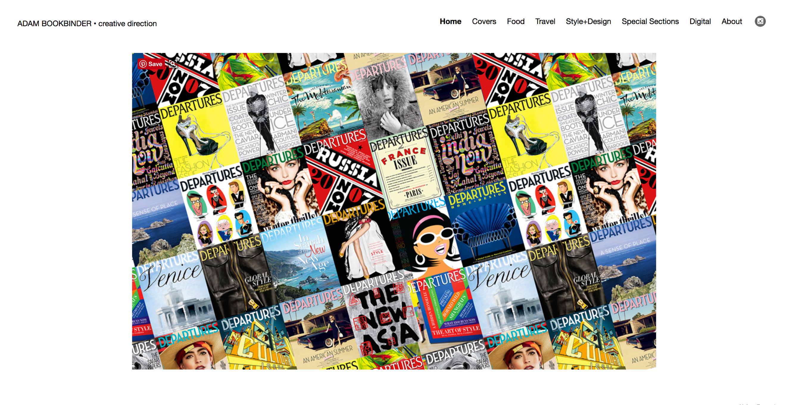
http://www.adambookbinder.com/
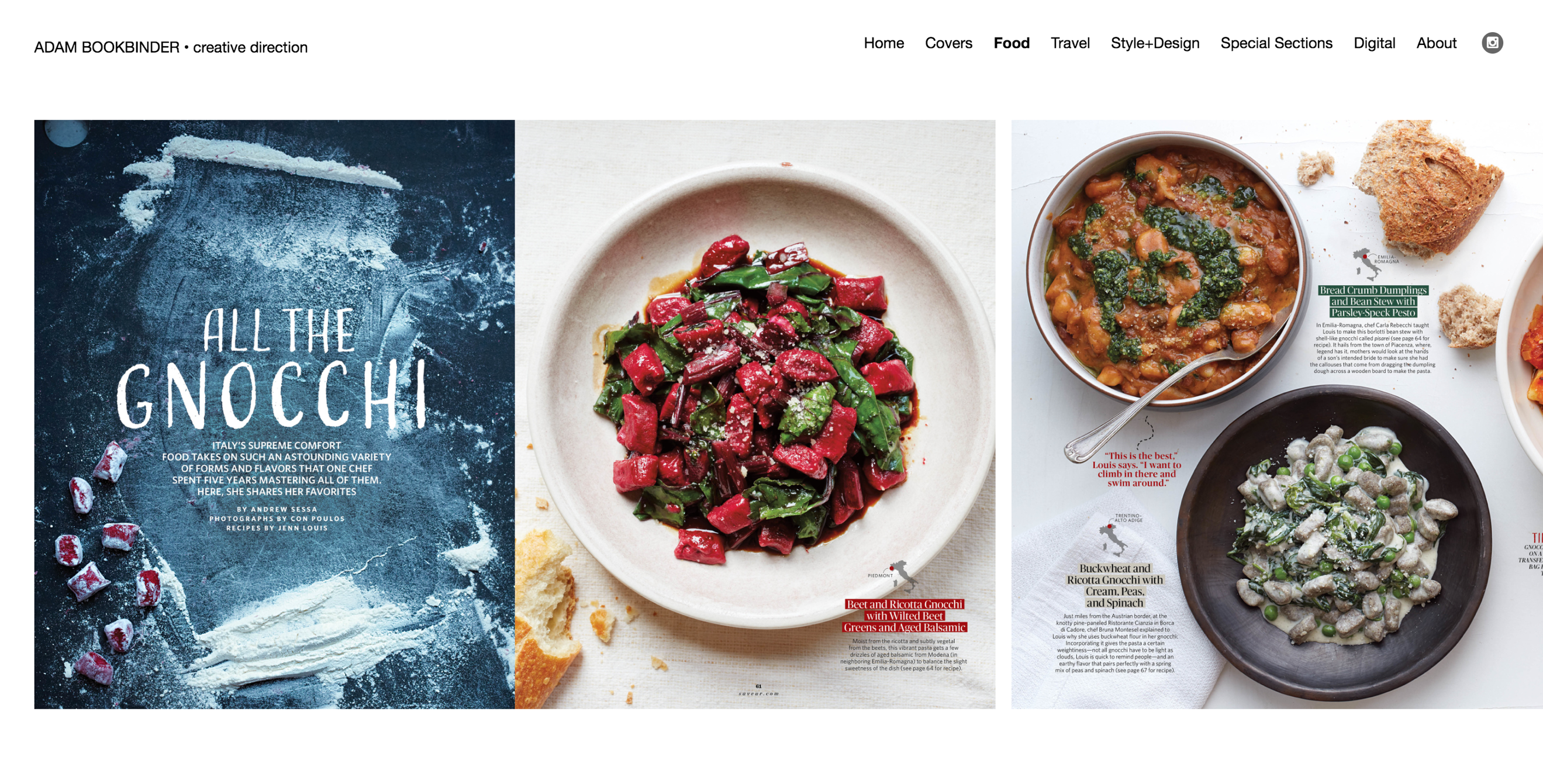
Adam Bookbinder’s home page is a collage of a number of his projects all in one image. They are not clickable, and his header is very minimalist. But the collage is intriguing and invites the viewer to click on one of the design subjects in his header. Once the viewer has navigated to a subject, the website changes direction from a simple image on the home screen, to a side-by-side scrolling view of the many different projects he has created, reminiscent of flipping through a magazine. This format invites the viewer to keep scrolling and scrolling, because you just have to see what is next.
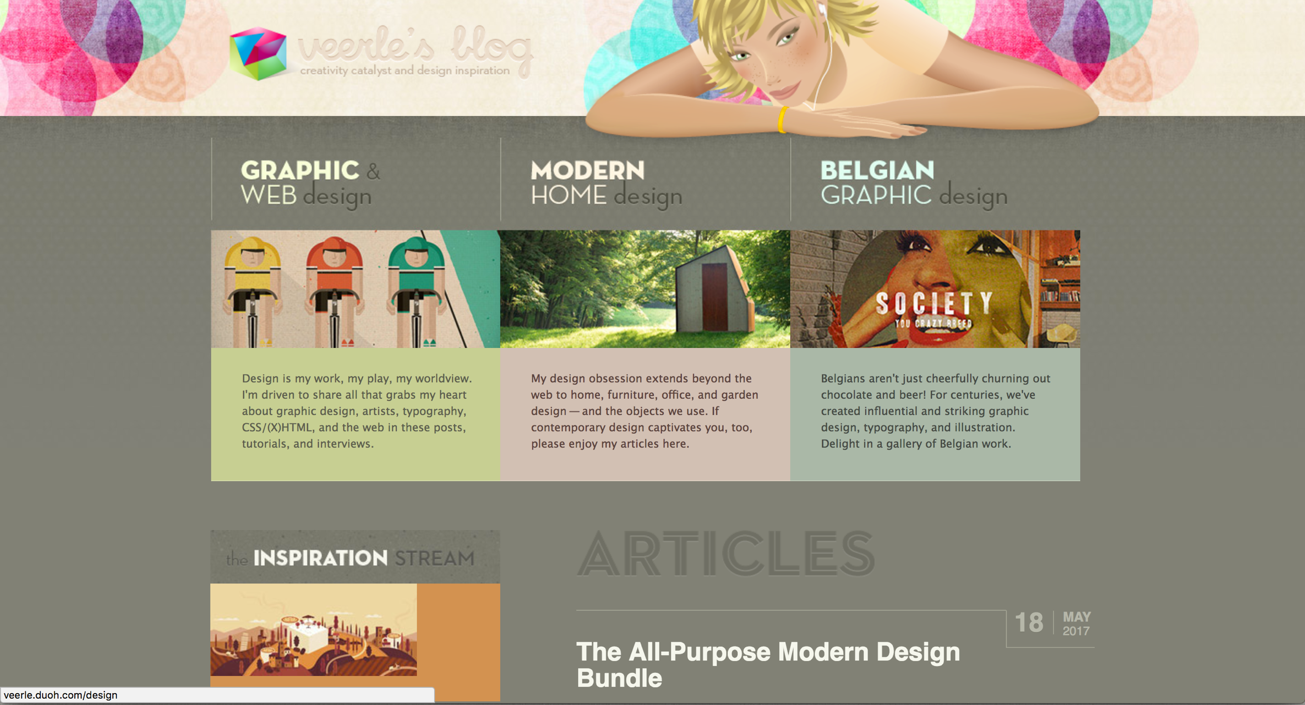
This website is welcoming because of its use of color to invite the viewer in, as well as to divide the designers work into clear sections, so the viewer knows immediately where they’re going and what to expect. This site stood out because it clearly reflects the personality of the designer, and it has an inviting feel that makes the viewer want to explore the designer’s work and investigate deeper into the site.
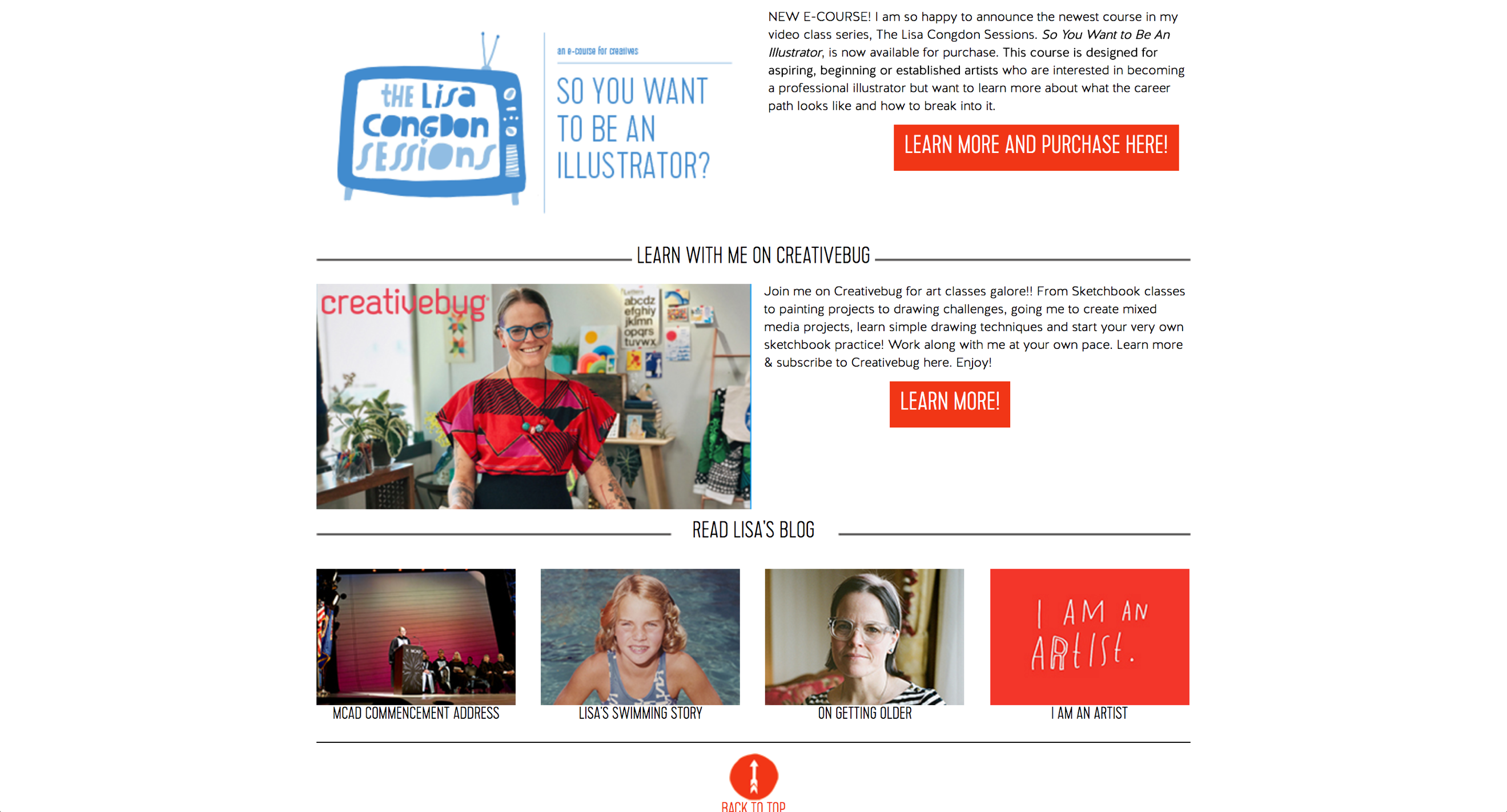
The appealing use of a folk art feel in the initial image on the home page draws the viewer in. This is a style that is not edgy or minimalist, as seems to be common among many graphic designers. Because it is more vibrant and arty, with a lot of shape and color going on, it invites the viewer to explore and see what else they will find. There are many facets to this designer’s work, and the personal touches in the layout allow the viewer to know her better and invite the viewer to become more acquainted with her work. It is intuitive and user friendly.