10 examples of Minimalism in Web Design

https://www.georgetowncupcake.com
Georgetowncupcakes.com has a simple website, but it still has a lot of information with the slide bar.

http://www.steffenallen.com
I felt like my list is missing black. White is very clean and simple, but black can also be clean. This photography website is a great example.

http://www.pinterest.com
Ahh, Pinterest, the easy of finding new hobbies that will never be acquired. I think Pinterest really is an easy website to navigate through. It may look busy, but it is one of the simplest websites I’ve ever used.

http://www.sundance.org/festivals/sundance-film-festival
Another simple website with a white background. I like the navigation circles and the pop of color.

www.tiffany.com
Tiffany has always had a simple image with it’s monochromatic design trademark. This screenshot captures the simplicity of the separation for different products.

http://amyatlas.com
I’ve always admired the simplicity of this website, even if it is a little outdated (it’s been the same for a few years now). I especially like the 2 simple pictures and the tabs on the side of the screen.

www.ohjoy.blogs.com
Another blog with a white background and easy navigation. Oh Joy has a simple logo and professional photos to help add to the clean appearance.

http://www.artymcgoo.com
Arty McGoo, not only is she an incredible cookie decorator, her website showcases her work in a simple, easy to navigate way. She is able to show off her work, as well as create a simple place for visitors to watch videos and follow various content.

http://www.kenleyeventdesign.com
Kenleyeventdesign.com starts the page with a photo of an event, which can count as a portfolio photo. Scrolling down leads you to more parts of the website which are separated with white space. This website has a feel of high class and modern chic.
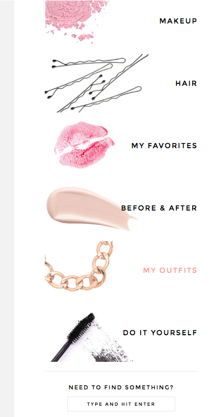
http://www.maskcara.com
I personally think a lot of blog websites are very simple. Every once in a while I’ll come across a few that have too many advertisement banners which end up taking the simplicity away from the page. Maskcara.com is a very easy to navigate website/blog. It also has a feeling of high end with how simple it is. The screenshot I’ve included simply shows the navigation bar from the side of the page. Very easy to understand, and clean.