10 Animated Websites
Student Guest Post Author Info
Student Bio: Thivya Nagalingam
Student Website: Website
Student Bio:
Published Date:
Apparently, this Russian website has been built for promoting certain brand of tires. On the
home page, the windows are sliding in and out when moving the cursor around to navigate.
Rather than using a still background, the space is developed as interactive. It is exciting how the
customers can choose tires by playing games. Even if someone doesn’t want to buy them, they
can always visit this website to play racing games without actual body of the vehicles.

https://www.buildwithchrome.com/
Do you want to build your own building? With Legos? This is the website for you. It’s really easy
and fun to navigate through this website and you can build anything, anywhere you want in this
world. It’s a great place for people who are 13 and above and want to play Lego without being
judged by others.

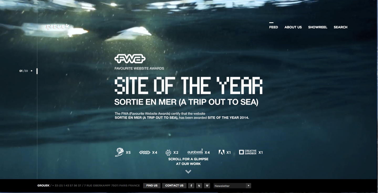
http://grouek.com/project/home
It’s an amazing animated website. Wherever the cursor goes, the whole site is moving
somewhat like adjusting a puzzle game. People just need to scroll up and down and move the
mouse around to find the navigation tab. It’s visually pleasing and magical.
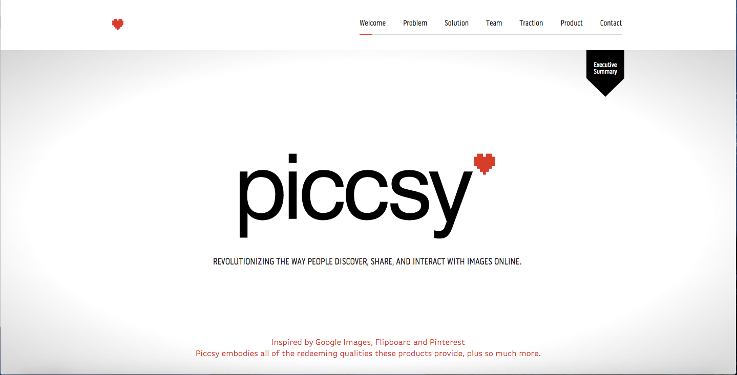
http://www.piccsy.com/investors/
If a business man or a person interested in statistics, graphs and diagrams this is for them.
Actually this website belongs to a team of investors. When scrolling down the page, one can
see the diagrams filled out automatically, graphs raising above and a creepy guy blinking now
and then. This kind of design is suitable for those companies which deal with digits everyday.
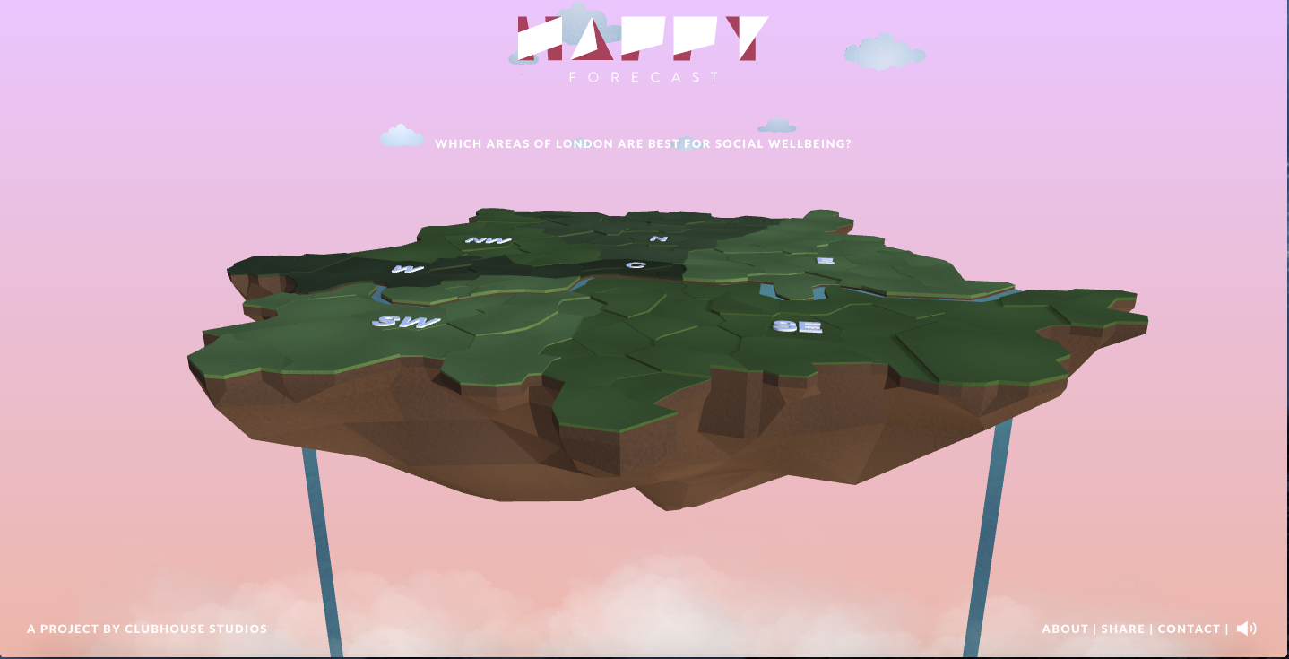
http://www.thehappyforecast.com/region-select/
A weather forecast couldn’t be any better than this. This website is created by Club House, an
interactive design studio in London. If anyone wants to know the weather status in London, they
just need to click on the region to find out. It comes with bird chirping, water running background
music too. There are no complicated navigation panels and homepage contains everything
together.
Promoting a brand while teaching people how it’s done, this website has reached a new level of
advertising. It gives the feel of letting the customer to choose the apple he wants and make the
cider from it. At the end, you can see the final product.

The color scheme of this site is great. Move your cursor through the text and the small yellow
particles move away then get back together. By scrolling down, the informations are received by
the visitor. Yellow particles join together to make the animation possible, such a great design
and thought.
It’s a shame that I never used apple music even though I use apple devices. I’vechosen the
apple website especially for the MUSIC tab. If you scroll down you will see more animated
background and it’s looking quite amazing, promoting the brand, apps andequipments. I am
wondering why they did not use such design on any other tabs though.

http://www.projectprometheus.com/trainingcenter
A testing center where one can get physical test done by pressing arrow buttons to avoid
obstacles. It’s quite thrilling to pass all the tests. It doesn’t really seem like a game website but
it kind of is one.

A great love story is made into a website with great color schemes, graphics, animations and a
lot of effort. The artworks are contributed by so many artists, you can see their names at the
bottom of every animated graphic design. I don’t know which genius came up with this
wonderful idea to create such a beautiful, interactive website as a wedding invitation though.
