10 Amazing Websites Using Illustrated Web Design
Student Guest Post Author Info
Student Bio: Courtney Willis
Student Website: Website
Student Bio: Freelance illustrator and hobbyist varied in multiple forms of art.
Published Date:
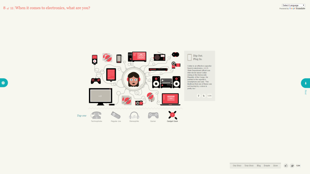 1. Slaveryfootprint
Slaveryfootprint.org is a wonderful example of illustrated web design. Slaveryfootprint.org is a survey website trying to promote awareness of people who are forced to work for very little pay for long hours and in terrible working conditions. They make the things that we use in more developed and privileged countries, such as electronics, clothing, etc. Each page on this website is animated with illustrated images that make the experience fun and entertaining. The interface is simple and the animations capture the user’s eye. Each page is simple, but different enough to create a unique and memorable experience.
2. Green Campus Guide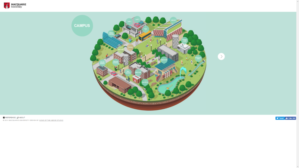
The Green Campus Guide is a website designed by Macquarie University. It was designed in order to provide a fun and interactive guide to keeping their campus clean and environmentally friendly. This site was obviously created by people who knew what they were doing! The user can click each pop-up bubble and get more information for each subject. When a user clicks on the white arrow to the right, a new image appears, taking a closer look into the building that are drawn on this zoomed-out map. More information bubbles pop up and give a Jell-O like appearance (wiggling like Jell-O for a moment) that catches the eye of the user. The colors are pleasing and not over the top.
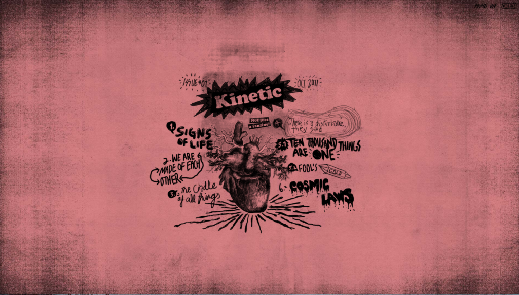
3. Kinetic
Kinetic.com is a highly interactive website utilizing illustrated web design. It’s not apparent from the still image, but many of the illustrated pieces are animated as well, drawing your eyes to the subjects. As you scroll down, the images change into new drawn pictures with animated and interactive pieces that gives the user new information about kinetic energy and how it works. This website is highly entertaining and the illustrations are well done and used in a way that doesn’t provide any visual annoyances. Overall, I would say kinetic.com is a fantastic example of illustrated web design.
4. Uchitomi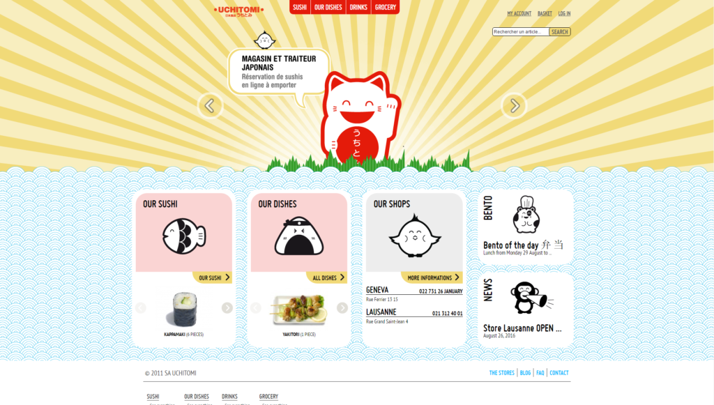
Uchitomi is a French site advertising Japanese cuisine. I used the translator feature for the screenshot and most of it was translated well. Although some parts of the site are still in French (due to the words being part of the actual illustrations), I would still say this is a really good example of illustrated web design. The art style is a style typically used in old Japanese paintings and the colors work well with each other. Clicking on the links bring you to separate pages for their different dishes. Although the art is eye-catching, the menu items have a simple white background. It is very easy to view and read the items and has a simple and easy-to-use interface that anyone could use.
5. Ipolecat
I really appreciated the design of this website. It uses a lot of eye-catching illustrations and I enjoyed viewing all of the different pieces of art. Ipolecat.com is about custom iPhone app development, processes, and releases. There are 3 different pages, so it’s simple to navigate and provides a lot of information to the user. The purpose of illustrated web design is to attract the eyes of its users and keep them interested enough to continue browsing the website. I am not interested in app design, but I wanted to continue browsing because the illustrations made it look like something fun!
6. Stop the Vom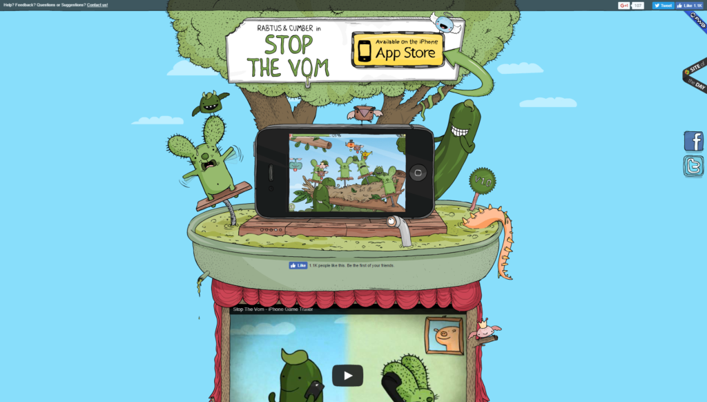
Stopthevom.com is a really creative way to use illustrated web design. The background image is one large illustration of character from the phone app game that it is advertising. There are areas around the animated images that make it look more interactive. The colors of the illustration are nice to look at, and the overall image reminds me of something I would see in a children’s book. The website is very simple and only consists of this one page. Everything you need to know about the game is on the front page. I would say this a pretty good example of illustrated web design.
7. Reverend Danger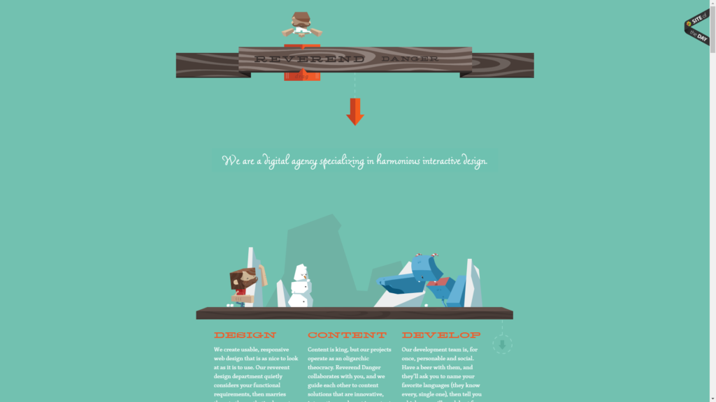
Reverenddanger.com is a website about graphic design and the people who made this particular website. All of the illustrated designs have a sort of 3-d design and as you navigate through the site, they change and are sometimes animated. The designs lead the user to other important areas of the website and keep the user’s attention. This is one of the best examples of illustrated web design I have seen so far.
8. Yipori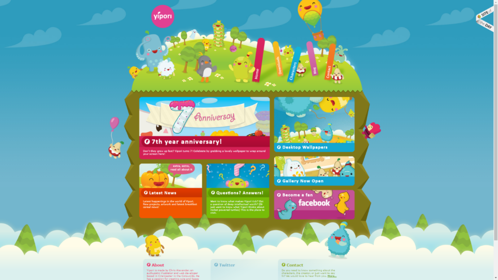
Yipori.com is a very cute website that provides fun wallpapers for its users. The front page has very eye-catching art of adorable characters that seem to be the mascots of the site. The clouds in the background move slowly to the right of the screen and give a nice effect. It is easy to navigate and I really appreciate the lack of ads that would completely ruin the effect the owners of this website are going for. Because of the colors, cute characters, and unique illustrations, I feel like yipori.com is a good example in using illustrated web design to attract new users.
9. Malika Favre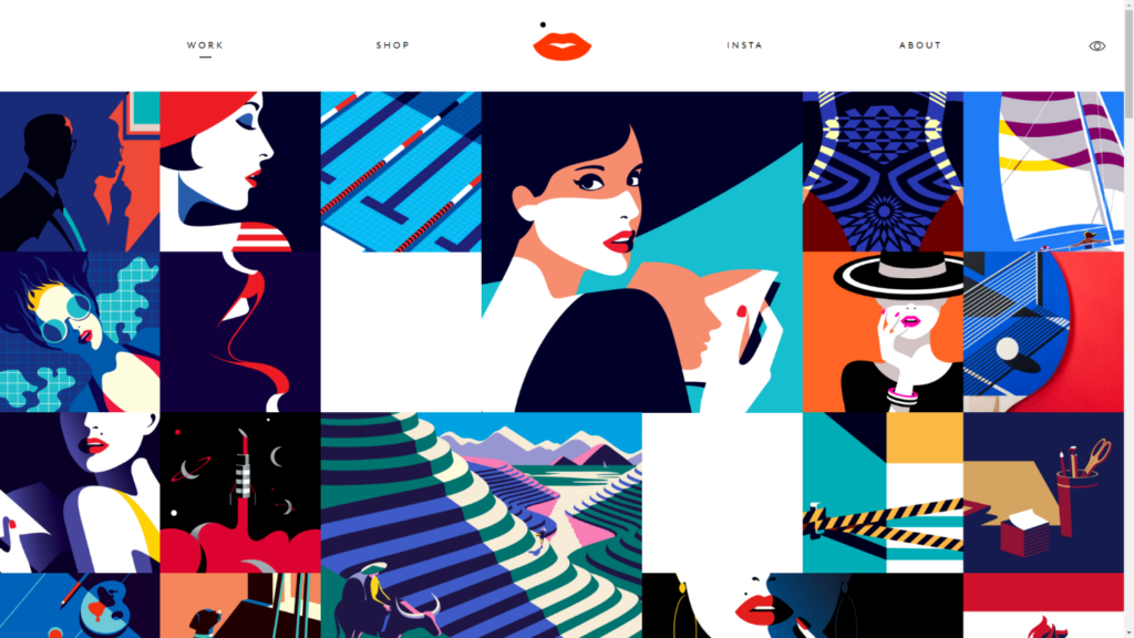
This is a website where the author, Malika Favre utilizes illustrated web design to showcase the illustrations. It is intended to bring the user’s eyes to the art itself and keep it there. Each icon leads to different areas of the site to view more of her art or about me sections, work experience, and even to buy the art you are looking at. I really like how the author chose art pieces that worked well together in themes and colors. Everything flows together. This type of web design is perfect for showcasing art and is a great example of illustrated web design.
malikafavre.com
10. Gallery of Mo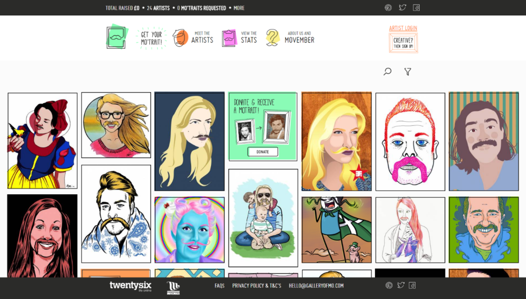
Gallery of Mo is a really creative way to incorporate illustrations in web design. It focuses around the art itself while also using it as the main design of the website. The purpose of the website is to donate money to artists to draw the user’s portrait, or “mo’trait” by a different artist. A mo’trait is a portrait, but with a moustache! When hovering over a different portrait, it shows an overlay of the artist who drew it, the person it is of, and how much the person donated to the artist. At the top of the page, the “Get your Mo’trait” logo is animated in order to attract the user to that particular button, encouraging donations. I really enjoyed navigating this website because of its creativity and simplicity.