10 exceptional minimalist web sites
Here are 10 exceptional minimalist websites.
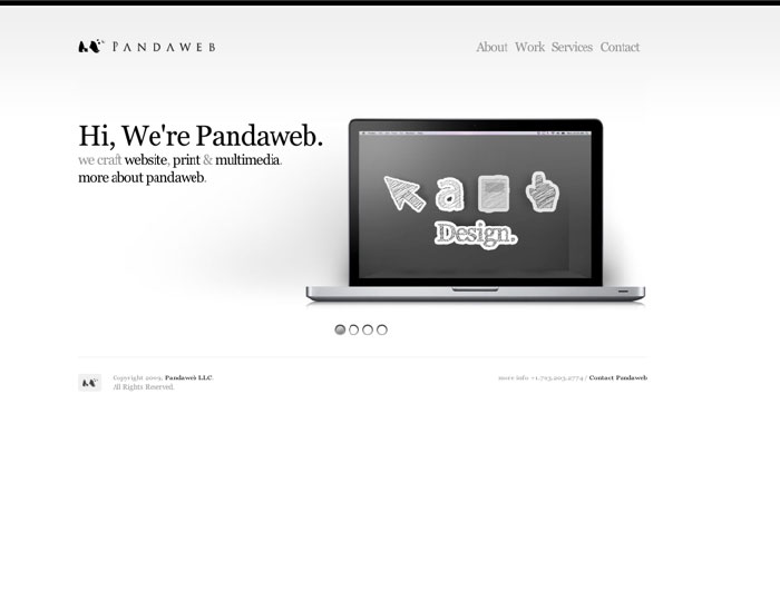
This site is extremely minimalist. It uses color very sparingly and has instead relied mainly on placement, size, and contrast to direct the user to the most important elements. The site gets straight to the point with the larger and higher contrast of the laptop image and tag line text. There is a good use of negative space used both in the Panda logo as well as the site in general. The white space is used as a dividing element between tasks. For example the navigation ‘about’, ‘work’, etc. is separated from the logo and laptop image. The one divider that remains is to separate the footer from the body and has a minimal footprint: a one pixel, light grey line. Only the most important elements remain and are configured in a organize way.

This site minimal in the use of colors and treatment. The subtle background gradient leads the user’s eye to the most important aspect and purpose of the site, the bike. The site is simple and clean and follows the thought that pictures are faster and therefore simpler than words. This is demonstrated by the dominating bike in the center of the screen as well as the navigation icons above the words. Most unnecessary elements are removed; however, the heavy dark gray button next to the bike is a repeat of a navigation item and ruins the balance of the page. Overall the design decisions are minimalist.
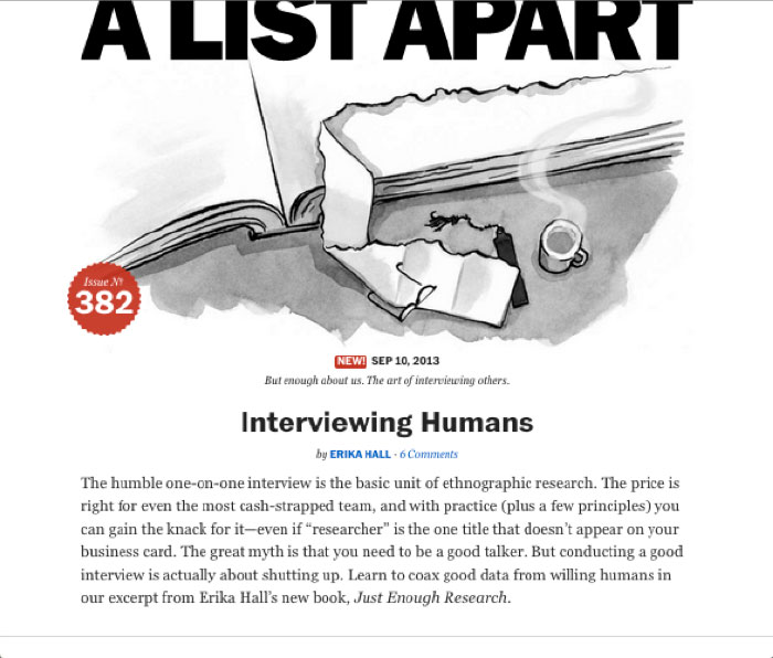
The site is very simple. There is a great use of white space and no unnecessary UI elements. Very few colors are used, mainly black on a white background. The drawn image helps conveys the article’s topic as well as brand the site. Red accents are used sparingly to show that the article is new or show the issue number. The title is large with care given to typography here and throughout the site. The title treatment is also trying to follow the minimalist mantra by removing as much as possible without losing functionality.
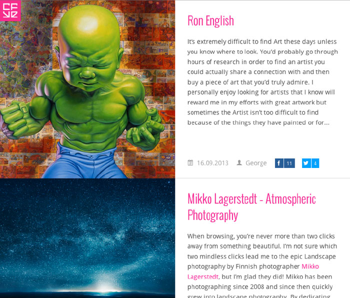
Minimalist design does not mean lack of images or illustration as long as it is organized and makes sense for the business and purpose of the site.
It has great delineation of where the user looks for images and text. Pink accents set it apart and make it simple to scan. The content comes first while the navigation is tucked away behind a button. This technique allows the site to get to the point with little distraction and allows the user to accomplish the reason for coming to the site quickly.
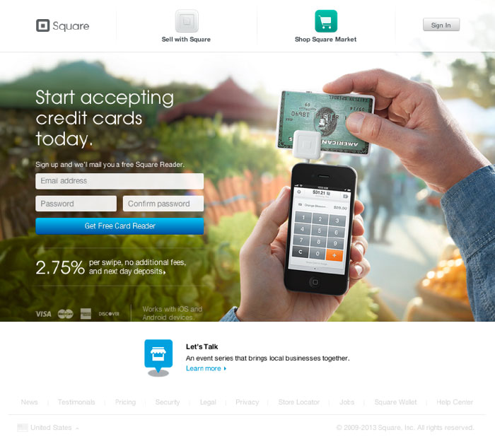
At first glace, this site might not feel minimalist; however, it conforms strongly to the principles of minimalist design. The site uses strong and simple full frame images to display their simple product. The pictures eliminate distraction with a short focal length that blurs the image background thereby differing to the product while adding just enough for context. The two-color-gradient call to action button pops off the page and directs the user eliminating possible user confusion. The site has no randomly placed elements.
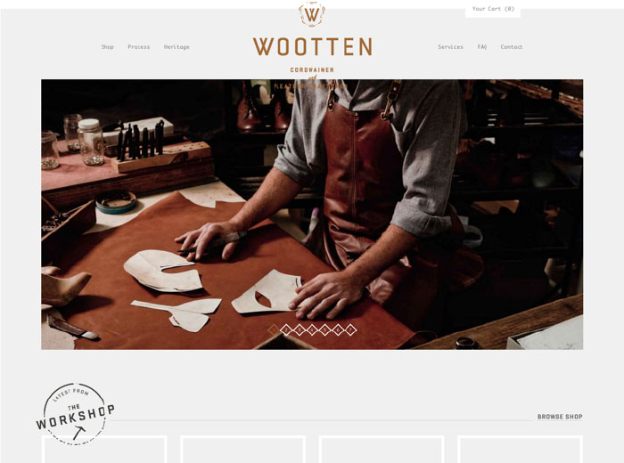
The most prominent feature to this site is a large image treated in a minimalist fashion. There is only one large image seen as the user enters the site. The image is logical and rational serving a few purposes. It gives immediate context, strong branding, and helps to sell the product to the user. The image also only focuses on one concept ‘a shoe maker workshop’ and cuts out competing ideas like who the shoemaker is by not showing his face. The background is grey, simple, and clean. The navigation is subtle relying only on typography. The logo uses a neutral color and fairly clean.
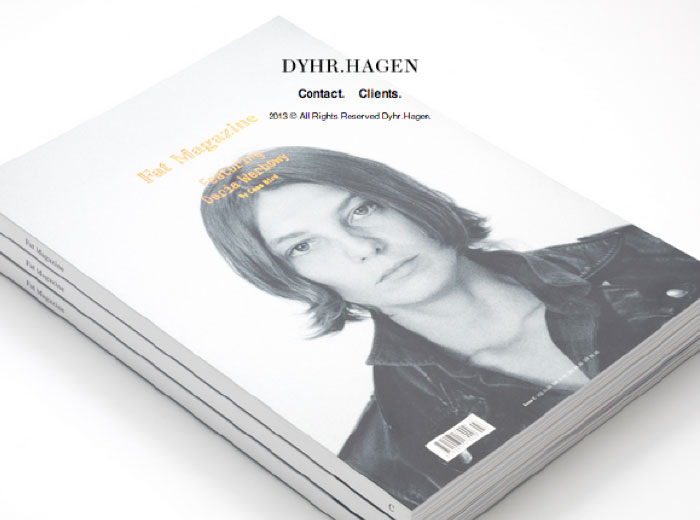
This fashion company keeps it extremely minimalist and simple. They have a hero image with company name, two links, and an ARR. The site caters to a specific audience that is already familiar with their name. The user can see you they’ve worked with and contact them. The site is simple and to the point both in functionality and layout.
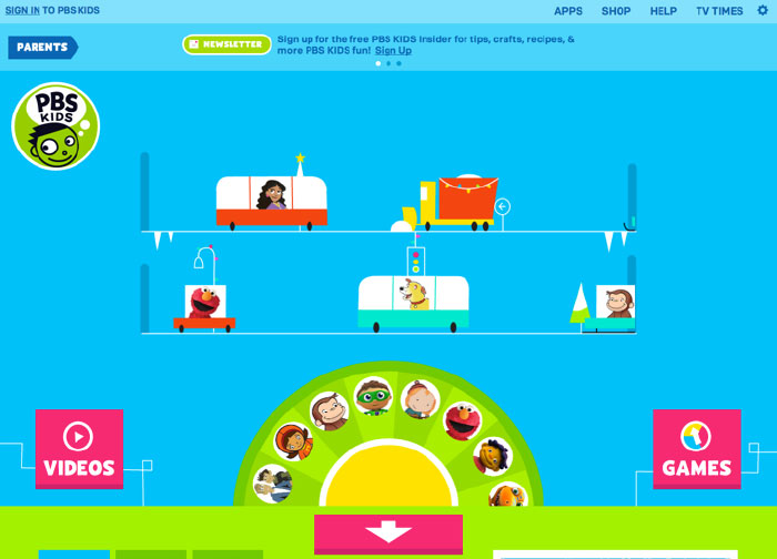
Minimalist sites don’t have to be white or boring. PBS Kids site has a good use of color and is fun while maintaining minimalist principles. There is plenty of white space and room to breath. The site uses pictures in a game like way for navigation. Almost all the text is at the top in the first hundred pixels. Pictures can often be a faster and simpler way to communicate especially when they are easier to recognize.
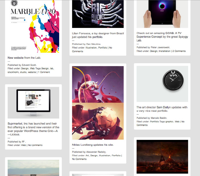
This website handles a massive amount of information in a very minimalist manner. The navigation is reduced and allowing the content to speak first. Minimalist website should be quick and easy to scan and Reform Revolution does a good job of this. Being “minimalist” is also a thought process, there is little thought required for accessing images. The user ether uses a simple search or just scrolls, which has become second nature to most users. Visually, the site uses one repeating pattern to simplify the vast array of data. It has little modular units that start with a picture followed by descriptive text and comments. Also the background is plan and simple differing all attention to the content.
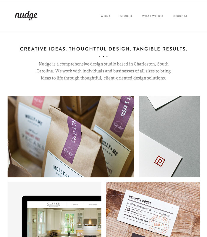
This site has a nice clean and minimalist feel. The site is nearly black white and grey. There is a good use of white space with plenty of padding around the logo and navigation. The pictures introduce a little bit of color and as you roll over the image it gives you more information. The technique of hiding complexity until the user asks for it is a very minimal approach.